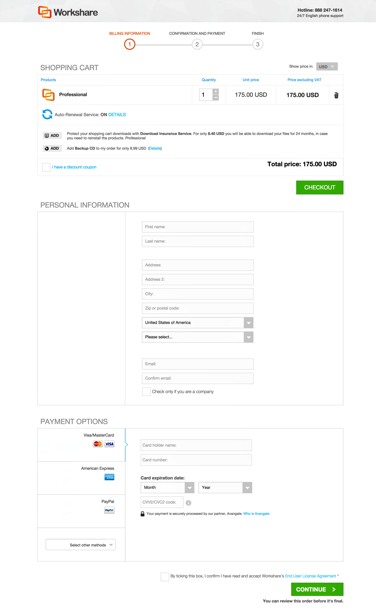
“Less is more”, the old adage goes, and we’ve confirmed that less can be way more when it comes to cart conversion rates. Avangate recently ran some split tests on the Checkout page that increased conversion rates by an impressive 12%. And all it took to make such a big difference was eliminating a few fields on the Billing form. Tweet
To test our “less is more” hypothesis, we partnered with our customer Workshare, a B2B software provider that specializes in document collaboration. We split-tested two different checkout forms, one of which required the customer’s full street address, city, and zip code, while the other did not. We call the latter our “Short Form”.
Although many of us think that address information is required to process a credit card transaction, that’s not actually the case. In most countries, the name, city, ZIP code, and country are all that’s necessary to process the transaction successfully. Think about it – do you type in your address every time you swipe your card in person at a store? Why should you always have to enter it online?
You can test the “less is more” hypothesis with your own Checkout Page using Avangate’s advanced A/B testing tool, which was recently updated. The tool, which is included in the platform under “Marketing Tools” allows anyone to easily test Short Form and quantify the increase in conversion rate – and revenue.
There’s no coding required, and the system automatically calculates statistical significance and generates cool graphs and reports to show off your CRO know-how.
While testing Short Form is a clear winner, there are many other elements of the purchase flow to optimize as well. Use our A/B testing tool to test cart templates, purchase flow, upsell placement, and express checkout to see how a leaner experience can boost conversion rates.
Watch our webinar on how to use the A/B testing tool, then come back to report your results in the comments – we can’t wait to hear how you do.


