
The CommerceNow 2023 virtual event offered invaluable insights into online selling from industry experts Michael Aagaard, Nicoleta Danilet, and Brian Massey. The discussions revolved around the art and science of optimizing eCommerce pages, the innovation in A/B testing, and the evolution of web forms.
If you’re a merchant interested in staying ahead of the competition, experimenting with new conversion rate strategies, and are excited about emerging new technologies, keep reading.
Optimizing The Four Key Pages in Your eCommerce Site
A website serves as the storefront for eCommerce businesses, welcoming users into their digital space. Like how retail businesses optimize their in-store user experience and satisfaction, eCommerce brands must treat their website visitors to a pleasant customer journey.
Unfortunately, numerous brands fail to meet this standard, and it’s no one’s fault. Many business owners are overburdened and overworked, resulting in a loss of objectivity and confusion regarding the next steps.
Luckily, Michael Aagaard, a veteran with over 15 years in Conversion Rate Optimization (CRO), shows us in his session, “The 4 Most Critical eCommerce Pages and How to Optimize Them ”, that there are only four key pages that your eCommerce brand needs to worry about:
- Home page
- Product Listing Page
- Product Display Page
- The Shopping Cart
Together, these are the most visited pages of your website and have a significant impact on your business’s bottom line. They attract a large volume of traffic and can guide users to all your brand’s offerings, ultimately increasing revenue.
Additionally, you can experiment with different approaches like A/B testing to achieve even better results.
Below, Michael shows us how playing around with elements of your website can lead to a positive, lasting effect for your customers.
Key Page 1: The Home Page
Page Objectives:
Create an immediate impact. Your brand and offerings should be front and center as soon as the customer lands – providing you with the highest chance of converting a prospective lead.
Always minimize the clicks to your product pages – the fewer clicks, the better. Ultimately, the homepage acts as a bridge between your different product offerings and overall brand experience.
Actionable Tips:
- Don’t Overwhelm The User: About 5% of users scroll to the bottom of a homepage. As Michael puts it, overly long homepages are simply not effective. Keep it to only the most essential details for optimal conversation rates.
- Immediate Showcasing: Show your categories and products right off the bat.
- Pop-up Strategy: If you must use pop-ups, ensure they don’t annoy the user. Timing is everything; for instance, trigger a popup for a user who is browsing their second product page – showcasing their interest in further shopping.
Key Page 2: The Product Listing Page (PLP)
Page Objectives:
Provide a clear and concise overview of items in each category, and ensure easy navigation to product pages.
Actionable Tips:
- Show the Products, Not Just Descriptions: Users want to see products as soon as they land on the page. Avoid burying them under promotional content or unnecessary details.
- Relevant Promotions Only: If you must include promotions, ensure they are relevant to the user’s browsing category. Irrelevant promotions can be a turn-off.
- Include the important details: Product thumbnail, SEO title, price, list of variations and an “add to favorite” button.
- Easy-access filter and sorting function: Have these options “sticky”, meaning always in view for the user, so they can quickly navigate to them should they need to – this will greatly improve the overall user experience.
Key Page 3: The Product Display Page (PDP)
Page Objectives:
Create compelling product display pages by integrating high-quality images and comprehensive descriptions. Anticipate your customers’ needs and offer insightful information to build their confidence and trust, ultimately motivating them to buy.
Actionable Tips:
- Distraction-Free Zone: Avoid diverting the user’s attention with cluttered product images.
- Clear UI for Size and Color Choices: To make selecting products easier, it’s important to use consistent button sizes and color themes. Using color swatches allows comparing and testing different color schemes to determine which one results in the highest conversion and user satisfaction.
- Critical Information Near ‘Add to Cart’: Place essential information like shipping, delivery, and returns near the ‘Add to Cart’ button.
Note: When designing these PLP and PDP pages, understanding consumer psychology can be a game-changer.
For example, the principle of ‘scarcity‘ can be leveraged in PLP by indicating low stock levels. This creates a sense of urgency within users, leading to accelerated purchasing decisions.
Key Page 4: The Cart/Checkout Page
Page Objectives:
Provide a clear overview of items and their price, make adding and removing items easy, and propel users into a frictionless checkout experience.
The checkout process is a key touchpoint in any eCommerce journey and often the point where customers decide whether to finalize their purchase or abandon it.
Actionable Tips:
- Avoid Unnecessary Distractions: Overcrowding the cart interface can lead to unnecessary scrolling. The last thing you want is to divert your customer’s attention at this crucial stage. Keep the focus on completing the purchase, not on downloading your app or entering a discount code.
- Information Hierarchy Matters: Arrange elements in a way that puts essential information like total price and items at the top. Push secondary elements like coupons and fine print lower down.
- Add Relevant Cross-Sell Item(s): Mejuri, an eCommerce jewelry brand, does a great job by offering a jewelry care kit for $20 when your cart is already nearing $500. It’s a no-brainer add-on.
- Free Shipping Threshold: If the user is close to qualifying for free shipping, make that information easy to find. It’s an effective way to increase the Average Order Value (AOV).
Make sure you get all the insights on how to successfully optimize your eCommerce website pages by watching Michael’s full session here.

Innovate Your Shopping Experience With A/B Testing & Analytics
In the rapidly evolving digital commerce landscape, understanding customers’ buying patterns is critical.
In her session, “Innovate Your Shopping Experience With A/B Testing & Analytics ”, Nicoleta Danilet, Senior CRO Specialist at Verifone , points to A/B testing and analytics as the best techniques to eliminate guesswork in website optimization, empowering your business with data-informed decisions.
Why A/B Testing and Analytics Matters
A/B testing is comparing two web pages to see which one converts better. Analytics analyzes your user’s shopping behavior and traffic sources to reveal patterns, trends, and insights. Used effectively, A/B and analytics can make your web presence more impactful.
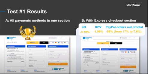
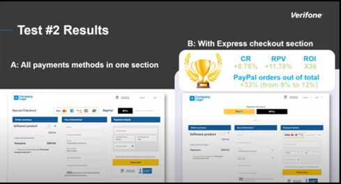
Nicoleta discusses a new technology that allows sellers to create a hassle-free checkout process.
Coined “InLine Checkout Forms”, these inline cards are iFrames that load directly on the product page, effectively removing the need for a separate checkout URL. But why should you care?
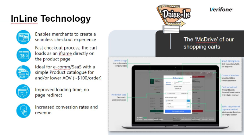
Nicoleta’s data shows that this seemingly minor change has led to substantial conversion rates and revenue increases. The reason is simple: a smoother, faster checkout experience keeps customers engaged, reducing friction and finalizing sales more efficiently.
Here’s where it gets interesting—inline cards aren’t one-size-fits-all. They come in two variations: multi-step and one-step. Each offers distinct advantages and challenges, making it critical to choose wisely based on your unique business requirements.
In general, inline carts work well for companies with simpler product catalogs and lower-order values.
To cover their differences briefly:
- Multi-step inline carts offer a more comprehensive view of customer behavior through analytics, allowing you to optimize your sales funnel at various stages.
- One-step inline carts aim to reduce cart abandonment with their streamlined design, though they offer limited insights due to restricted analytics.
Techniques for a Secure Shopping Experience
Social Proof as a Trust Signal
Nicoleta emphasized the role of social proof in enhancing the shopping experience. For instance, adding third-party logos or performance statistics to the top of the checkout page can increase conversion rates by up to 11% and revenue per visit by up to 21%.
However, don’t overwhelm users with too much social proof. Stick to a clean and concise cart page with clear form fields and call-to-action.
Does this make integrating social proof into your checkout? The answer is a resounding yes.
Key Security Features
Data privacy and security are non-negotiables. Nicoleta advises using encryption protocols, SSL certificates, and secure payment badges to safeguard customer data. These trust indicators should be prominently displayed, especially around the payment details section, to reassure your customers and reduce cart abandonment.
Competitor Shopping Cart Research
With your A/B testing strategy in place, Nicoleta focuses on the value of competitor analysis for accelerating your own hypothesis results.
By analyzing your competitors, you can gather insights, identify friction points, and better understand what works for your businesses.
Nicoleta reviewed three SaaS companies—Microsoft, HubSpot, and Zoom—and their self-made checkouts. The analysis revealed that even industry giants have room for improvement, particularly in geolocation, payment methods, and form design.
If they can benefit from optimization, imagine what targeted A/B testing could do for you. Standing still is not an option.
Through rigorous A/B testing and analytics, you can fine-tune your checkout experience, enhance customer trust, and ultimately boost your bottom line.
Bonus: If you want to learn more about optimizing your shopping cart and getting the best conversion rates out of it, download our free eBook on Shopping Cart Best Practices.
Building in-house CRO Team vs. Consulting
An in-house team allows businesses to have greater control over their optimization strategies, aligning them closely with specific goals and brand identity.
Building an In-House CRO Team provides:
- Greater Control Over Optimization Strategy
- A deeper understanding of Unique Challenges
- Ongoing Focus and Sustained Improvements
Conversely, external experts bring a wealth of experience and best practices in eCommerce and digital optimization, offering immediate expertise.
Consulting provides:
- Immediate Access to Specialized Knowledge
- Fresh Perspectives and Flexibility
- A more resourceful approach
To learn more about hyperboosting your A/B testing strategies and upgrade your blueprints for increasing your conversions, make sure to watch Nicoleta’s full session here.

How To Level Up Your Web Forms: Forget The Pancakes
First things first, why are pancake forms so prevalent? According to Brian Massey’s, Founder and Managing Partner at Conversion Sciences, session on “Rethinking Web Forms: The End of the Pancake Form”, our brain, that 3-pound ceiling of biases, loves to take shortcuts.
When a design pattern repeats often enough, we start to believe it’s the “right” way to do things.
But here’s the deal—our brains are not necessarily the best judge of what works for our users.
The Problem with Pancake Forms
The main issue with pancake forms is that they can look daunting, particularly on mobile devices. When a form seems like a lot of work to fill out, potential customers are likely to abandon the process.
It’s not just about the number of fields; it’s also about the cognitive load it places on users, making them think twice before proceeding.
Brian suggests breaking up your form into smaller steps. For example, in an online store, you could start by asking a few fun questions about the customer’s style. This makes it less overwhelming and more like a conversation.
Want to go further? Try quiz-style forms. This is more than just breaking things down; it’s about asking and explaining why you need certain information. This can make customers more comfortable and less likely to leave.
Finally, always remember to focus on a Mobile-friendly design and provide clear progress indicators between each step of the form.
The Psychology Behind Multi-Step Forms
Brian also highlights the psychological aspects that make multi-step and quiz-style forms effective. These include:
- Sunk Cost Fallacy: The more time users spend filling out a form, the less likely they are to abandon it. This creates a momentum that encourages them to complete the process.
- Room to Explain: Unlike pancake forms, multi-step forms provide ample room to explain why you need specific information. This can significantly reduce user anxiety and increase form completion rates.
- Mobile-Friendly Design: Scrolling on mobile devices can hide crucial information or buttons. Multi-step forms are better designed to fit a complete mobile screen, making the process more intuitive.
It’s important to note that simply switching to multi-step forms might not solve your problems. Brian emphasizes the need for A/B testing, echoing the remarks of Nicoleta, in determining the best flow for your business.
He also adds that it’s best to save more personal and challenging questions for the final steps of multi-step forms – reducing the likelihood of the user bouncing since they are close to completion.
What To Measure When A/B Testing Your Web Forms
If you’re not A/B testing your forms, you’re essentially flying blind. Brian stresses the key role of A/B tests in pinpointing the weak links.
Which part of your form is the bottleneck? Data-driven insights can offer the answer. Once identified, it’s about fine-tuning those specific segments to ensure smoother transitions and reduced drop-offs.
Step-by-step, this looks like this:
- Track each step in your form flow
- Analyze which step(s) causes the highest abandonment rate
- Redesign or change the order of the unoptimized steps
- Use the gathered data to decide whether Pancake forms or Multistep is best
Discover the inside scoop on why this alternative style of form is proving to be so effective by watching Brian’s full session here.

Wrapping Up: Empowering Your Business Through Data and Optimization
To succeed in eCommerce, mastering the customer journey from homepage to checkout isn’t just important—it’s essential.
By tracking each stage of the user journey, you empower your brand to pinpoint opportunities for elevating the customer experience to extraordinary levels. This focused approach not only helps in identifying shortcomings but also transforms them into actionable insights, leading to increased customer loyalty and maximized revenue.
Draw upon the invaluable insights and decades of experience offered by Michael Aagaard, Nicoleta Danilet, and Brian Massey. Be sure to watch the wisdom-packed CommerceNow’23 full sessions to discover actionable insights to innovate the way you sell online.