Your goal as an eCommerce business is simple: sell a product online that delights your B2C and B2B customers. No matter how great your product is, you must present it in a way that helps your site visitors reach the point of trying it out.
If they can’t get past your website, they’ll never know how great your product is. This may sound daunting, but there’s good news! There are some small changes you can make that will create a world of a difference in how your customer consumes. No one has time to waste and people’s frustration levels with subpar websites are at an all-time high.
When best practices aren’t followed, customers don’t stick around, and they definitely don’t put your product in their shopping cart.
So, here are 19 best practices for you to implement on your product page to boost conversions. You don’t have time for 19 you say? That’s fair… Choose a few, sit back, and analyze.
1. Use one hero image
Your hero image, or the main banner image that you use for your site, should give a great first impression. It should communicate to people what you want them to think about the brand when they land on this page.
People process visuals faster so this, more than your copy, will give visitors to your site their first taste of your product and the emotions that come with it. The image you choose should be a high quality, professional photo that is engaging. Surround it by white space — not using too much copy — to help people focus on the image and get the clear picture (see what we did there?). Try choosing a colorful and vibrant image, to make sure you get their attention.
The right image will make people do a double take, and ultimately, linger longer.
2. Feature more product photos
Remember that your buyers can’t see your products in-person so you need to build their trust.
As an eCommerce business, you must overcome the fact that people prefer to touch an item before making a purchase. To get as close to this in-person experience as possible, you can use video that tells a story about the product or use large, high-quality images that highlight the product’s strengths.
You don’t need a ton of pictures — just enough to tell the story and help them envision themselves as the owner. The image gallery for each of your products should be filled with unique images (contrary to the ones provided by the manufacturer) that show the product in 360 degrees. Images showing your product being used are also always nice. This should circumvent the fact that your consumers cannot touch, feel, and smell your product prior to purchasing.
Having just the right number of images in your gallery will not only increase user trust of your product, it will also improve the usability and navigability of your site.
3. Use a compelling description
As you describe your product, focus on the benefits instead of the features — benefits are what sell.
People just want to solve their problem no matter how superficial it may be. Test different writing styles and tones to see which your customers most connect with. No matter what kind of language you use, make it simple, clear, engaging, and easy to understand.
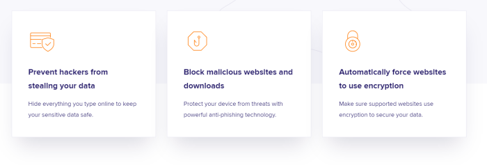
For example, Avast has a pretty straightforward description for their Secure browser product, that explains what’s in it for the customer: keep data safe, block malicious websites, use encryption to secure data.
4. Add trust badges
Trust badges show that you are a legitimate site.
They associate your company with other well-known, respected companies, to hopefully give you a leg up, as well. These badges are frequently found below the call-to-action of your site because they are less important than the product itself.
Badges you could feature include the trusted payment processing company you use, your site security service provider if you want people to create an account, the company powering your site, and your BBB rating. This is something small you can do that barely takes any thought or time — big bang for your buck.
5. Include social proof of various forms
The power word of mouth carries is significant. People trust other real people.
Reviews from users like them can give them reassurance about their decision or direction their thoughts are heading. Your social proof will have the greatest impact, in the appropriate form, where visitors might have some apprehension. For example, have 1,000 people given it 4.7/5 stars? Feature that star rating just above the price to justify it.
A great example comes from Pinnacle, a video editing software:
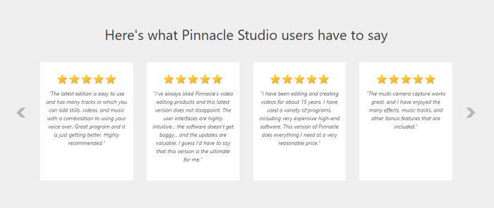
A bonus for you is that people will commonly scan through reviews before buying just to make sure they fully understand the product. Hearing from other users could decrease the workload on your customer support team!
Pull quotes from case studies to feature in relevant places. Are people tweeting about how great your company is? Have an RSS feed of those tweets. Not only do consumers care about what is being said, they care about sheer volume.
6. Work on site speed
Your consumers get frustrated at unprecedented rates. If you don’t cater to their frustration, your conversions will falter. One of their top pet peeves when it comes to online shopping experiences is slow page load times. It turns out that half of web users expect pages to load in 3 seconds or less. They don’t want product exploration to require any work on their part, nor do they want to sit idly while pages are loading.
Bonus: Here are some extra tips for speeding up your website.
Chances are low that they will return if they have trouble with the site. Start by determining what your page load times are. Then, try something to reduce it like making image sizes reasonably smaller or cutting down on the number of images you have on a page.
7. Have FAQs handy
FAQs help you and help your customers. By anticipating your customers’ questions and having satisfactory responses, you will increase your conversion rate while simultaneously relieving some of the pressure from your customer support team.
User-generated FAQs put them in the buyer’s position while addressing their concerns, questions, and objections. Sharing the answers to their most common questions not only decreases the chances of negative reviews — because people know exactly what to expect of your product — it also improves your SEO.
8. Integrate live chat and support options
When a buyer is on the fence, you need to be available to help them and they need to know exactly where to find you.
The solitary experience that many crave from online shopping can only go so far when they can’t touch the product they are preparing to buy. But, because they do want to be shopping from the comfort of their home, be readily available in a frictionless, non-intrusive manner, to answer their questions.
Integrate a live chat within your site or use a chatbot as a more economical route to retain or gain a sale.
9. Don’t forget about mobile
A whopping 54% of eCommerce sales are predicted to come from mobile devices by 2021, which changes how you must interact with your customers.
The design you choose for customers accessing your site from mobile should be different from that of the design for a laptop or desktop shopping experience. Because of the inherently small size of mobile device screens, people need to be able to enlarge images by pinching and zooming in on them or double tapping them to see the finer details of a product. This is just one of the reasons images need to be of a high resolution.
Also noteworthy is how people perceive shopping on mobile devices. Shopping from mobile is done altogether differently: people like to bookmark items on mobile to consider purchasing at a later point in time.
A wishlist feature on your website could enable this.
10. Have a clear call-to-action above the fold
You want customers to buy and customers want to buy — so let them! Make it easy for them by making it obvious. This will also help the consumers we fondly call the “scanners.”
Your main CTA should not be detracted from by other calls to action, it should be easy to read, and it should stand out. In essence, it should be the largest button on the page and have ample white space surrounding it. Choose your button’s words carefully by thinking about your buyer’s emotions. How much of a win would it be for them if they clicked your button?
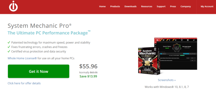
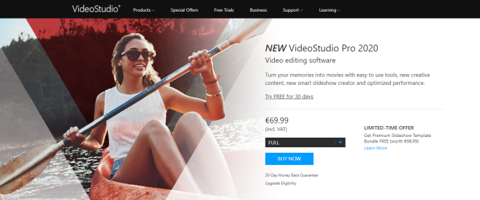
Customers don’t feel good when they click a button that says “Buy”; that just reminds them their bank account is being drained. A great option would be “Get it Now”, and it’s something that iolo.com has in place for its System Mechanic Pro product.
Ikea has followed this methodology and features a shopping list rather than a shopping cart.
11. Use urgency and scarcity
Communicating urgency and scarcity helps people convert more frequently and faster.
Try communicating urgency by offering promotions for limited periods of time — telling the user what that deadline is, of course. Countdown timers are one way to show how much time is left before the price goes up.
Scarcity can be expressed by telling the consumer how many items are left in stock, and give people a more favorable attitude toward a product.
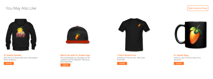
12. Display related products
Increase conversions by cross selling, upselling, or selling an alternative if the item the consumer was looking at didn’t quite fit their needs.
Do this more and better by displaying related products based on what other customers also viewed or purely based on similar features. This is particularly useful when your product is out of stock. You lighten the consumer’s load when you bring alternatives to them instead of requiring they search more on their own.
For example, Image Line advertises their branded merchandise shop at the bottom of their FL Studio product, a software music program.
13. Get rid of the clutter
With content scanning on web browsers at an all-time high, people want to be able to find the information they are looking for nearly instantaneously — possibly unfairly so.
They are looking for certain key points and it is your job to help them find those points as easily as possible. Clutter essentially functions the same way as slow site speed and is a deterrent for people. You can fix clutter by aiming for minimalism and thinking about quality and not quantity of content.
Ample white space gives the reader room to breath and comprehend your simplified message.
14. Experiment with price
Your conversions will undoubtedly be low if the market you are selling to cannot afford your price.
Is there something you can do to help them afford it, such as an installment plan? Your pricing should be aligned with the value that your product provides.
Bonus: Check out this article for actionable pricing insights, tips, and examples.
The price is generally thought to be appropriate if it is 10 times lower than the value that can be derived from it. Do you need to change your pricing? Alternatively, try presenting your price alongside an offer that brings the price down. People always appreciate a good “deal.”
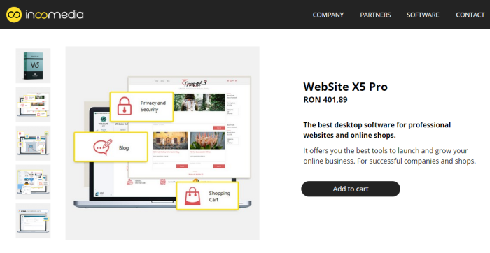
15. Offer pricing in the local currency
Consumers feel more comfortable purchasing in their own currency. This way, there’s no question about conversion rates and additional fees. In fact, 50% of online consumers say that they wouldn’t go through with their purchase if it were in a foreign currency.
As an eCommerce platform, you can accept local currency to make the payment process more similar to how customers spend money on a daily basis.
Incomedia does a great job at this, by displaying the local currencies straight from the product page.
16. Feature clear shipping information
People want to spend money on your products, not on shipping.
There are still huge discrepancies between companies and whether or not they cover shipping costs. Consequently, people want transparency and to access the shipping information easily. If a consumer isn’t certain whether they must pay shipping costs chances of cart abandonment increase.
Ultimately, they want it free and they want it fast. There’s nothing worse than discovering your cheap product is going to cost more to send. A bonus to free shipping is a tracking number to track their purchase’s journey to their doorstep.
17. Trigger positive emotions
Sell the feeling people get from using your product rather than the product itself. There are a variety of ways to trigger positive emotions in your buyers.
One by showing aspirational characters taking part in experiences your consumers want to have. Additionally, bright, positive colors and other color choices that convey the emotions you want to evoke can increase conversions.
Estee Lauder uses blue as its main color to reinforce its messaging around confidence.
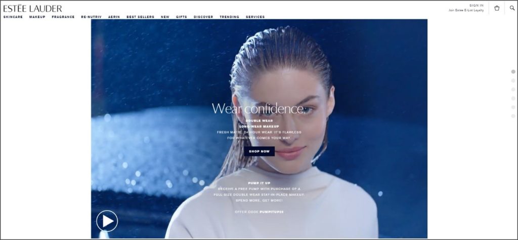
The same goes for your font choice and its color.
Bonus: Here are 22 psychological triggers to help you sell more online.
18. A/B test everything
Every single element on your product pages is A/B testable and should be tested. You may think that everything is great and you are satisfied with the conversions you are seeing, but what if they could be better?
A/B testing will help you determine whether your consumers understand what you are presenting and whether or not it is compelling. Maybe they prefer you talk to them in a different tone of voice, or maybe there is a value proposition that resonates with them more. Tweak elements like the CTA, button colors, product descriptions, number of visuals, etc., and track every change to note differences in conversions.
19. Measure key metrics for continuous optimization
All product page best practices factor into the average time people spend on a page, the bounce rate, conversion rate, and other metrics.
Constantly strive for better statistics and monitor where these metrics stand when you change anything on your product pages. With each change, heat maps can show how behavior has changed on your site.
You can boost eCommerce conversions and sell more by choosing one or several simple strategies to implement that make shopping your product pages the best experience possible. Some of the strategies might not be right for you because of how much time or consideration they take, but that’s okay because some of the others may be something that you can change today like providing clear shipping information or adding trust badges.
How much would you like to see your conversion rate change? What are you going to do to get it there?
Want to learn more on conversion optimization?
Watch this webinar to discover the key things you can test to maximize revenue: product pages, shopping cart templates, cart flow, the checkout form, and more!