Trials are one of the top ways for desktop software companies to acquire new customers. Marketers are constantly seeking to improve trial conversion rates to grow their user base and reduce their CPA (cost per acquisition, or cost per download).
In our latest webinar hosted by myself, Shannon MacLeod, and special guest Marco Pimentel, CMO at Deskmetrics, we cover the most critical KPIs to measure during each step of the trial conversion funnel, as well as how to get more downloads and higher conversion rates from trial to paid users.
We also cover using A/B testing and analytics to enhance your conversion results across both B2C and B2B markets. Read on for a summary on maximizing trial conversion for desktop software, or watch the 60-minute webinar.
Trial Models
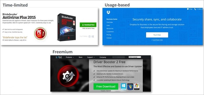
When it comes to trial software models, there are three main types:
Time Limited: A time-limited trial provides access to a fully functional product, but only for a limited time, typically 7, 14 or 30 days.
Usage Based: A usage-based trial allows usage of the product up to a certain threshold, such as storage capacity or number of users or transactions. Once the maximum usage is reached, the trial user must purchase to continue using the product.
Freemium: A freemium model provides unlimited access to a limited feature set, with an opportunity to upgrade to a full version to get more features or turn off annoying ads. It is not time limited, and has purchase offers built into the software to continually try to convert the user to a paid license.
When it comes to finding the best trial model for your software business, you can look at what your competitors or others in your industry are doing, and experiment with different models to see what works for you. Once you’ve chosen a trial model, you can do additional split-testing to improve trial conversion.
The Trial Conversion Funnel for Desktop Software
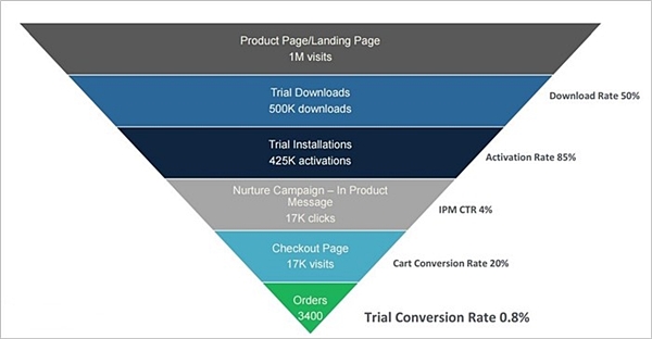
It’s easy to think of a trial conversion as one transaction. In fact, there are many micro-conversions in the funnel that eventually lead to an order, and each step in the funnel can be measured and optimized to increase your macro trial conversion rate.
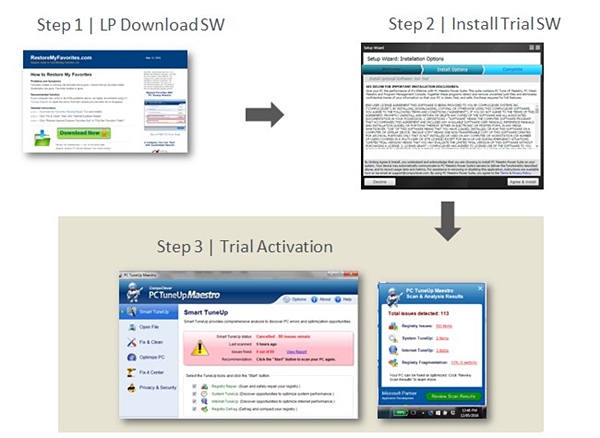
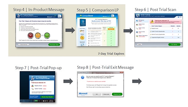
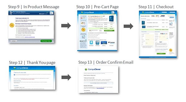
The process typically starts with demand generation campaigns driving traffic to a product page or landing page. From here, a percentage of visitors will download, and then install, the trial software. This creates your active user base or installed base. Nurture campaigns such as emails or in-product messaging lead customers to a checkout page and, finally, an order. The overall trial conversion rate may be 0.5% to 2%, but you can see there are important metrics throughout the funnel such as download rate, activation rate, and cart conversion rate that must also be optimized.
Once you’ve defined your trial funnel, you can document the customer experience at every stage in the funnel. Do a complete audit of your trial workflow and take screenshots of every step the user must go through to download and purchase your software.
It may be more complex than you think: one company completed an audit and found that they were requiring users to go through more than a dozen steps to convert! The simpler you can make the purchase process, the higher your conversion rate can climb.
Optimizing Trial Registration
There are different models for trial registration, depending on if you have a software or SaaS product, or if you focus on B2C or B2B markets.
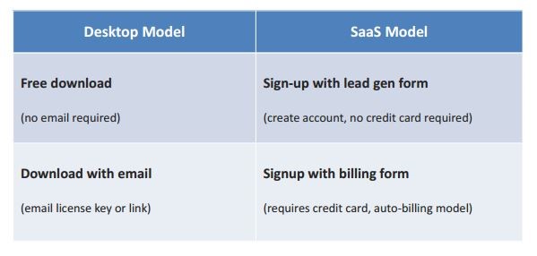
Some companies offer free downloads without requiring an email address in order to maximize their installed user base. This model typically has the lowest conversion rate, but millions of users can generate significant revenue.
At the other end of the spectrum is the auto-billing model, where users must provide their credit card to begin a free trial, and their card is charged at the end of the trial period if they do not cancel their subscription. This is common in SaaS models. It typically has lower trial registration rates, but very high conversion rates.
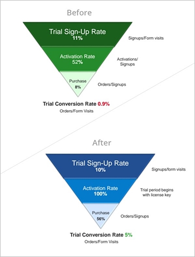
How you ask for credit card details is also important. Absolute, a leading security company, increased trial conversion rates fivefold. They added a trial sign-up form requiring credit card information in the signup process instead of a simple checkout page with pricing listing at zero dollars.
The new trial system improved the user experience and provided clear expectations regarding trial start and end date, product activation and auto-renewal. The implementation of a true subscription model removed the requirement to activate the software, making the user experience frictionless. Users have the option to turn-off auto billing any time. The impact of this change was a 5x increase in the trial conversion rate. This case study on Absolute was actually presented in another webinar, and if you are interested in optimizing trial conversion, it is worth checking out.
Case Study: ABBYY Removes Competing CTAs to Increase Trial Registrations
To encourage more users to sign-up for a free trials, ABBYY, a software company that provides optical character recognition, document capture and language software, was using a small “Try free” link on its product page. The trial link was competing for attention with a “Buy” and “Upgrade” call to action on the same page.
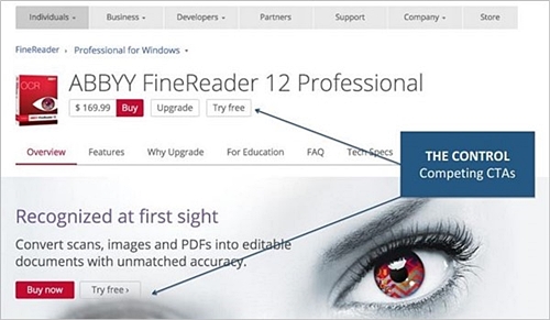
In an effort to improve the trial registration rates, the company tested product page variations that focused on trying instead of buying and provided a money-back guarantee. The variation that combined a money-back guarantee with dual free trial links won out (Variation 3), increasing visits to the trial registration page by 25%.
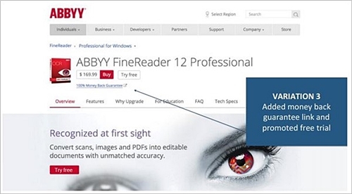
Some of the lessons learned from the test included:
- Have one primary call-to-action
- Remove competing CTAs
- Repeat the CTA throughout the page
- Experiment: split-test product pages
Optimizing Trial Downloads
Case Study: CompuClever Declutters to Increase Downloads
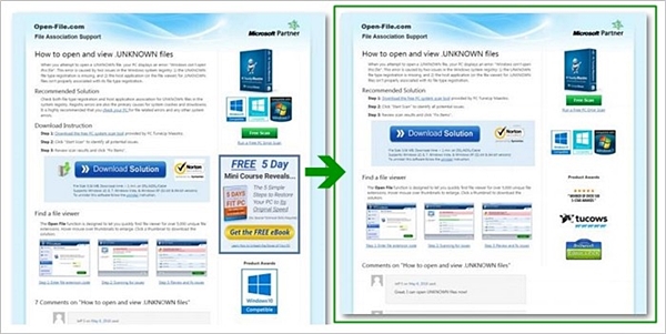
CompuClever, who makes PC optimization software, wanted to increase the number of trial downloads from its paid search landing page.
The hypothesis was to reduce the cognitive load of the page by removing competing call-to-actions and other elements on the page that might distract the user from downloading.
CompuClever split-tested the original landing page with a decluttered version of the page, and found the more simple design increased the download rate by 8%.
Insights from CompuClever’s case study include:
- Use principles of Attention Driven Design (A.D.D.)
- Reducing clutter increases conversion rates
- Build the page around the CTA
- Use visual cues to highlight the CTA
- Experiment: split-test your landing pages
Optimizing for Trial Signups: Best Practices for Trial Forms
Forms are necessary for collecting customer information, but can also serve as a barrier to conversion. The number one rule for optimization is to make forms as simple as possible. If all you need from a customer is an email address, that’s all you should ask for. If you absolutely need more, ask for it, but keep the form clean.
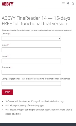
You should also design your landing page around the form, not the other way around, to maintain customer focus in completing the form.
Case Study: Deskmetrics Identifies Highest Converting Traffic Source for Shift Product Launch
The team at Shift used Deskmetrics during their product launch to track the entire trial life cycle, from landing page visits, downloads, installs, uninstalls, and purchases.
Deskmetrics is an analytics tool for desktop software that can help you understand where your users are coming from and how much they interact with your application. Using custom metrics, the Shift developers could track what features were most popular with users, and made adjustments to product features as a result.
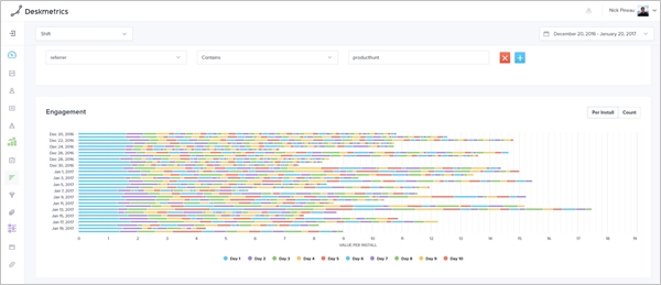
Keep in mind that simply looking at conversion rates won’t help you understand why those users converted. Looking at engagement data and what encourages additional usage, as well as how users got your app in the first place, can help you see why users are sticking with your application (or not). Metrics such as information about uninstalls by cohort can also show you what groups of users are not getting enough out of your app to stick around.
Using Deskmetrics, the Marketing Team at Shift was able to segment users by traffic source, and optimize their cost of acquisition by focusing their marketing spend on the channels that had the highest conversion rate. For example, they could see that traffic from Lifehacker had a higher install rate, but traffic from Product Hunt had a higher conversion rate.
Key takeaways from the Shift & Deskmetrics case study
- Use tools that can track the entire life cycle from landing page to purchase
- Measure engagement & key drop-off points within your app
- Present offers at key-drop off points to convert users
- Track cohorts & marketing channels to reduce cost per acquisition
- Focus your marketing budget on channels that convert the best
And if that’s not enough for you, a few other key resources for maximizing trial conversions include: Formisimo, Virtual Website Optimizer (VWO), Optimizely, Unbounce, Principles of Attention Driven Design, Thinking Fast & Slow by Daniel Kahneman
Summary: Maximizing Trial Conversion
As with most elements of digital marketing, the key to maximizing trial conversion is experimenting. Test landing page offers and CTAs, make everything as simple as possible and track everything that happens from download to engagement to uninstall so you can understand exactly who is using your product and (ideally) why.
Armed with the right information about your trial conversion and engagement, you can start to improve conversion for user cohorts and target specific marketing channels to reduce the cost of customer acquisition. Now that’s something worth trying.
If you want to learn more on the topic, we encourage you to watch our webinar on Maximizing Trial Conversion for Desktop Software as well as other webinars on conversion and optimization.


