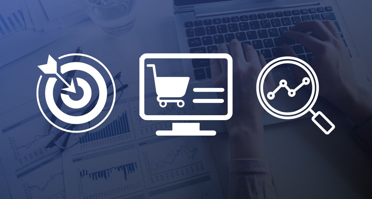
As a digital business, you’re likely spending significant sums to drive traffic to your site. As a result, you understand the importance of creating impactful landing pages that convert. But there’s a lot of advice out there about how to effectively design a landing page to maximize conversions. And not all of it is good.
While good taste is subjective, good, effective design can actually be broken down into objective principles, which are supported by years of testing and experience.
For concision, we’ve boiled those down to the following simple four points: be concise, focus on the form, think about attention ratio, and above all, test.
Use them as guide when creating and optimizing your landing pages, and you’ll be sure to maximize your conversions and investments every time.
Read on to get started.
Be concise.
Brevity is crucial in converting visitors into leads. While you want your content to be persuasive, you also don’t want to bore your audience into bouncing from the page. Recent studies have shown that the average online attention span is as little as eight seconds, giving you precious little time to persuade your visitors to convert. Tweet
Visuals can help keep your landing page short. If you can convey a paragraph of text in a single image, you should probably do so. That is another reason that a testimonial video may be more effective than its written counterpart. The saying that a picture is worth more than a 1,000 words is not just a cliche — for landing pages, it’s a fact.
Another strategy is to treat your landing page copy like an advertisement. Check out this Dropbox landing page, which conveys everything the user needs to know in one simple sentence.That sentence may as well be on a billboard, but because it’s located right next to the CTA, it acts as a persuasive push toward the sign-up button. If your content is persuasive, visual-heavy, and concise, it will lead your audience straight to your form.
Focus on the form.
This is where the action happens. Just like the effectiveness of a landing page can make or break your lead-generating campaign, the effectiveness of your form can make or break your landing page. If it’s too long, too difficult to navigate, or too invasive, your visitors will decide against signing up and simply navigate elsewhere.
To understand just how long your form should be, it’s crucial to understand what stage of the digital lifecycle your audience is in. Generally, the closer they are to becoming a customer, the more information they will be willing to give up. Conversely, if they’ve stumbled upon your company for the first time, they won’t be willing to enter much more information than their name and email address. Generally, keeping your form at or under seven fields is a good idea, regardless of your audience’s lifecycle stage.
Finally, an important point of consideration for forms is the actual CTA. This button should be easy to find, colorful, and describe the action your audience is about to take. That means no “submit” button. Instead, use “Sign Up,” “Get your Trial,” and other phrases that prompt specific action and apply a benefit.
Think about attention ratio.
In addition to the attention span mentioned above, attention ratio is another important concept to grasp when it comes to understanding your audience. Oli Gardner, founder of unbounce.com and a leading landing-page expert, defines the concept as “the ratio of links on a landing page to the number of campaign conversion goals.”
Put simply, every landing page should have a single conversion goal: to get the user to sign up on a form. In an optimized campaign, the attention ratio should therefore be 1:1, meaning that there should only be a single place for the user to click: the CTA at the end of the form. As soon as the attention ratio increases above 1:1, giving your audience multiple options to click elsewhere, the user’s attention may be diverted and he or she becomes less likely to convert. Tweet
For your landing page, that means getting rid of all links other than the call to action. If you want to optimize your landing page for conversions, the only possible destination for your audience (other than closing the browser window or manually typing in a URL) should be to sign-up on your form.
Test, test, test.
The takeaway: to increase conversions, your landing page’s content and form should work in concert to keep the attention ratio at 1:1. But how do you know which content is persuasive, which images work, and how successful your form is? That’s where A/B testing comes into the equation. On a truly optimized landing page, every aspect, from the headline all the way down to the CTA, should be tested to ensure you’re using the right option to maximize your conversion rate.
For that to be possible, you shouldn’t consider testing to be a preliminary process, to be completed before your landing page goes live to your entire audience. Instead, it’s a continuous process, designed to constantly improve your landing page and increase conversions. That’s how you get your audience to enter the digital lifecycle, and ensure long-term success.
Avangate powers modern Digital Commerce, solving the complexity of online commerce, subscription billing, and global payments for Software, SaaS and Online Services companies. Backed by a proven cloud platform, unmatched expertise and a depth of digital commerce services, Avangate helps digital business leaders drive the fastest path to revenue, maximize the value of every customer, and expand global reach. Contact us for more information about how our digital commerce services can help you grow your business.