In 2014, Coca-Cola launched a “Share a Coke” campaign, which emblazoned bottles of coke with hundreds of names like Jessica, Ravi, and Dan. The goal of the campaign was to build a more personal connection with customers.
And it worked — Coca-Cola saw a 2% rise in sales for the first time in nearly a decade.
In an ever-noisy online world, personalization lets brands cut through the noise and deliver a customized experience that resonates with their audiences.
How can you leverage the power of personalization to help your business succeed? The good news is, you don’t have to launch a world-wide campaign like Coca-Cola to see the benefits.
Just a few changes to your website can help your business deliver a more personal experience.
What is website personalization?
Website personalization is a strategy of using information about your customers to deliver an individualized experience. The most common example of marketing personalization is when companies address you by name in their marketing campaigns. However, website personalization takes it a bit further.
For example, a website might show you specific content based on the last page you looked at. Or, they might use your name in a pop up recommending an upcoming course. These small changes help site visitors feel welcome and understood.
From the business side, however, website personalization can offer a wide range of benefits.
Why does website personalization matter?
According to HubSpot, personalization boosts conversion rates by 202%, which means it could have a massive impact on revenue. If you aren’t offering your customers a personalized experience, you’re instantly losing a fifth of your potential income.
But the benefits of website personalization go beyond revenue. A personalized web page can also help:
- Increase lead generation
- Lower bounce rate
- Improve customer service
- Reduce marketing spend
- Better understand your customers
- Increase customer engagement
- Improve customer loyalty
- Reduce the length of the sales funnel
Today’s customers don’t just prefer a personalized experience — they expect it. 22% of customers will only engage with personalized online experiences.
The following examples of website personalization prove the value of personalization and will help you implement this effective strategy on your own site.
How does personalization impact data privacy?
Personalization is powerful for brands and users expect it. But how a brand balances data privacy with personalization needs is an important matter. Make sure your personalization efforts are compliant with your local laws, such as GDPR and state privacy laws.
10 website personalization ideas to keep customers coming back
Website personalization is one of the simplest ways to make customers feel welcome and deliver highly targeted, personalized content. But, you might worry that it will make site visitors feel a bit…stalked.
The good news is that website personalization doesn’t have to be creepy. In fact, when personalization is done well, your site visitors likely won’t notice it at all — but they will respond to it.
Website personalization example #1: Pop-up promotions for targeted lead capture
Outdoor sports brand, GILI Sports, uses a targeted lead capture pop-up to personalize promotions to relevant customers.
The giveaway rewards customers for supplying customer data, which is later used for targeted email campaigns.
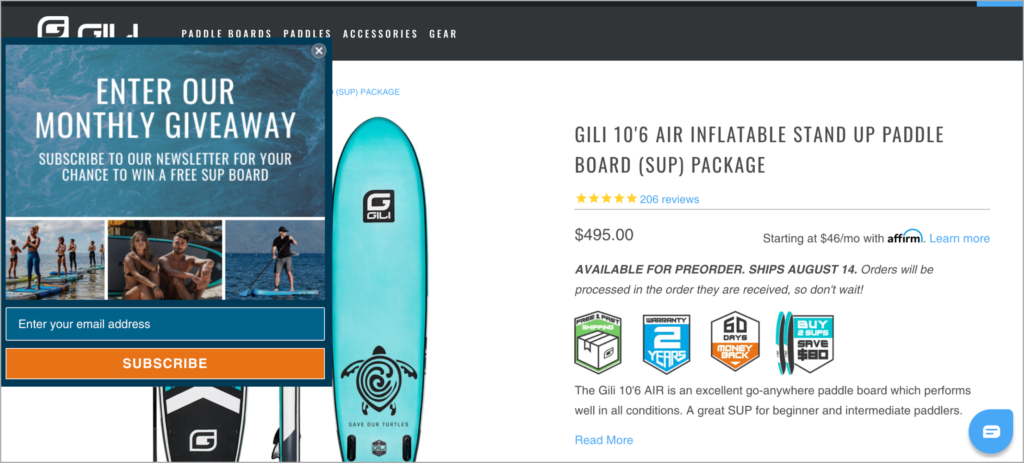
The pop-up gives away a surfboard and appears on a product page for a surfboard, directly tailoring the promotion to key customers.
Make it your own:
Target relevant customers by creating popup triggers on related pages. For example, if you are promoting a social media marketing course, you might create a trigger on your social media news page.
You could also further segment your audience by asking them what topics they are interested in, what size company they work for, or other information to help you better personalize your marketing efforts.
Website personalization example #2: Personalized cart abandonment emails
A recent study found that the average cart abandonment rate is nearly 70%. And while some users might just be checking the shipping costs or have no intention of buying, there’s a good chance they just forgot.
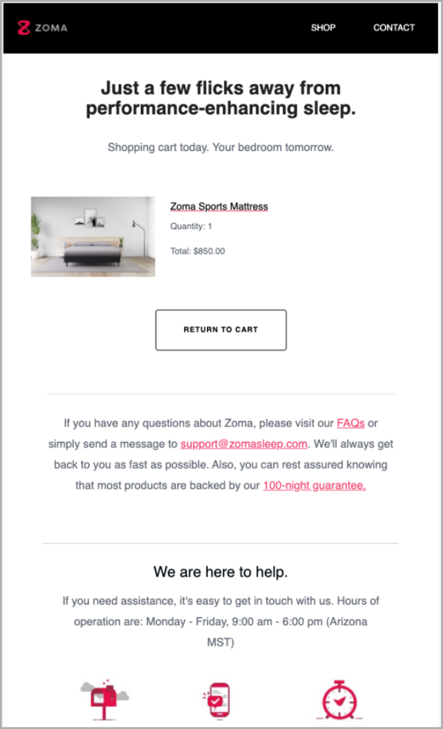
To combat lost sales through cart abandonment, mattress brand, Zoma Sleep sends personalized cart abandonment emails.
These tailored emails trigger automatically when a user adds an item to their cart but doesn’t convert. The emails are personalized to remind customers of what they are missing out on.
Make it your own:
Cart abandonment emails can help businesses recover around 10% of lost sales — and they are super simple to create. Consider offering a small discount or suggesting related products to bring site visitors back.
Website personalization example #3: Personalized live chat
Live chat takes personalization to a whole new level by connecting users with real people who can solve their problems or direct them to useful information.
Implement Consulting Group uses a landing page call-to-action to invite website visitors to chat with company consultants.
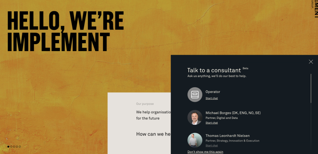
Live chat can help answer questions, direct users to resources, and provide details about your products or services.
Customers prefer live chat over all other support channels, making it an ideal way to personalize the customer experience and boost retention.
Make it your own:
Live chat can serve as a customer service rep, salesperson, and friendly face all in one. If staffing a live chat doesn’t seem possible, consider a chatbot that can help users navigate your site and find critical information.
Website personalization example #4: Delayed pop-ups
Pop-ups tend to get a bad rap. If you were on the internet in the early 90s, it’s easy to understand why. Back then, popups were annoying, spammy distractions that kept you from interacting with the site.
But times have changed.
Today, the top-performing pop-ups have a conversion rate of 9.28%, which is pretty solid for an automated function you can set and forget.
Vitamin brand, Future Kind deploys a delayed pop-up game to personalize the customer journey, speed up sales, and collect customer data.
The discounts they offer encourage conversions, while the game provides an interactive experience.
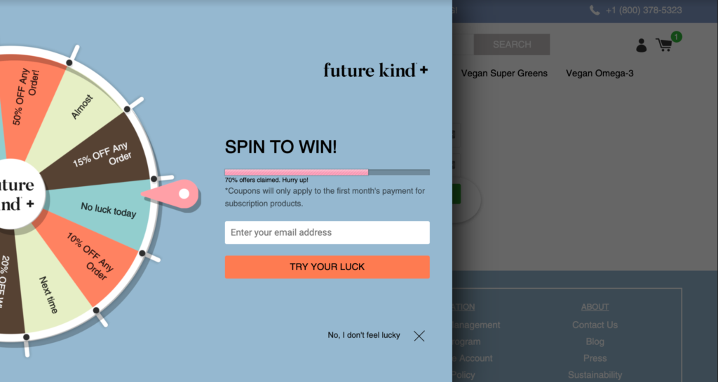
Offering different discounts also allows brands to test what promotions are most effective and ensure they only offer discounts to customers who are interested in what they have to offer.
Delay your pop-ups let’s site visitors get a feel for your brand before you hit them with a promotion. They are more likely to trust your brand, making the pop-up more effective.
Make it your own:
Time-delayed pop-ups are just one way to make your pop-ups more personal. You can also trigger popups when they hover over the exit button (exit intent) or spend a certain amount of time reading a page.
Website personalization example #5: Interactive landing page games
Games, contests, and sweepstakes help brands build a real relationship with customers. They create a positive association around the brand that can help improve customer loyalty and drive sales.
Why not personalize your branding experience with a little fun. Check out how Gucci’s makeup brand created the game, Gucci Mascara Hunt.
Beauty fans try their hand at bowling, which personalizes the advertising experience.
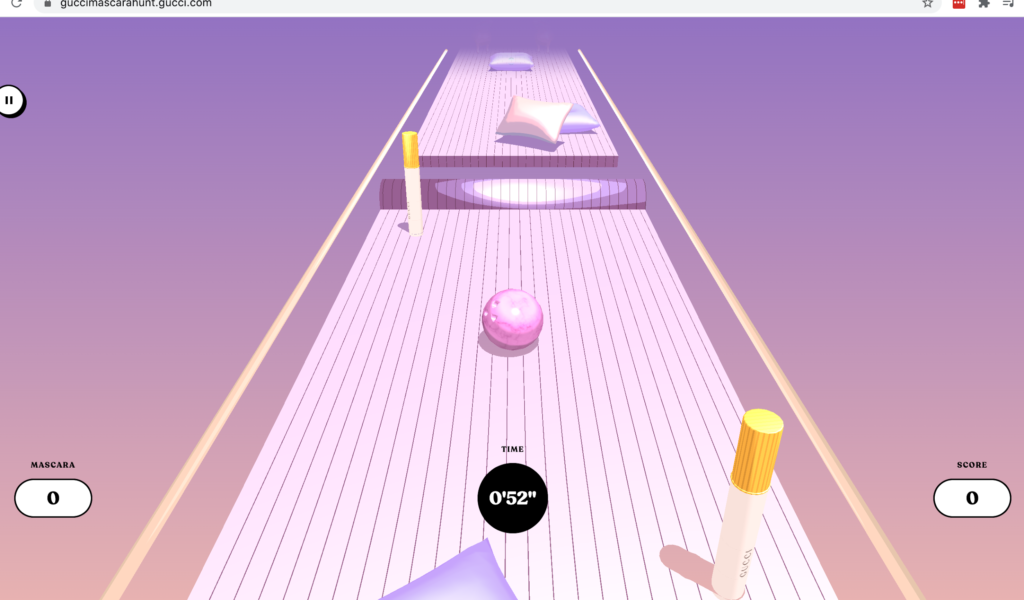
By increasing customer interaction, Gucci creates an emotional bond with page visitors.
Make it your own:
If making a full-fledged game isn’t in your budget, try your hands at contests or giveaways. Customers enjoy a bit of fun, and you get to learn more about what your customers really want.
Website personalization example #6: Tailored questionnaire
The online eCommerce clothing company, Stitchfix, completely reinvented the online shopping experience by providing a personalized online styling assistant.
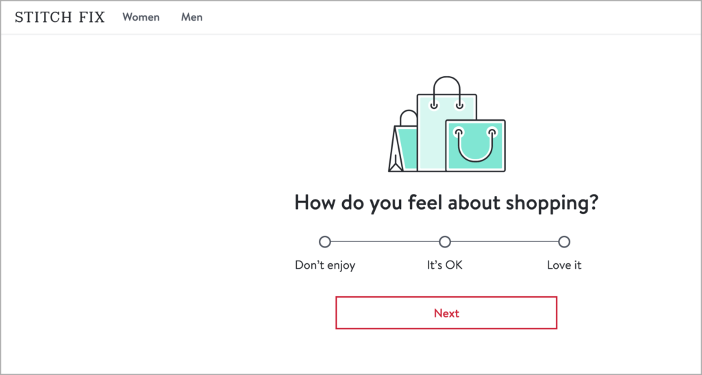
The customizable questionnaire is an amazing example of eCommerce personalization. The in-depth survey personalizes the web shopping experience by offering a comprehensive range of questions on style, taste, body shape, daily lifestyle, and budget.
This information allows the brand to send personalized products to the customer’s door and customers only pay for what they decide to keep. The styling costs around $12 but is deducted from purchases customers make.
The whole process is a uniquely personalized end-to-end process, driven by one customizable online questionnaire.
Make it your own:
You don’t have to create a complex questionnaire to offer personalized product recommendations. Consider creating a “people also buy” section on your site to show customers products they may like based on their past behavior.
Website personalization example #7: Personalized scheduling
How you deliver your products can impact retention rates.
Mindful Chef, a food box delivery brand, invites customers to customize the delivery process by choosing which delivery dates suit their needs and skipping boxes they don’t want.
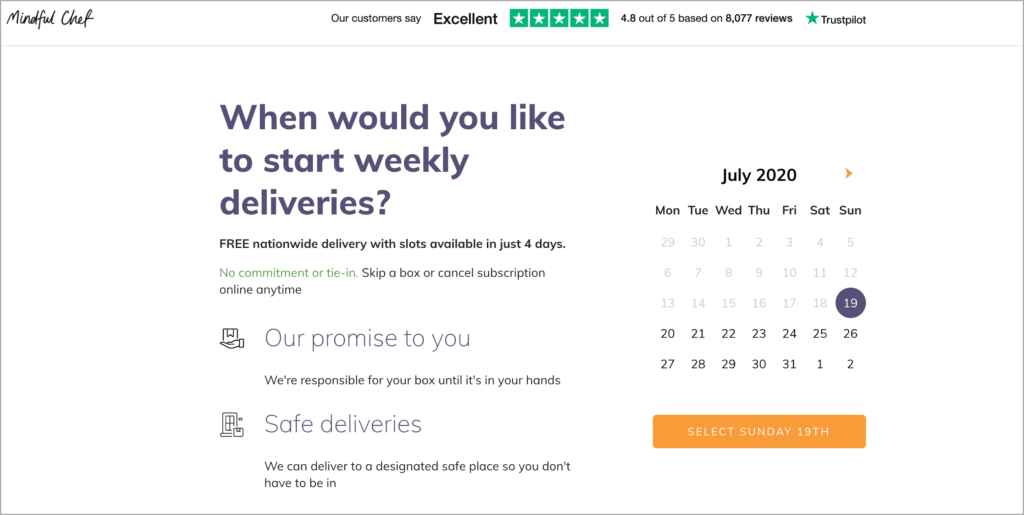
Later in the process, the site enables customers to personalize the recipes to their tastes, cooking preferences, and dietary requirements.
Keep in mind that personalization can reduce customer acquisition costs by 50%. By allowing customers to tailor your product to their specifications, you can save drastically on marketing costs.
Make it your own:
Not all ecommerce companies have control over when their deliveries arrive. However, you can look for other ways to personalize the delivery process by offering low-waste packaging, gift notes, or allowing customers to ship all items they order in one box.
Website personalization example #8: Optional landing page videos
Video is kind of a big deal. Nearly 80% of marketers agree that video boosts sales, so using video in your website personalization strategy is a great way to align your product with your ideal customers’ needs.
Check out how workflow management software firm, Process, uses landing page videos to show how the company tailors solutions to customer needs.
The clickable landing page video offers optional explanatory content that users can choose to watch or not.
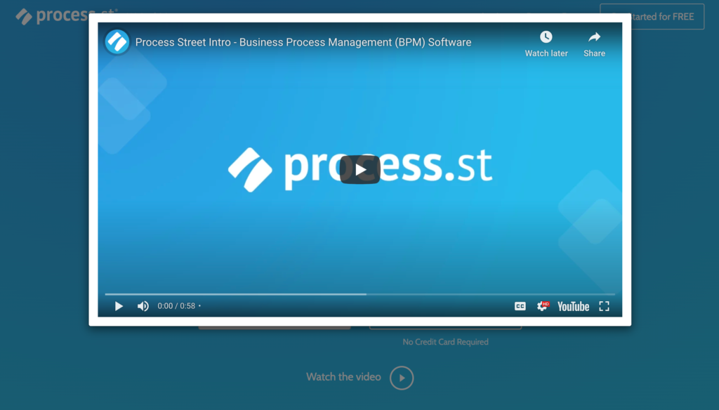
Here’s the thing — videos are popular, but not everyone likes them. By offering the option of the video, you can reap the benefits of video without alienating folks who don’t want to watch them.
Make it your own:
Considering offering content in multiple mediums to cater to all customers. For example, you might host a podcast and offer a transcript, or provide a video product description and a written one.
Website personalization example #9: Keyword-driven categories
Keywords are critical to a successful SEO strategy, but did you know they can also help to personalize your website experience?
Check out how online cooking class company, Traveling Spoon enables web visitors to search for classes by cooking style, location, and class price.
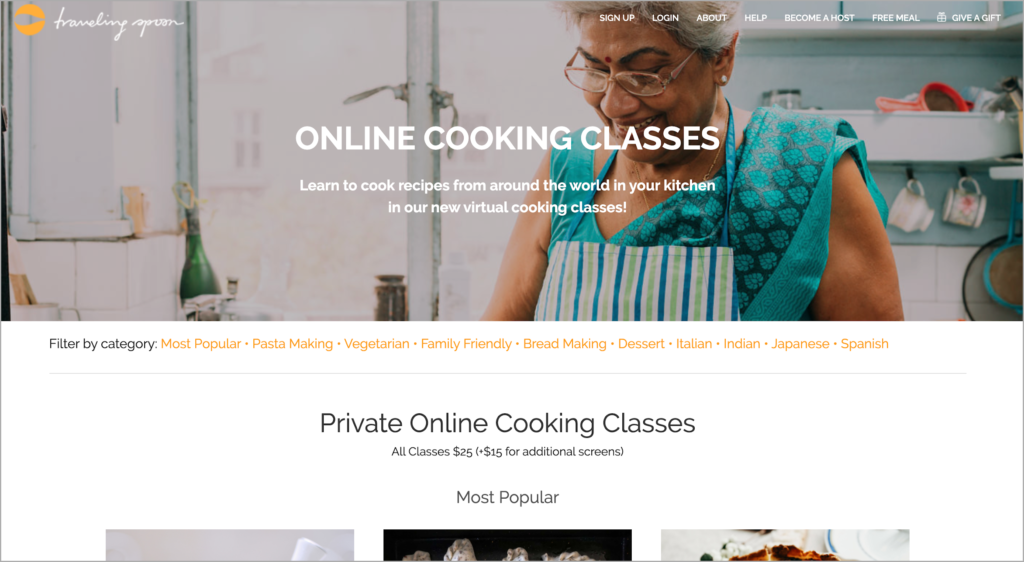
Popular keywords drive these categories. By understanding the top search terms your audience uses, you can offer personalized website options for customers to find what they need.
Make it your own:
Use information from your onsite search to find out what categories site visitors are most interested in, then add those to your nav bar, a drop-down menu, or make it a search category. This will make it easier for site visitors to find exactly what they are looking for.
Website personalization example #10: Customizable value proposition
When customers have a problem, they won’t spend time digging into your site to figure out if you can help. That is where a UVP comes into play. But, what if you have multiple products or multiple target audiences?
Your Unique Value Proposition (UVP) tells your target audience exactly how you bring them value in a way that your competitors can’t.
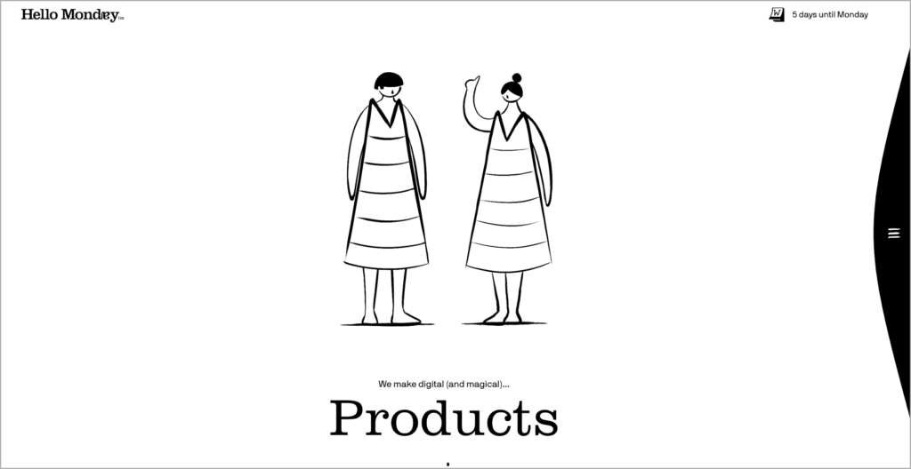
Hello Monday uses personalization to highlight its multifaceted UVP. If you click through to their site, you can see how the bold header loops through different key terms to target different ideal buyer personas.
By rotating through ‘Products/Experiences/Branding/etc.’, the design firm shows how they tailor their skillset to suit customer needs.
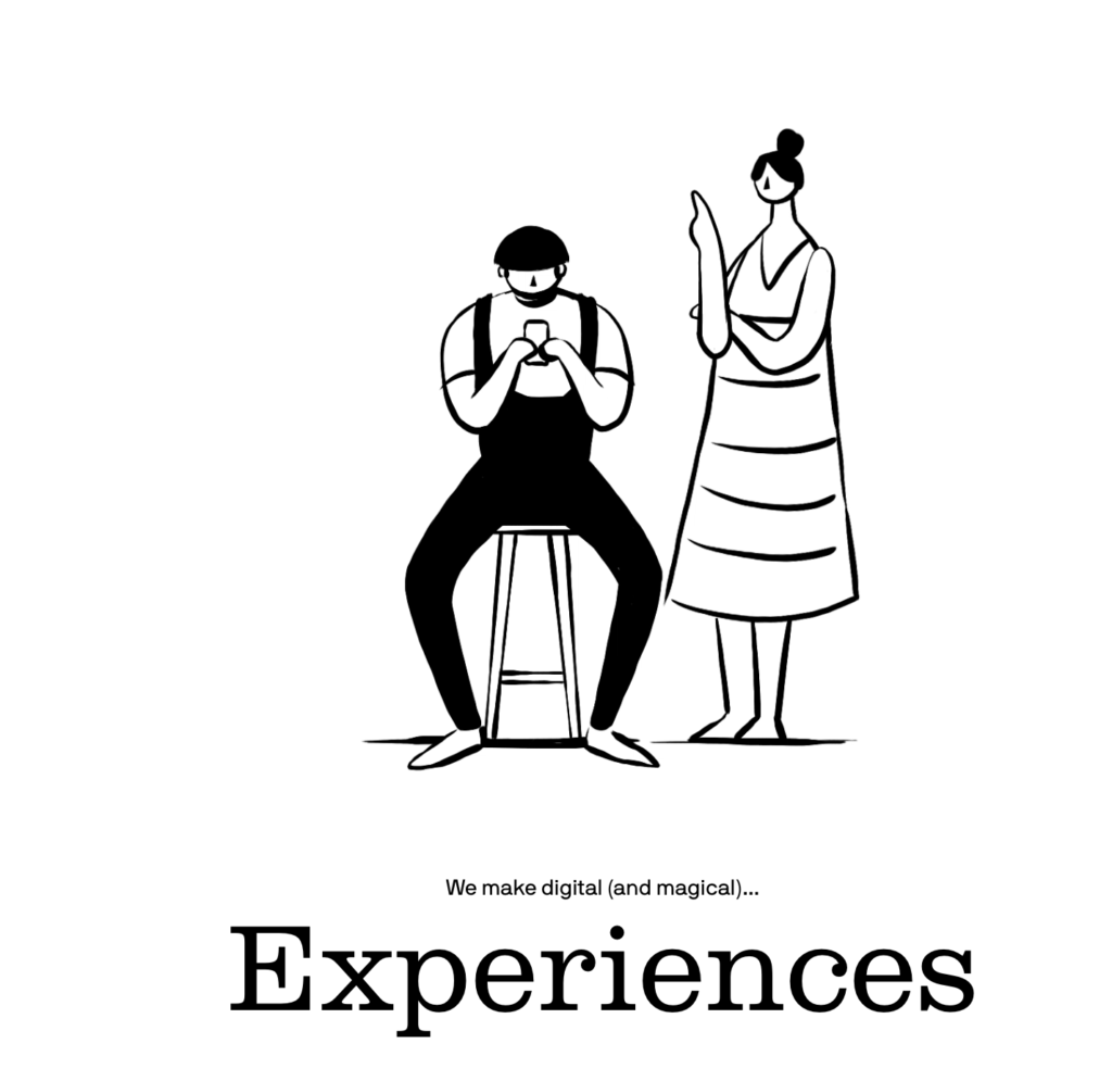
Notice how the images change too. These different character sets appeal to different buyer personas, creating a personal, emotional connection with the audience.
Make it your own:
Using a rotating hero image or dual landing pages for different customer bases allows you to target customers based on what matters most to them directly.
Final thoughts
Personalization is the future of online communications — and creating a personalized website doesn’t have to mean full site redesign. Use the suggestions above to kick-start your personalization efforts and find new ways to connect with your audience.
Now that you convinced users to return to your website, make sure you keep them there so that they convert. Here are some specific product page optimization tips from 2Checkout that will compel your visitors into buying your product.
_____________________
About the Author

Leadfeeder is one of the world’s best website visitor tracking tools for sales and marketing. It uses your Google Analytics data to show real companies visiting your website and it integrates to your CRM and email marketing tools to increase your sales intelligence.

