
So, you’re a marketer, an entrepreneur with minimal budget or even a solopreneur with no budget at all, and you’re trying to promote your brand somehow.
You’re using any and all methods that will help you out, you’ve delved into the world of email marketing and marketing automation, you’ve gone through guides on how to create a landing page, you tried storytelling and brand marketing…
And now, you want to make your website hold on to those visitors and convert them as they’re browsing happily.
But this can be extremely tricky to achieve without some serious marketing arrows in your toolkit.
So, you’ll need to use a technique that, more often than not, has a negative rep, but in reality it’s just misunderstood: pop-ups!
What makes them tick?
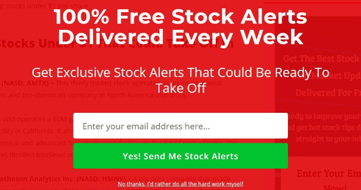
Pop-ups have been dubbed “annoying” for a very good reason: you’ll see pop-ups with neon letters appear on your screen, carrying messages like “100% FREE DEALS” or “YOU ARE THE 100TH VISITOR!!!” that simply won’t-go-away:
You’ll need to know what makes them tick and what you’ll need to create, to grab a user’s attention, without being spammy, annoying or hurting your customer retention efforts – you know how bad word-of-mouth goes around.
What this means is you have to delve deep into your data and create somewhat custom content that will match your marketing persona down to a tee.
Use extra-strong personalization and segmentation and start creating! Here’s what you should be paying attention to when starting a website pop-up project.
Use a tone that matches your brand
It’s not like you need strangers to convert or anything, right? *enter sarcasm*
When a visitor enters your website, they need to quickly understand what it is that you’re doing and what they can expect to find.
This is because they need to know what’s in it for them from your brand.
Remember, you don’t have a lot of time to make a first impression. This means that your message needs to be clear and simple and express everything your brand’s about:
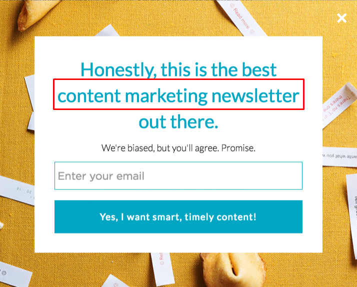
The example above shows an example of this. It’s smart, it’s relevant and it showcases value right up front: what you’ll get is content marketing ideas, tips, and tricks.
It’s very important for a visitor to know why you are attractive and for you to remain relevant and to-the-point and for your form to be of actual service to the user, seeing as it’s not going to convert if nobody’s interested in it.
Don’t forget that this is your first impression and first impressions count.
Use copy that will entice and engage
A brand’s tone is the overall feel that will appeal to their ideal customer. It can be broken down into two parts: Copy and visuals.
Copy is what will make the visitor stay on your page for more than a couple of seconds, as they’ll try and actually read something that may or may not change their lives, businesses, outlook on things, whatever you’re aiming for.
But you can’t be too subtle on that one, as it may become confusing to your visitor. You don’t need to be too bold, either. Just bold enough.
The whole point behind this is the fact that the user needs to be engaged, needs to realize that you’re the answer to what they’d been looking for.
If you don’t manage to intrigue the user with your texts, there will be little incentive for them to fill out the form.
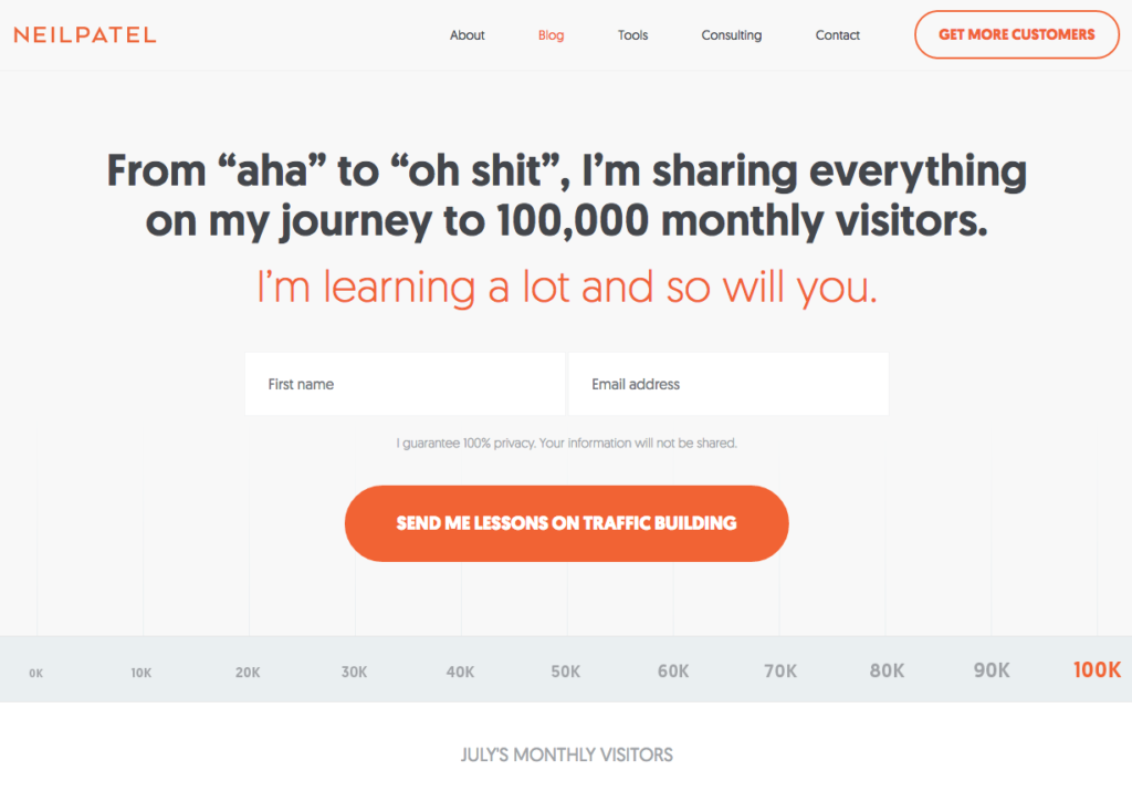
The only way for this to happen is through the use of copy. Neil Patel’s form does that perfectly. It showcases why one needs to sign up – they’ll get much sought after traffic and learn a whole lot of things while they’re at it.
This form is made with the K.I.S.S principle in mind: Keep It Stupid Simple. It shows incentive right off the bat: You want traffic? I can tell you how to get traffic.
Use images that will keep them from hitting the X button
This is a very important element, as visuals draw attention and help the untrained eye perceive your brand’s tone and product without any friction. It’s not as important as, say, your logo’s design, however, your visuals will give a touch of innovation to your brand.
An image is worth a thousand words, after all.
Just make sure it matches the brand’s tone and the message you’re trying to portray. Let’s see the following example:
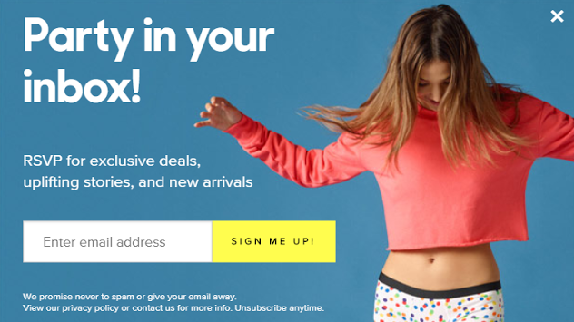
So, you see an image of a woman having fun. You don’t need to be an expert to see that the first word one will notice – aka the word “Party” – is spot-on when it comes to the image. But is it a regular party?
It looks a bit more like a pajama party actually.
Maybe this brand is selling something akin to home attire? Undies, pajamas, socks? That’s spot on!
Meundies decided to combine the girl having a good time at home, the calm baby-blue background and the words “exclusive” and “uplifting”, in a visual that’s very on-brand.
An honorable mention should go to the contrasting colors that make some elements hard to miss: The sign-up button and the exit button.
It’s important to guide users through those two basic actions, giving a little more emphasis to the signup button of course, which should have contrasting colors and a clear-as-day message.
But you don’t want users to feel trapped, that’s why you need your X button to be right there where people can see it.
What makes popups work?
You can have the most beautiful, most intuitive popup form in the world, and, despite your best efforts, it still won’t convert if it’s misplaced or perceived as annoying. Let’s see how you’ll turn pop-ups into a converting machine!
Be nice and informative
This applies to your copy and your opt-out practice. You’ll need to let people know about what they can get, in a way that is informative, perhaps a little bit salesy too, but definitely not aggressive.
Many pop-ups make users seem like fools for not wanting to do what the form tells them to do, and that is not okay. By contrast, take a page from OptinMonster’s inspirational approach:
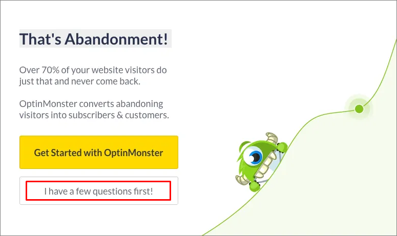
I won’t mention how cute the copy is or how I wouldn’t want to hurt that little alien monster. But what I will mention is that it’s normal for a prospect to not want to opt-in at that stage.
The OptinMonster crew has worded the opt-out button perfectly. It’s normal for prospects to have questions so the brand’s approach of presenting itself as welcoming inquiries inspires a helpful, proactive attitude.
Be timely, be relevant
This is true for everything, not only emails. You’ll need to make everything worth your users’ while – after all, the pop-up is interrupting the prospects’ browsing and, perhaps, their intention of leaving the website as well.
Dive into your data and go through some vigorous testing to manage to get the perfect timing for your popup. And try many, many different practices. Maybe perfectly timed isn’t what you need.
Give your users the time to read and somewhat digest your content by having your popup appear. Or find what they may be looking for. Just time your popup in a way that will appear after the user has scrolled half-way or all the way down the page.
Or maybe you’ll want to time the popup according to the cursor’s behavior. This is ideal for the exit-intent popups.
Just test and test again, in order to find the right timing for your pop-ups.
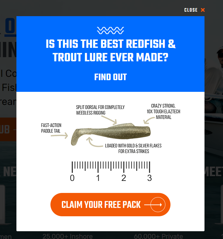
Check out the exit-intent popup above. You may have absolutely no interest in fishing but chances are the question that you couldn’t answer at the top will have you stop and stare for a bit.
Not only that but also there was some data on the form, that could lead a knowledgeable person to an answer.
But what about making the popup relevant?
Whatever the reason behind the popup, always keep in mind that you’re interrupting something. And as such, you need to make your offer relevant and worthwhile.
Craft a strong CTA that will be able to lead your prospects to the desired kind of action and make your offer clear as day:
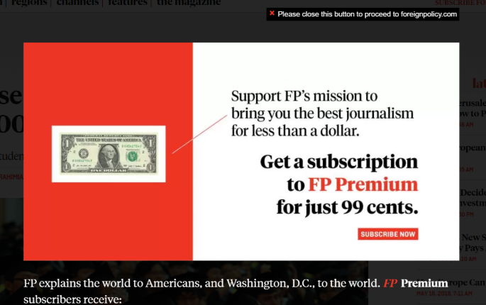
Foreign Policy’s popup is here to give a very plain and simple offer: Premium subscription for 99 cents.
It’s also here to highlight the words FP Premium with a different, contrasting color, there’s the dollar bill for that extra something and it explains everything in as much detail as possible.
The three most creative examples that’ll boost your inspiration
And for the final part, let’s look at some examples of popups that will keep you happy and give you the boost you need, in order to get from “Jeez, not another popup!” to “Oh, that’s interesting!”.
Here they are!
Tommy Hilfiger
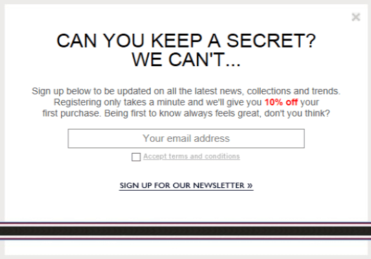
Contrasting colors matching the well-known marinera style of Tommy Hilfiger’s brand, the discount code in red that makes everything pop and the question that keeps readers engaged… What’s not to like?
This popup form is also pretty nice at guiding the user to the desired action and it scores a lot of small “yes’s. “Can you keep a secret?” Yes. “Being first to know always feels great, don’t you think?”
Emily McDowell
Yes, there is a discount code on that one. Yes, the popup was pretty well-timed, as it appears after the user checks out what the website was about. Yes, there is a strong contrast between the colors and the discount rate and the signup button pop as they should.
But the thing that catches your eye primarily is its darn cute design.
KlientBoost
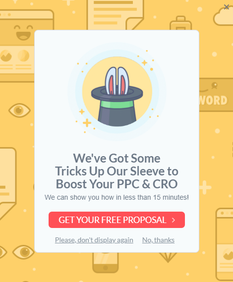
This popup form is aiming to get more “Klients” and not more signups. Hence the “Get your free proposal” CTA. And you can see there are two opt-out buttons, one for those who don’t want to see this again and one for those that are just not interested right now.
But what makes this form extra special is how matching the visuals are to the copy. “Tricks up their sleeve” – Bunny in a magician’s hat. Fantastic and very fun!
Takeaway
A pop-up form is not the devil in disguise, so long as it’s created with some best practices in mind.
Make it easy on the eyes, interesting and as close to the brand’s tone as possible. Also, make the CTA button pop and ease your users to the desired action.
By timing the pop-up form to appear when the user is most engaged and making it so that they’ll actually find value in what you have to say, you’ll make them convert and see both your lead-gen game and your sign-ups and revenue game get closer and closer to what you think is the desired effect.
________________________
Author Bio:
Téa Liarokapi is a content writer working for WriterZone, email marketing software company Moosend and an obsessive writer in general. In her free time, she tries to find new ways to stuff more books in her bookcase and content ideas-and cats-to play with.