What’s killing your conversion rates? A complicated purchase funnel? Unclear product or pricing pages, shopping cart abandonment? There are a number of factors that can keep your visitors or leads from converting. By pinpointing and optimizing those areas, you can dramatically, and often quickly, improve your conversion rates throughout your buyer journey. Here’s what you can do to optimize your cart conversion by at least 10 percent.
Reduce the Risk
Take for example shopping cart abandonment. Over the last four years, shopping cart abandonment has stayed above 68 percent across business sectors, including software Tweet. So, what’s happening? Are shoppers just indecisive? Potential customers often back out of a sale because they perceive too much risk. They just aren’t willing to make the commitment of money and time to implement your software. How can you reduce this perceived risk? Take a lesson from Movavi, a maker of multimedia editing software.
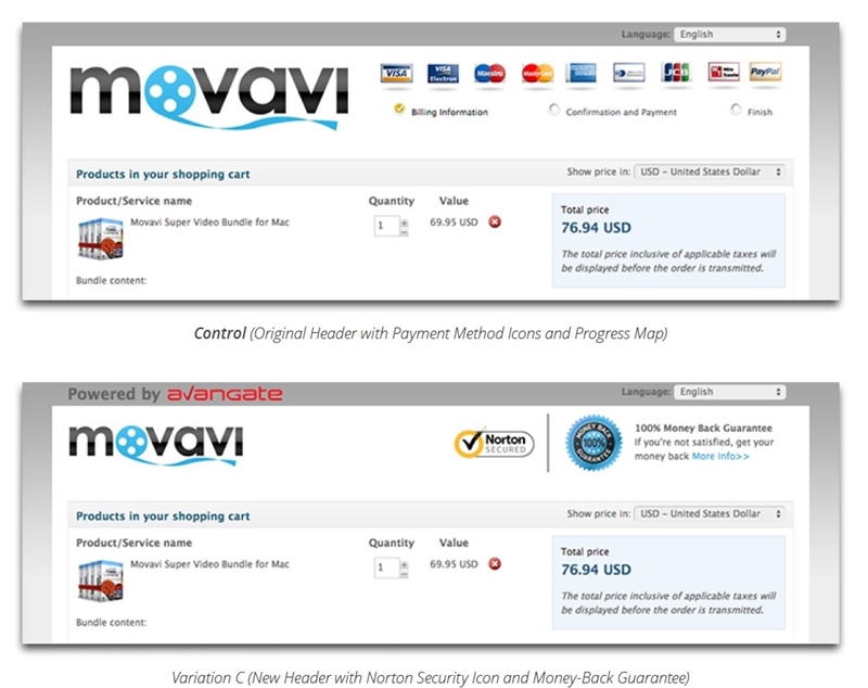
To understand what was affecting customer-perceived risk the most, the company tested three variations to its shopping cart page. The winning scenario increased conversions by 5.5 percent over a 21-day period. What made it the winner? Movavi reversed the risk simply by offering a money-back guarantee and prominently displaying a Norton Security icon, building greater confidence in the both the software and the security of the site.
Tweak Your Design
A frustrated user is not going to convert Tweet. If your potential customers have a hard time figuring out exactly what to do to buy, you are going to lose them. Everything matters, from color schemes and the location of your calls to action to the time it takes consumers to figure out how to make a purchase. Consider three lessons on design from software company Telestream. Simply testing and tweaking their design increased their annual revenue forecast by $2 million.
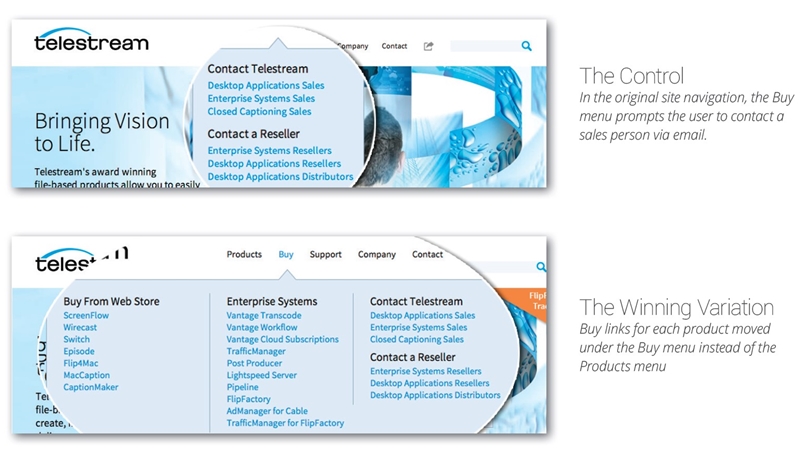
1.It Has to Make Sense. Users should get what they expect when they click on a call to action. Telestream had a “Buy” menu, but the call to action said “Contact” and opened an email when users clicked on it. If users really wanted to buy, they had to go under the “Products” menu. Fixing this logistical issue increased their conversions by four percent.
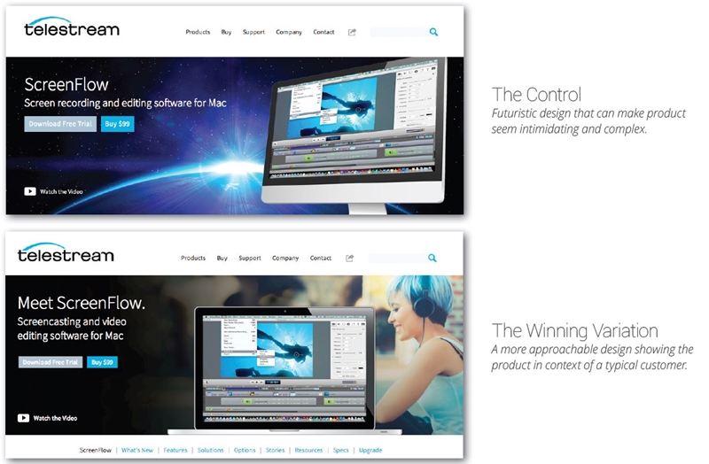
2. Carefully Choose Your Imagery. Your favorite background might not be what appeals to your target audience. Telestream had a futuristic image in its backgroun Technology firms often lean toward abstract imaging, thinking it portrays them on the cutting edge. However, research told this company that the imagery made the product seem complex. Switching to a less intimidating background increased conversion by 26 percent.
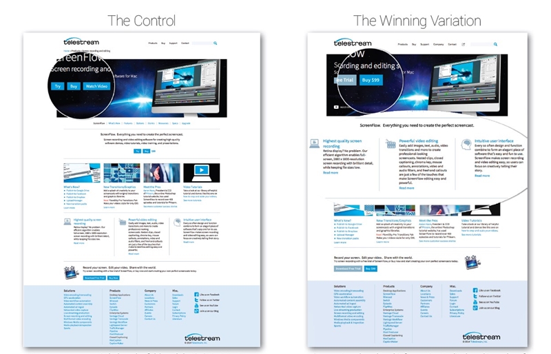
3. Less is More. Telestream tested just one product page, reducing text-heavy content and highlighting the most important features. That change alone generated a 16 percent uptick in their conversion rate.
Another case study, involving SaaS Provider of Enterprise File Sharing and Collaboration Applications Workshare, further proved the “less is more” theory. By simply reducing the number of fields on their order form and shortening the number of payment options, customers were less overwhelmed Tweet. The result was a 12.15 percent higher conversion rate.
Don’t clutter your pages, and avoid multiple calls to action. Clean, minimal content is less likely to overwhelm your visitors.
Reduce the Steps
Here’s an impressive case study, and the lesson it offers is this: don’t make your customers jump through hoops to complete the sale.
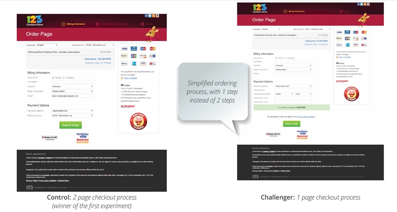
123contactform, a SaaS provider of Web forms and surveys, increased their conversion rate by 63 percent. How did they do it? They reduced the steps on the checkout page for yearly subscribers with high AOV products from two to one. That’s it. Simplifying and speeding up the process gave them a huge jump in conversions and an estimated 12 percent increase in revenue.
Don’t Give Up
Even with all the right CRO tactics in place, there will still be customers who won’t convert. Continue to improve the customer journey using tactics such as on-site engagement and email remarketing to recapture – for instance – shoppers who abandoned their carts before completing their order Tweet. These tactics and others can result in additional revenue uplift.
Continue the conversation
What about you? Can you share some examples of conversion rate optimization? Please share with us by providing more info & links in the comments below. Also, you may want to check out more resources on the conversion optimization topic from Avangate.


