
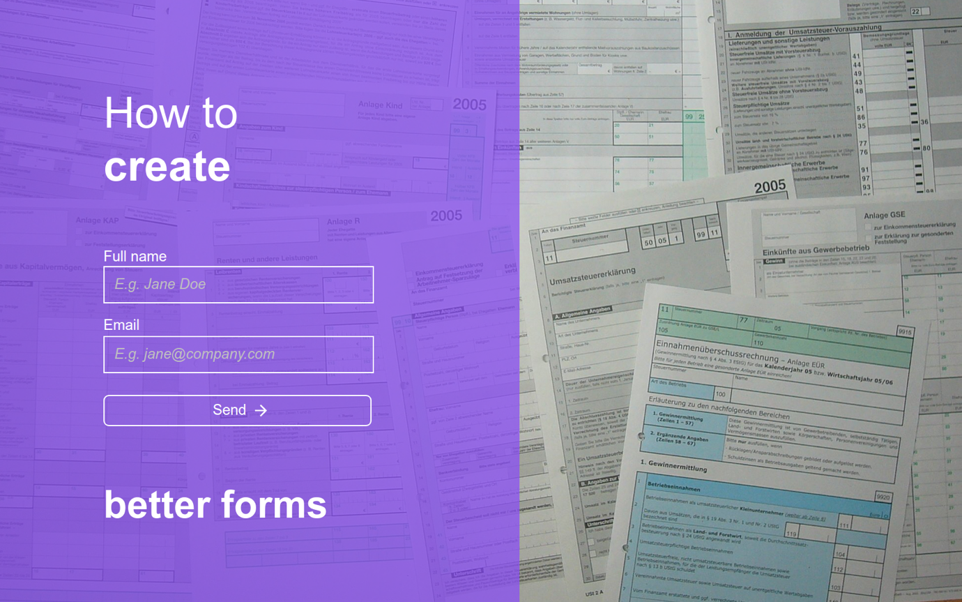
What is a (digital) form?
In a broader sense of the meaning, a form, is an interface that collects through interactions, the required information, in a logical, meaningful way, and then passes it to at least one third party entity.
Sounds complicated, right?
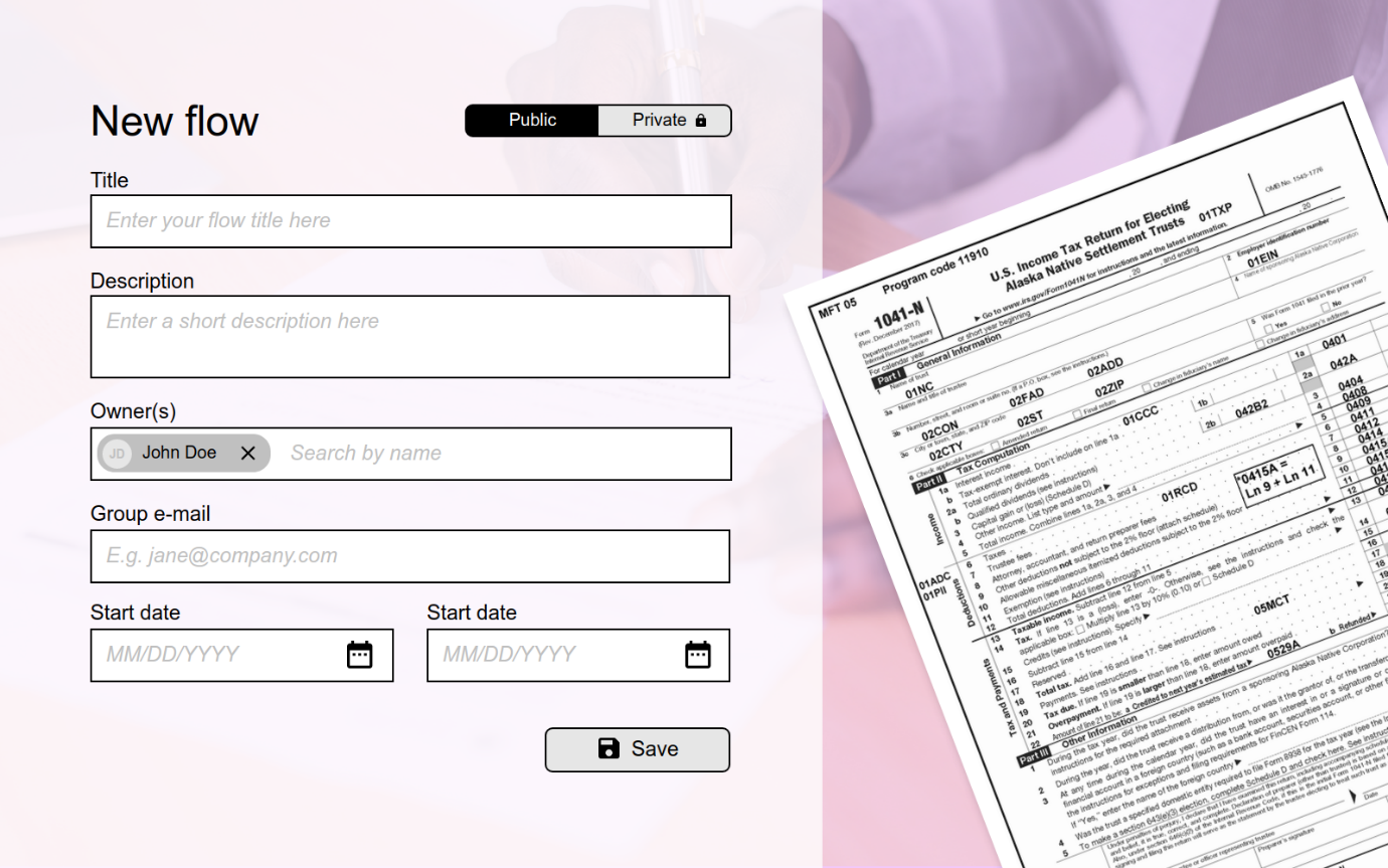
What is a form document?
Wikipedia describes a form document like this: “A form is a document with spaces (also named fields or placeholders) in which to write or select, for a series of documents with similar contents. The documents usually have the printed parts in common, except, possibly, for a serial number.Forms, when completed, may be a statement, a request, an order, etc.; a check may be a form. Also there are forms for taxes; filling one in is a duty to have determined how much tax one owes, and/or the form is a request for a refund. See also Tax return.”
Do you notice the resemblance?
We at 2Checkout have been using forms as a way to collect information for a significant amount of time. All forms use the same metaphor and serve the same purpose: collecting information.
Ok! So… What makes a good form?
On one side, it means that it needs to serve the intended purpose, in that it collects the necessary information that an organization needs in that specific context. On the other side, it needs to be well adapted for the needs and context of those users.
Basics
Collecting information is what distinguishes a form from any other types of interactions. The way we interact with forms has changed, user mental models and expectations have changed, but the UX aim remains the same: to adapt, iterate and deliver an optimal experience.
If we look at this from general UX standpoint, then in order to create this optimal user experience we apply the same UX principles or techniques as we would with any other challenge, including:
- Research
- Ideation
- Testing
Research usually refers to learning more about the needs, wants, context, preferences of both users and stakeholders.
This is an important step because it can offer valuable insights on users (through contextual inquiry or cognitive interviewing) and can better define the intended purpose.
Here are some insights that you may uncover:
1. Mental model – Mental models are an artefact of belief. They are the beliefs that a user holds about any given system or interaction.
- Do your users understand how a digital form works on a desktop? How about on mobile?
- What are your user beliefs (specific to your type of form)?
- Do they understand how specific fields works (like date/time field)?
2. Context
- What do we want to achieve?
- Is the form where it should be on the site?
- Are the questions appropriate?
3. Jargon
- Do your users understand the words?
- Do you need to use specific jargon?
- Are your questions clear?
4. Expectations
- What do users expect to see or to happen?
Unfortunately, this research step is usually skipped, resulting in a poor understanding of the purpose and context, or simply poor conceptual models.
The ideation and testing are parts of the UX (Design Thinking) iterative approach, and there are a lot of materials online which explains this approach (for example, Change by Design – Tim Brown).
In depth
Forms are made of three main elements:
- Words
- Layout
- Flow
Words are what you say in the form and how you say it.
To have proper wording you need to do some research so you use the appropriate vocabulary and reduce ambiguity.
Cognitive scientist Roger Tourangeau proposed (in The Psychology of Survey Response) a four-stage model for how people answer a question
- Comprehension (understanding words and meaning)
- Retrieval (searching memory)
- Judgement (checking for suitability and making additional adjustments)
- Answering (providing an answer)
These stages can happen in an instant and people are not consciously aware of them; sometimes they can be repeated if the user decide that their answer in not suitable.
It is better to use precise terms, frame of reference, and to explore only one concept per question.
Layout is how things are presented, visually.
Here we need to apply the Universal Principles of User Experience like: Design Principles and/or Gestalt Principles.
Design Principles are some widely applicable laws, guidelines, biases, and design considerations. Design Principles draw from many disciplines—e.g., behavioral science, sociology, physics and ergonomics.
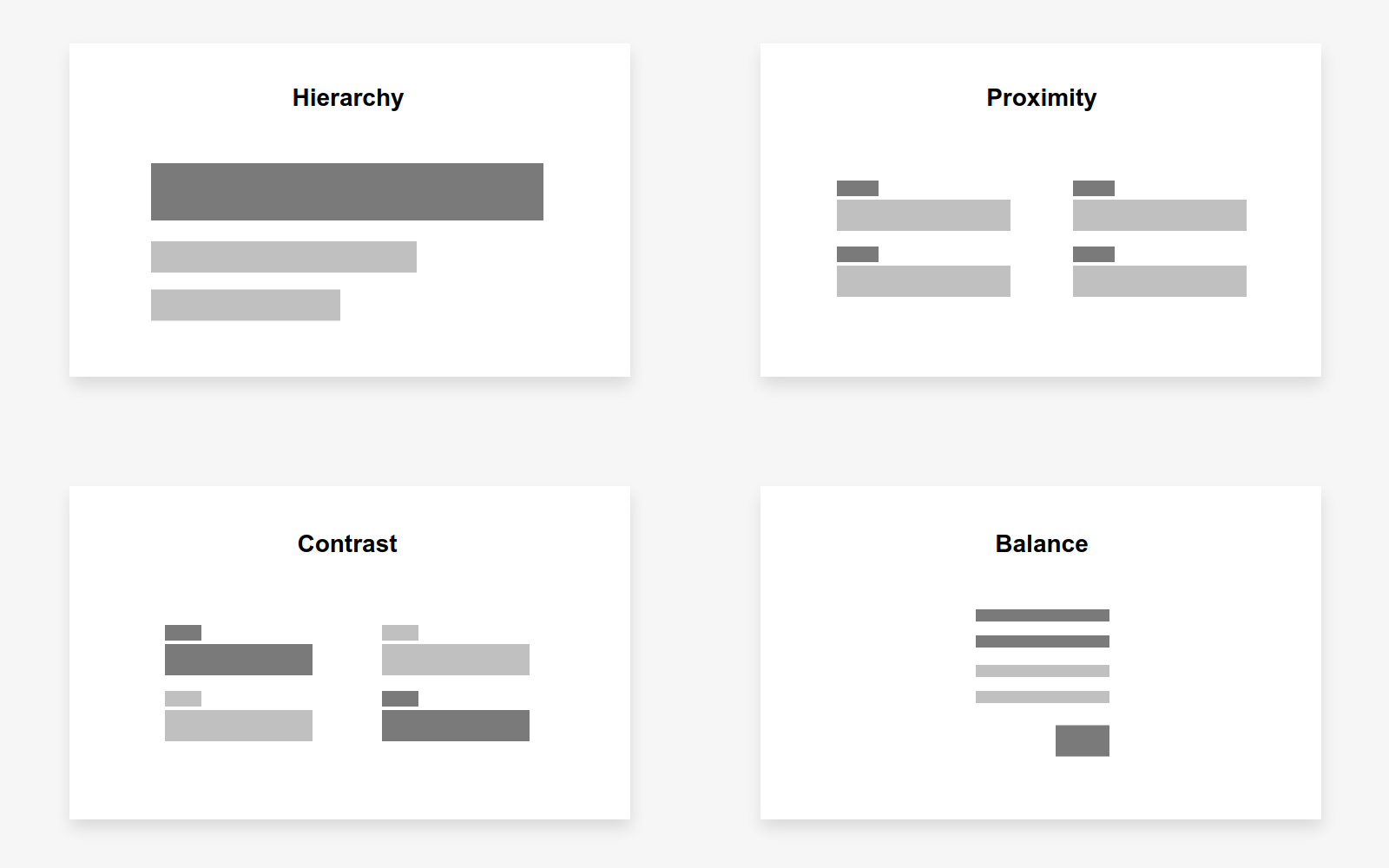
Here are some important design principles to consider when it comes to form layout:
- Hierarchy – is a combination of several dimensions to aid in the processing of information, such as color, size, position, contrast, shape, proximity to like items, etc.
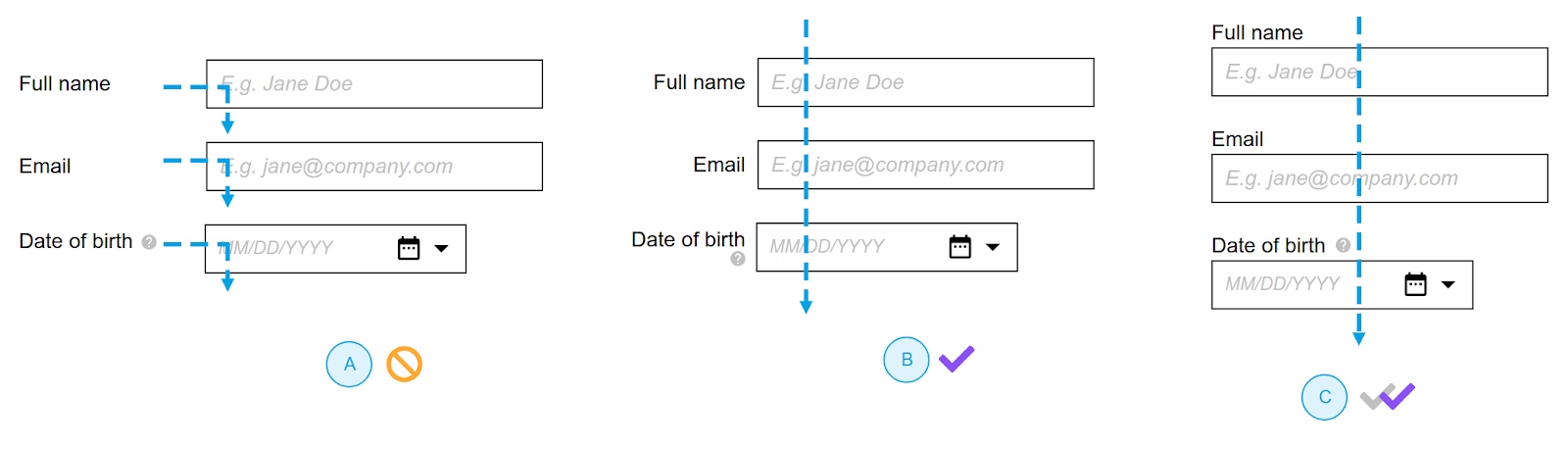
- Proximity – creates relationship between elements. It provides a focal point. Proximity doesn’t mean that elements have to be placed together, but it does mean they should be visually connected someway.
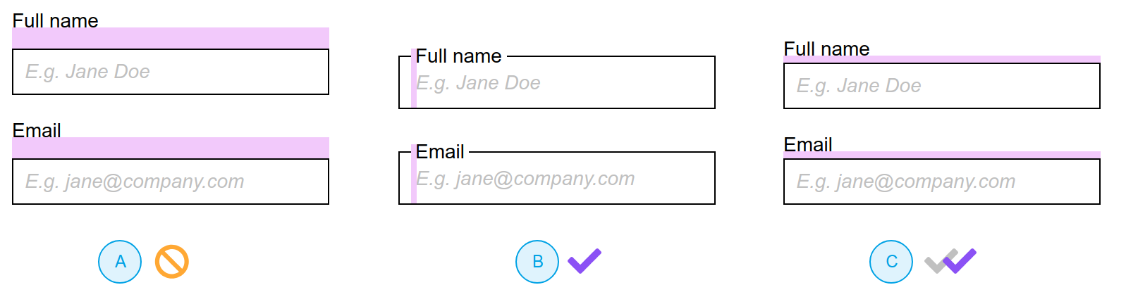
In the above example we see a proper use of the proximity principle. In the A option the top labels are too far away from the input fields, so it makes it harder for users to understand (or perceive) the relationship.
- Contrast – the difference among opposing elements (opposite colors on the color wheel, or value light / dark, or direction – horizontal / vertical).
- Balance – refers to the distribution of the design elements to create harmony within a composition.
Flow refers to how a user moves through the form.
There are some important key aspects that you need to keep an eye when it comes to forms:
- Use appropriate input fields (but do not overthink think this) – to make it less difficult for users to fill in certain fields.
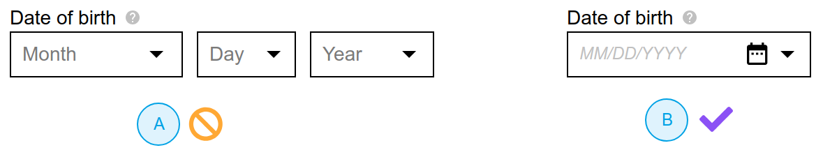
In the above example the A version is a very common and uninspired way to collect the date of birth.
- Use smart defaults whenever is possible – avoid undefined or unselected options (unless they make sense)
- Help users understand the errors – add additional hints to show them how to correct their error
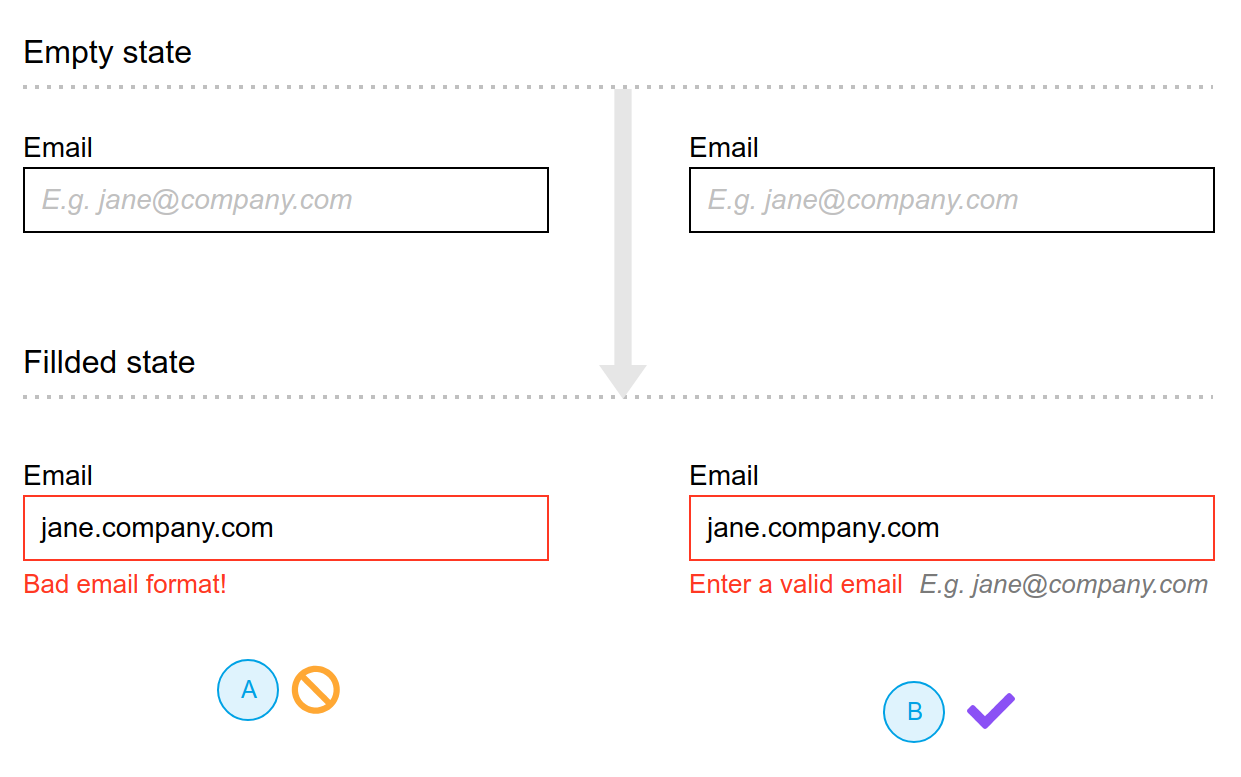
In the above example the A version doesn’t really help the user and fails in providing hints on how to correct the problem.
- Users don’t want to give unnecessary information – usually they avoid giving any personal information and this results in fake data. Ask sensitive information when is proper to do so and explain why is need it.
Recommendations
General
- Design patterns are a great place to start, but you shouldn’t rely only on them. Research comes before anything.
- Eliminate everything which does not fulfill a definite and necessary function. everything unnecessary. Ask yourself: Will this aid the user, and if so, how?
- Use satisficing – it’s better to design your form so that it can be completed without reading any instructions
Word
- Set the context for a question
- Nonetheless, some instructions are critical. You can often make sure they’re read by turning them into questions.
- Order information in expected ways: states – alphabetical, ratings order. Alphabetical order should be the last choice, when determining the order.
- Do not repeat the label as a hint.
- Form title: don’t include redundant words like: “form,” “online,” “web.”
- On closed questions, make sure the options are: appropriate, complete, mutually exclusive, self-explanatory sorted unbiased.
- Remember: Users can overcome poor layout but not poor wording.
Layout
- Group similar inputs/fields
- Use the length of field to inform/suggest the type of answer is expected
- Do not give your fields a background color – background color in fields makes them look like buttons (similar to this buttons without background color look like fields :) )
- Have no text inside the fields – the only text that should appear inside a field is the user’s answer
- Some UI elements can really benefit from color:
- Buttons: The only color on this form is the background of the button
- Key messages: like errors: highlighted in red (this is also a key color and should be used only for errors)
In the above example we can see how we can combine words + layout + flow to create a better experience. Option A is an exception because it doesn’t follow design principles like proximity. Option B and C are great, but the only downside of option B is that it doesn’t allow to group fields horizontally
Flow
- Take into account the moment when you ask for personal information
- Try to avoid “Submit” if you can – button labels should contain a more specific action
- Stop using the Reset button
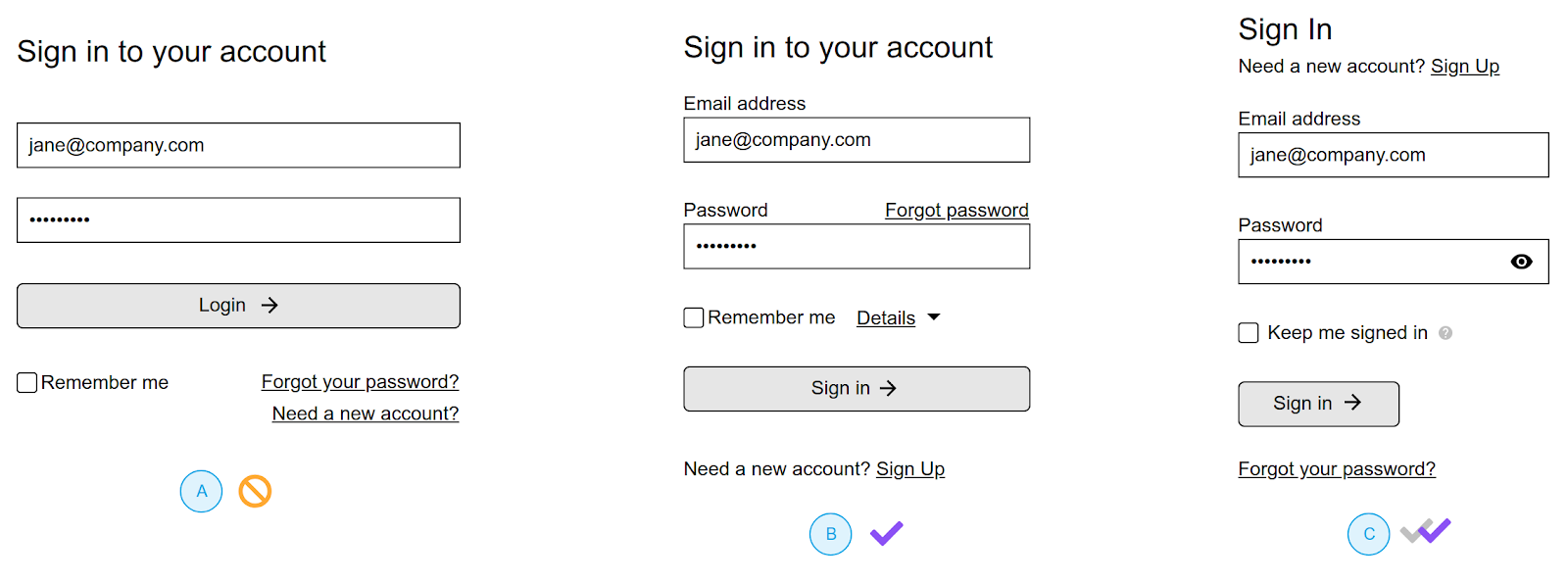
In the above example we can see an example of a sign in form.
Let’s explore a little bit this example. Option A is a common sign-in form that we are accustomed to seeing online. Options B and C are improved (better) versions of A.
In depth analysis:
Option A problems:
- Words
- No consistency – CTA button text is “Login,” while the form title is saying “Sign in.”
- “Remember me” option can cause confusion – user needs additional information to understand exactly what it means (and this information is not available)
- Layout
- Both fields (email and password) don’t have labels – in this case (a common one) the placeholder is used as a label
- Unrelated links like “Forgot your password?” and “Need a new account?” are grouped together
- Flow
- There is no way for the user to check if the filled-in password is correct
- “Remember me” option creates more confusion as a feature instead of being useful
Option B problems:
- This is an improved version of A but still needs to be address two problems
- “Remember me” option needs to be explained and for this we added the “Details” link where the user will learn about this
- There is no way for the user to check if the filled -n password is correct
Option C problems:
- Solves all indicated problems, but there is always room for improvement
In the end there are many more things to add; if you want to learn more I recommend you to read Jessica Enders – Designing UX: Forms.