
We’re living in a world dominated by hyper-competition and this holds particularly true for etailers.
Now more than ever, online businesses that want to succeed must concentrate on the overall customer experience which starts from the discovery journey that leads people to a particular offer and continues throughout the entire relationship with the brand.
Modern store management systems allow you to choose and customize incredibly good cart templates. These templates are already designed to offer a good UX. But what can you do to make sure that the overall experience goes from good to excellent?
Customers of the digital era expect to be wowed. And a great user experience must be associated with delight.
Everything starts with a precise map of the entire customer journey.
Consider every single touchpoint with a potential or existing customer. Start with your ads, social media messages, and content.
Move on from there and inspect the journey at each step. Map the UX on your site, check all the processes involved in the experience, from search to payment to order confirmation. See what happens next.
Go beyond the simple purchase and analyze the journey your customers go through after receiving their goods.
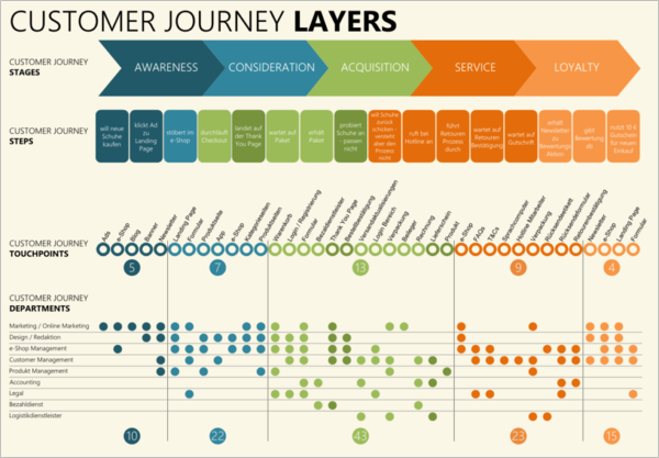
Image Source
Once you mapped the entire journey, try to gauge your customer’s level of happiness; identify any form of friction and start optimizing the journey by eliminating any form of delay or frustration caused by a bad UX, or cumbersome processes. What to watch out for?
Here are some of the common mistakes that might kill your customer experience.
Part I: Discovery
Targeting the wrong audience
The first mistake you can make is targeting the wrong audience. Be precise with your targeting! Nobody likes to see irrelevant ads. Make sure you select the right audience who can actually profit from knowing more about you.
Bombarding people with the same message over and over
Once you know which audience(s) you are targeting, think about how you approach them. Your customer experience starts way before people actually land on your site. Your ads and social media presence are often the first point of contact you have with a potential customer.
It’s your chance to make a very good first impression. And you know how hard it is to recover from a very bad first impression! Therefore, you really need to play your cards right.
When targeting or retargeting people on social media, or other sites, the biggest mistake you can make is bombarding people with the same promotional message over and over.
It’s true, people might need to see your products more than once to become familiar with your brand, but if you keep pushing the same messages again and again, people will either ignore you or hate you.
We’ve become highly skilled at ignoring ads, especially those we’ve seen multiple times. Our brain seeks novelty. If you want your ads to create positive associations with your brand you need to create multiple versions that include different creatives and a different copy.
Present your products and brand through valuable content. Add useful information, create seasonal content, educate your audience, provide tips and how-tos.
Our brains love to be confronted with unexpected patterns. Try to be remarkable!
Misleading ads
Another mistake that can destroy the entire customer experience from the very beginning is connected to misleading ads.
Make sure your ads are completely in line with the landing pages you direct customers to.
You might have experienced this situation yourself: you google for a specific product and you either land on the main page of a random store that may or may not sell that specific product or you even land on a completely different product page that has little to nothing to do with your initial query.
Create responsive ads that adapt to the search query and direct people to the right landing page.
Your search ads must include the same terms that the person entered in their search query, provide enough information to convince people to click (price, shipping conditions, special offers…) and direct traffic to a landing page which again contains the same search terms and the specific product your customer was looking for.
Deceiving ads create the wrong impression and generate frustration. Your ad quality score will also suffer from this and so will your ranking on search engines (while your price per click will surge) due to all the people who click on that ‘back’ button every time they land on your website.
Well-designed ad campaigns provide guidance and speed up the process, thus enhancing the user experience!
Overusing promotions and discounts
I remember a very popular home improvement store that started a huge campaign to promote their discounts. The campaign involved print, TV, radio, online ads, social media…they kept promoting a 20% off on every product for a month.
People reacted positively to the campaign. After seeing such a positive reaction, the store kept promoting the same discount for over a year. The result? The company went bankrupt and they had to sell all their assets to their competitors. Why? The campaign wasn’t believable anymore. There was no sense of urgency, and the fact that they kept offering discounts was not well received.
If a company keeps offering the same discount for a year it means that a) They’ve always worked with very high margins b) They simply increased the prices and offered discounted products using the original pricing c) They’re kind of desperate and they’re trying to acquire customers even without making a profit.
The price can’t be the only reason why your customers choose your brand. People want to identify with your brand and they need to know your true colors. Either you’re known for constantly offering the best deals or not. The biggest mistake is being stuck in the middle.
Define your positioning carefully and be consistent with your messages. If you’re a premium brand put all your emphasis on exclusivity and service, if your USP involves your inventory focus on variety.
Part II – A Bad On-Site UX
Unresponsive Design
This one is self-explanatory. Your website needs to work perfectly and provide a seamless experience across all different devices. The trend is clear: mobile surpassed desktop!
Wrong language
Some sites automatically change the storefront language based on the IP address of the visitor. It might seem reasonable but it can be very painful. People are mobile and in such a global economy, people often relocate abroad.
If I’m in Tokyo for a business trip, do I really need to spend five minutes to try to find a way to switch your site back into English?
A much better signal is the browser language. Many sites adapt their user interface (UI) based on the language settings in the browser. That makes a lot more sense because this setting isn’t connected to your temporary location.
Complex Search
Categories and subcategories should help customers find what they’re looking for. Your search function must be pristine.
Users need to be guided through the process exactly as it happens when you enter a brick and mortar store.
Virtual shopping assistants can support your visitors provided that they aren’t too pushy and if you managed to spend some time and resources in creating a proper tool that actually understands what your customers need.
People need clear instructions. Don’t overwhelm visitors with calls to action. Choose one path and guide each visitor to a specific goal. Too many messages and signals are confusing.
Upselling too soon
Make sure customers know how to get from A to B and once they quickly get there you can go ahead with suggestions and tips. Don’t try to upsell even before your customer actually made their first purchase!
Once your customer achieves their goal, you can leverage the adrenaline kick to present them with additional options.
Lack of information
People hate bad surprises. Nobody wants to go halfway through the purchase process to find out that there are additional fees or that it might take a while for you to restock.
Make sure that your customers have access to all the information they need to make a decision before actually signing up and/or proceeding to the checkout.
The checkout process needs to be seamless and clear. Customers expect to have options in terms of payment and delivery. That’s the place where you can offer additional services such as insurance, assembly, and installation, or express delivery service.
And don’t forget to take into account different regulations around the world: for an online store to operate in the EU it is necessary to present the final price including all taxes and fees before people proceed to the checkout.
Confusing Sign up
And speaking about signing up…of course, the process needs to be straightforward and seamless…A convoluted sign-up process will push customers away.
Allow people to shop and sign up after they decide to proceed to the checkout. In some cases, you can even allow people to shop as a guest.
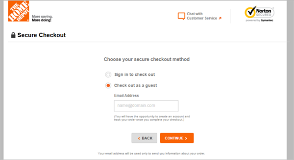
Image Source
Also, reduce complexity by breaking down information into several pages.
Instead of presenting one huge form with tons of fields, break down the process into steps that include two or three questions each. This way, you don’t scare customers away with a million questions about billing address, shipping address, payment method and so on in one single page.
Try to pre-fill all the fields you can be based on the information you can automatically connect.
Allow integration with social media to both, add information and foster a relationship with your brand outside of your platform.
Needless to say….returning visitors should not be required to enter any information unless they want to update their data.
Uncertainty regarding the purchase process
Five minutes at the bus stop can feel like an eternity. But simply adding an electronic sign that shows how long people need to wait have proven to significantly enhance the entire experience. People perceive time differently based on the information they have.
People need to know where they are in the purchase process. Make sure you signal how many steps there are between search and purchase.
Customers will perceive a lower level of complexity and feel safe. They know exactly when the process is over and they’ll be charged, and they’ll feel guided through the process.
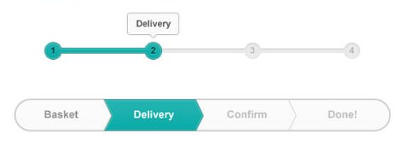
Image Source
Besides, providing such signals is even mandatory for stores that operate in the EU.
Customers need to know exactly when they’re actually placing the order and the button they click must clearly point out that they’re about to be charged for their purchase. Using the same ‘next’ button throughout the process is illegal.
Not signaling the presence of human beings
Modern technology allows pretty much anybody to set up a store in less than an hour. But a highly digital world is inevitably connected to mistrust.
Create a proper about page, provide an actual office address, add badges and seals, and set up a secure environment for customers (proper certificates, secure payment, transparent privacy policy and so on).
Show faces and names in your “About us”. Make sure that people know how to contact you directly. Offer an email address, a telephone number, and add a live chat to your site.
Mention who your partners are, all the third-party applications that will have access to their data, and explain how payment information is encrypted…the first time you enter such information in a brand new store is scary. And there are unfortunately many examples of people who created a fake platform just to gather such information! People are providing you with their information…make sure they feel comfortable when doing so.
Image Source
Add videos where you talk to people, include real testimonials and reviews, and link to your social media channels. Show your premises and present real facts and figures. People need to trust you.
Besides, all this information is mandatory in the EU, and according to the recent guidelines introduced with GDPR, you won’t be able to serve the European market unless you comply with these regulations.
Intrusive Live Chat
Your live chat is a great opportunity to talk directly to customers, answer their questions, and guide them through the process step-by-step. Don’t be pushy, though! Try to be useful and lead customers to their goal!
Dark Patterns
We’re all familiar with dark patterns in online stores. If, on the one hand, it’s normal to try to push customers through the process, on the other hand, people are developing a strong allergy to dark patterns.
The more educated your audience is (meaning people who are very used to dealing with online processes) the more likely they are to recognize dark patterns in your UX.
It’s okay to highlight products which are very popular but you can’t fill your store with a myriad of fearmongering messages like “only one left”, “twenty people are currently looking at the same offer”, “only ten minutes before we double the price”, and so on…
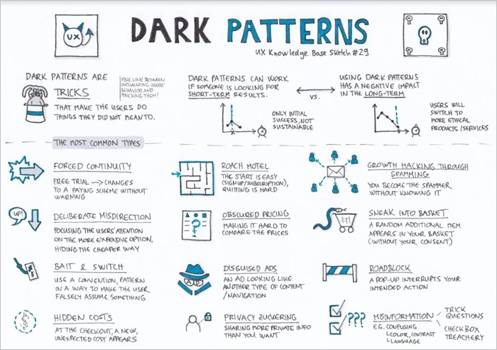
Image Source
After a while, people will realize that you’re just trying to leverage their irrational side and will stop trusting you. Creating a sense of urgency can be done with positive messages: “order it now to receive it in three hours”.
Forcing people to make quick decisions by introducing scary, flashing red signs and constantly leveraging loss aversion can work for a while but digital-savvy customers will quickly discover a pattern and your signals won’t work anymore while actually generating mistrust and harming usability.
Segmentation and Price Discrimination
Another big mistake that destroys the entire customer experience is connected to price discrimination.
It’s okay to segment users and personalize their experience based on their needs and purchase history. But if customers notice that prices change when they access your store from a different machine they’ll feel betrayed and soon lose interest in your brand.
If you want to maximize your profit, make sure you do so while also providing a service to your customers: add niche products, offer different versions of the same product, and offer bundles.
Versioning and bundling are common strategies that stores have been using since the dawn of time. Think about the choices you’re given when you go to Starbucks!
Customers need to be in control of how much they want to spend. Offer options and defer the decision. Let people customize their order and guide them so that the experience doesn’t lead to regret.
A positive brand is always linked to positive feelings. Repeat purchase and advocacy have a deeper effect on your bottom line than deceiving price discrimination and upsell tactics!
Happy customers will become evangelists and bring in a lot more business than you can possibly generate with advertising.
Not collecting feedback
We can only improve if we collect feedback. Make it easy for customers to tell you what they think of the overall experience and adjust your journey based on these surveys.
Not asking for your customer’s opinion is a big mistake. You need to show that you actually care!
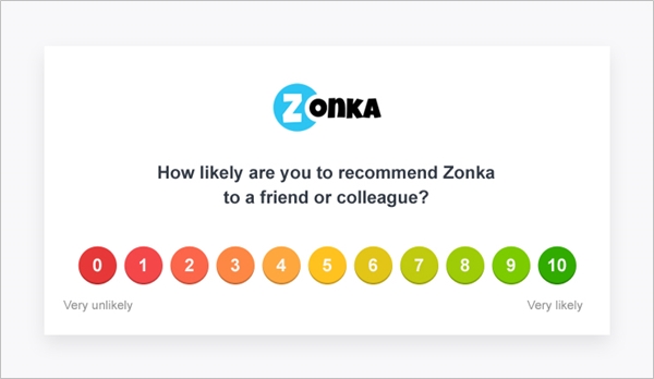
Image Source
Forcing Customers to Pay for a Great Experience
Make sure that the customer is happy no matter what they choose. Customers who can’t afford premium services (or don’t want to spend money on them) still need to feel special and know that the process will meet all their expectations.
If you can only offer a great experience to golden customers, you’ll soon lose the majority of potentially loyal customers who will actually promote your store.
It’s okay to create a premium experience that leads golden customers to invest more in your brand, but your goal is to provide a great CX in general.
Part III – The After-sale experience
Poor After Sales Service
After your customers place an order it’s time to see what the actual journey is all about!
It’s easy to make promises, but after the order has been placed it’s time to deliver (pun intended).
And talking about delivery, people need to be able to track their orders and have a clear idea of the delivery time.
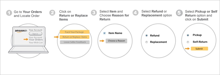
Unclear return policy
And while we’re talking about after sales services, make sure your customers know how they can immediately recede from the purchase contract or return goods. Make sure the process is as easy as 1,2,3. Make all the information customers require easily accessible.
If you also have brick and mortar stores, allow people to return or exchange goods they purchased online directly in your store and vice versa. It’s a great way to create a truly omnichannel strategy. Simplify the process with pre-filled forms and simple instructions.
Copyright
We mentioned GDPR compliance. Stores that operate in the EU need to send a full purchase contract together with all the information customers need to quickly and effortlessly withdraw their order or return their goods as soon as they receive the confirmation of their purchase.
Obsessive Communication
And while your customers are waiting for their goods try to keep in touch with them. Again, don’t exaggerate with promotional emails and discount codes.
I don’t know about you, but if I receive more than one email a week from the same store I simply unsubscribe from their newsletter and delete my account. People don’t want to spend their time cleaning up their inbox after receiving three emails a day from you.
An alternative is to keep in touch through social media. Think as an inbound marketer! If you provide great information, interesting offers, and great content, people will look for you.
Of course, you constantly need to remind people you exist, and a great drip campaign is the best way to create loyal customers. But make sure that your communication actually adds value. Create ad hoc content that is relevant to the person who reads your mail.
Tl;dr
In a nutshell, try to remember that particular warm feeling you feel when entering a local store where the clerk knows your name and helps you chose to make sure you’re satisfied with your purchase.
Remember how safe the whole environment is and how pleasant the overall experience is.
Now, map your customer’s journey and try to recreate the same experience for your online customers!
This is a guest post by Andy Mura, Head of Marketing at Userlane, the navigation system for software. Inbound marketer, speaker, SaaS enthusiast, digital transformation and customer success advocate.