Anyone running an online business today has faced this problem at some point: how do you grow your mailing lists and generate more leads?
To quote any avid marketer, “creating good copy on your landing pages and emails is only half the battle.” Well, maybe people don’t say that exactly, but it’s true: even the best message is no good if it doesn’t have an audience.
That’s where signup forms come into play. These bad boys are the foundation of any successful marketing automation flow. They’re the first checkpoint your site visitor goes through before moving further along your marketing and sales funnels, and they offer your first opportunity to understand more about what your users really want.
Whether it’s lead generation, email marketing or just signing visitors up to a service, here are a few proven ways to get the optimization mojo flowing for your business’s signup forms. Let’s get started.
1. Ask fewer questions to get more answers
The awesome people over at HubSpot analyzed over 40,000 landing pages to see if there’s a direct connection between the number of fields in a signup form and the associated conversion rates. They found that conversion rates decrease as the number of fields increases.
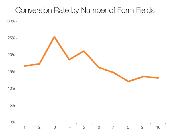
This chart paints a clear picture of the situation. As the number of form fields someone has to fill out grows, the likelihood of them converting decreases quite a bit.
Based on this data, we wanted to help 123FormBuilder users get the best results through their forms, so we asked ourselves this question: what’s in the ideal signup form?
Anatomy of a high-converting signup form
We started by looking at how our clients were building their newsletter subscription forms to get an idea of what elements should stay and what needed to go.
Having a newsletter is an amazing way to generate new leads and build up your mailing lists. Visitors give their contact info in exchange for curated content that you delivered to their inbox every month or so. Sounds simple, right? But if you ask for too much, you might not get anything.
Don’t ask for too much
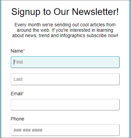
Here’s an example form we found that was having a rough time signing up visitors:
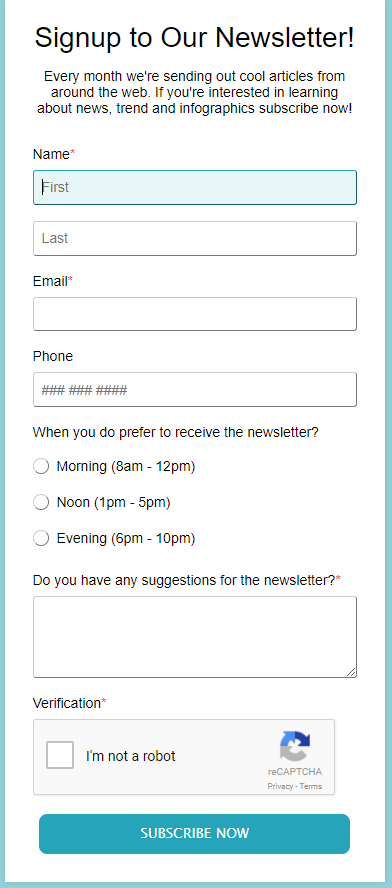
Let’s break it down:
While having a visitor’s name is great for personalizing the email, there’s no real need to ask for both first and last names. Try to cut as much as possible here. If you really want to personalize emails, ask only for one name and let your visitors decide which one to give.
Also, phone number isn’t needed for a newsletter, it just takes a toll on your conversion rate. We recommend dropping it.
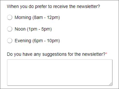
Customer feedback is important, but there’s a better time and place to ask for it. These options complicate this form and can be easily moved to a transactional email after users have actually signed up. Just follow up and ask new users when they’d like to receive the newsletter for segmentation reasons, what they’d like to see covered or anything else you want to learn.
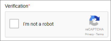
I recently read a great article from the people over at MailPoet showing why email signup forms don’t require a CAPTCHA. They make the point that a two-step verification process actually provides mailing list filtering just like a CAPTCHA field, without affecting the number of people who sign up.
Instead of using a CAPTCHA, simply send a confirmation email requiring people to verify that they wish to receive your newsletter. This confirmation email could also ask users for their feedback and timing preferences as described above.
If you have a problem with spam subscriptions, try a honeypot approach to keep out unwanted traffic.
The Conclusion: Less Is More
It’s clear that the client in this example wanted to get as much information as possible about the people that sign up. While having data is important, you have to verify that more details justify a decrease in the actual number of leads generated. Each business has its own needs, so analyzing this tradeoff is an important step when optimizing signup forms.
2. Looks matter
People trust beautiful designs more.
Just as we are psychologically wired to trust beautiful people more, the same concept applies online. Think about it: have you ever had second thoughts about entering your credit card information on poorly designed websites? Most people have, and it’s a normal reaction.
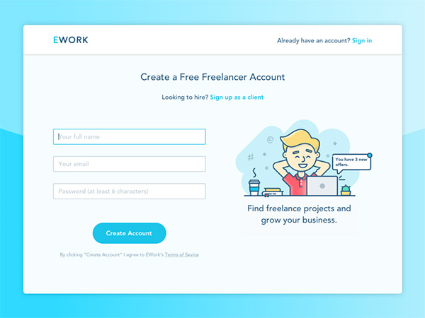
Test yourself: which form would you rather fill out?
This one:
…or this one:
Most people would opt for the first form. It’s clean, simple and even shows a smiling person next to it. This sends the message that the company behind the signup form is not just serious about good design, but also friendly and welcoming, which makes me trust them more.
Try a vertical layout
Layout is another important consideration for signup forms. A study from cxpartners used eye-tracking technology to compare different signup form layouts and found that single-column forms convert much better because users complete forms from top to bottom. This layout can be optimized even more with left-aligned field labels.
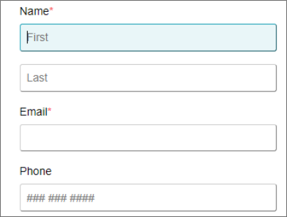
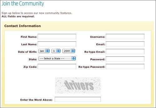
Remember the newsletter form we analyzed above?
They had the right idea from a layout perspective, they were just asking for too much info.
3. Reassure your visitors—and give them a clear reason to act
The last two essential form elements are the actual text used in the form and the submit button (though it shouldn’t actually say “submit”!). Both need to be on point to make visitors understand what they’re actually signing up for, as well as give them the motivation to take the plunge.
Tell people what to expect
Your visitors basically sign up for some kind of transaction. They give up their contact info in exchange for something you promise them, whether it’s a newsletter, an offer or anything else you might be providing. So, to get people to sign up, you need to tell them what to expect:
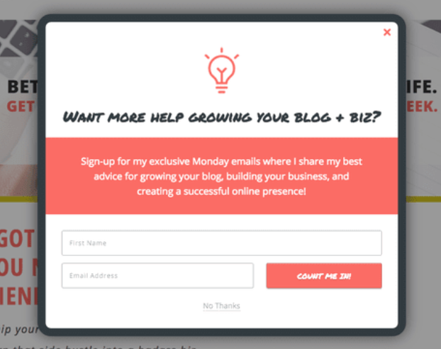
This example from xosarah is great.
It starts off with a simple question asking visitors if they want to achieve something. After that, Sarah tells users how they can get what they want: by signing up to her Monday emails. The copy also mentions the actual content that will be delivered, offering full transparency to visitors.
Be careful! There is such a thing as too much copy on your forms. Depending on your scenario, it’s often a good idea to test how much text is the right amount. More information might convert better, or it might be too much to read. It can vary by audience.
Call visitors to one clear action
The final step a visitor takes before making it on your email list is clicking the submit button, also known as the Call-To-Action (CTA) button. The CTA can make or break your conversion rates, so it’s important to pay attention to both how it looks and what it says.
Let’s start with how it looks. The size of a button has a direct impact on its visibility towards visitors, so… make it big!
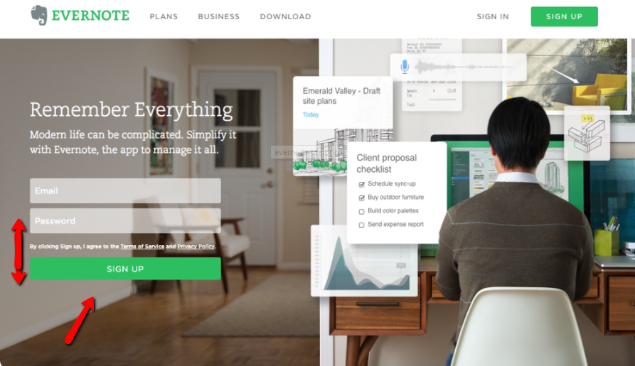
Now, hold on: don’t make it half the size of your entire form. A general UI rule states that the button’s width should match the fields above it. Evernote does it well:
The CTA’s color is another important element. Color speaks to us not just visually, but emotionally as well, so be sure to choose a powerful color that will draw users. Also take into account the type of products or services you’re selling, as different colors paint an idea about your offering. This chart may help you decide what color is right for your CTA.
Once you’ve made your CTA button beautiful, don’t forget to focus on what it says. Keep it short and to the point, but try new things. Action words tend to perform well, like “Sign up” or “Click here.” What doesn’t? The default “submit.”
Wrapping it up
Designing a high-converting signup form isn’t that hard. As long as your form stays short, looks good and has motivating context around it, you should see good conversion rates.
However, my advice is that you should always test general conversion optimization rules to see if they work for your scenario. Don’t take anything for granted, as each business’s audience is different and your users may connect better with specific designs or formats.
If you’re looking for an easy-to-use tool to build your signup forms, I recommend giving 123FormBuilder a try. With an intuitive drag-and-drop editor, you can build awesome forms and easily edit every visual and layout element on any form. You can also pick up a template and publish it right away to get leads coming in fast (especially if you use these best practices).
I hope you got some inspiration from this article. I’m curious about any other suggestions you might have to add, so drop them in the comments below!
This is a guest blog post by Adrian Timar, the CRO Manager at 123FormBuilder, in charge of the onboarding process and customer engagement.