A landing page can either make or break your marketing campaign. So how can we create landing pages that actually convert?
Duane Brown, a performance marketer from Unbounce joined us recently to share 6 principles for creating killer landing pages.
- Communicate your Unique Selling Proposition
The starting point of a marketing campaign revolves around your ability to define a point of differentiation. What is it about your product or service that sets it apart from the competition? You need to communicate this in a succinct way on your landing page. Try to break down your offering to its most basic level, to describe the specific benefit your customers will get by choosing your product/service.
- Use a Hero Shot to Visualize Your Product
The adage “a picture is worth a thousand words” is especially true in the short attention span world of the landing page. The hero shot is the visual representation of your offer and can help people to gain a better understanding of what it is or what it looks like. For maximum effect it should show context of use. This means showing rather than telling how it will be used by a customer.
- Be FAB
Features
And
Benefits
The benefits describe the problem your product will solve. Features help you tell potential customers what your product will do for them.
It’s important to strike a balance here and not get into so much detail that your landing page feels like it’s full of text. Write a brief one paragraph summary and 3-5 bullet points for clarity. Come back to this section many times and edit the copy to remove any bloated or unnecessary verbiage.
- Use Social Proof to Build Credibility
Leverage well-known brands, awards and trust seals to boost your own credibility; showing their logos beside yours lends their credibility Tweet. Or display customer testimonials and reviews to reinforce your product quality. Showing the number of downloads, customers or “likes” also boosts credibility and loyalty through the tribe effect – people want to join a larger group of people. It’s human nature.
- Focus on Attention Ratio
Your landing page should have one objective; to download software, or complete a lead gen form, or buy your product. Don’t distract your customers from completing the one goal you really
want them to do. Have one call-to-action on the landing page, and limit the number of competing objects or “clutter” that their brain needs to process. The smaller the attention ratio, the higher the conversion rate.
- Think Mobile
In the USA and UK, mobile can be as much as 50-65% of a site’s traffic. Making sure your pages and the experience you provide are optimized isn’t an option anymore. It’s a must for every brand large and small. Not being mobile ready says your brand isn’t thinking about the future. Also, tablet traffic has been plateaued the last few year, so it shouldn’t be as much of a focus.
BONUS TIP: Message Match
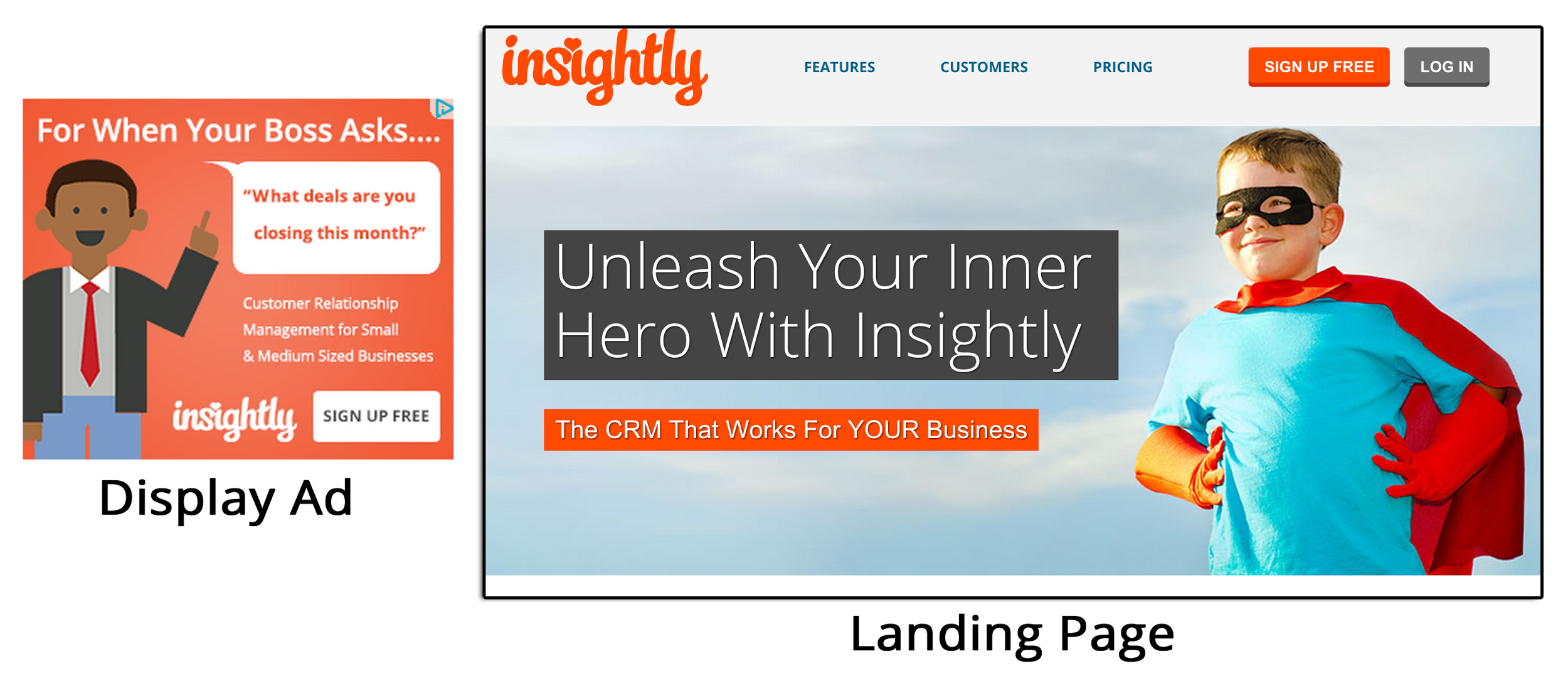
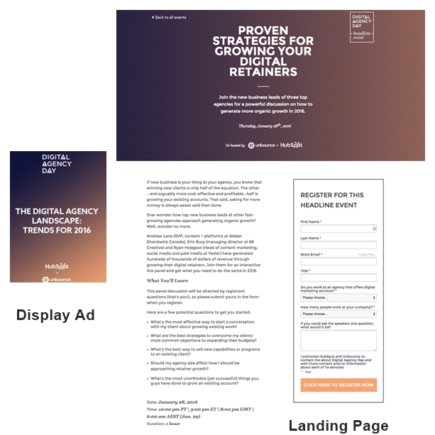
Connect your advertising to the landing page that a customer or lead lands on Tweet. The banner and the landing page should have consistent visuals, headline and messaging for continuity.
The example below does not have continuity between the banner ad and landing page. It looks like two different companies, or at least two different campaigns, and will increase cognitive load and decrease conversion rates.
This example shows consistent visuals between the banner and landing page. Visitors know they are in the right place and can focus on the call-to-action.
Now that you know how to create a landing page that converts, watch the webinar as Duane shows how to further optimize your landing pages through A/B testing.


