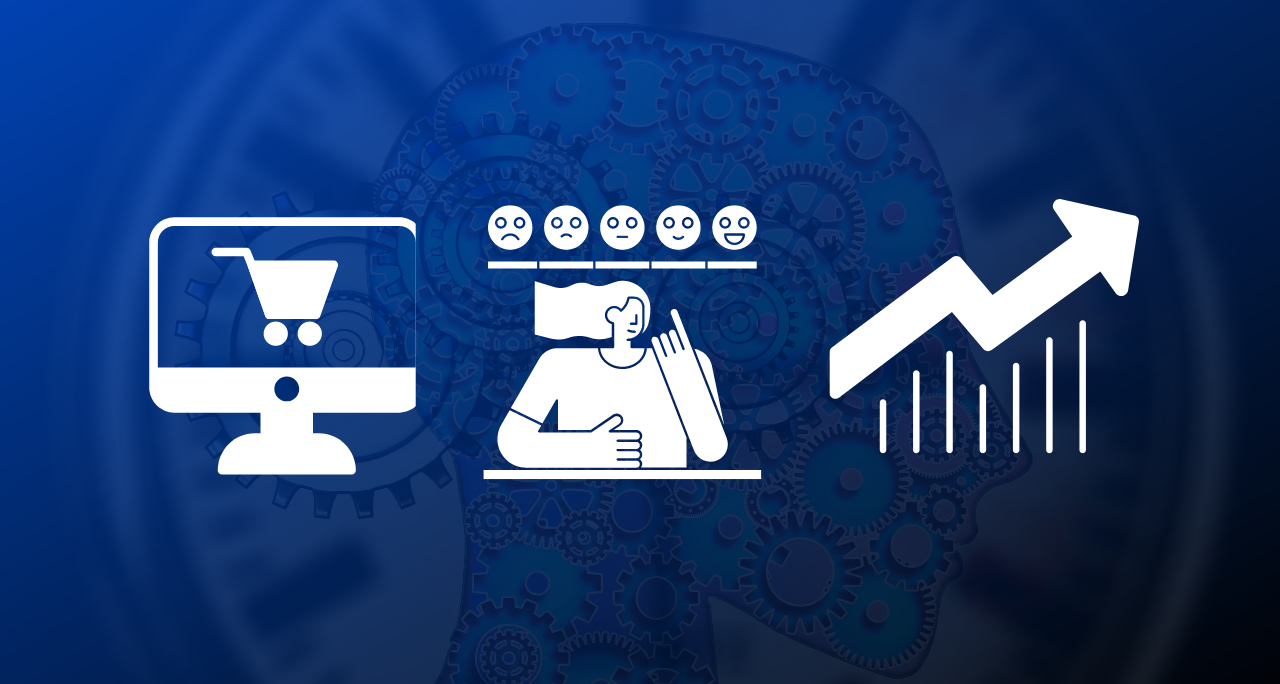
During a research on shopping cart conversion rates I did the last couple of weeks, I found websites with 0,4% funnel conversion rates and others with completion rates up to 70%. I never expected to find such big discrepancies; no analysis can be made in such conditions so I started to look up reasons for these discrepancies.
After talking to different software vendors about various issues their potential customers reported and after noticing different trends in multiple analytics data, I found the fugitive criminal guilty for many many abandons in shopping carts: Shopper Trust.
Shopper Trust Wanted. Reward Offered.
How to find it? Easy, or so they say. Check out the following clues.
1. Among Trust’s best friends there’s a guy named “Price”

Showing prices & discounts next to buy buttons
It’s important for your users to pay the “right” price for your products, but more important is to really know how much a product costs. You might say this is obvious (I for sure would have said that), but going from one website to another I found many where it was unclear how much a product costs.
It’s not mandatory to have the price on the right or on the left of the screen. The important thing is that when the user says to himself “I wonder how much this software costs. I’d like to buy it”, he should get the answer before he gets to finish his sentence.
My 2 cents is to always have the price next to the buy button or link. This way you make sure that every time a user gets in the shopping cart he already knows the price of your product. Also, place it next to the product box, something very similar to the offline world where the user is used to always have the price next to the product he is buying.
2. Trust’s worst enemy: intimidation

Let the user know about the security of its transactions
No user is going to place his credit card details on a certain page unless he trusts that page. This issue is related both to websites that use 3rd party eCommerce providers as well as websites who have their own eCommerce platform.
The software vendors who had the best conversion rates had the following things in common:
- the user understood that when clicking the buy button he will be redirected to the 3rd party eCommerce provider
- the vendor explained the reason for which it selected a 3rd party eCommerce provider and gave the user more data about the security of the transaction, the credit card details of the user and the fact that his credit card credentials would not be saved or accessible by no one at any moment.
- no Javascript or design errors were found on their shopping carts
- the price stated on the product page was the same with the price in the shopping cart
3. His mistress, a lady called Consistency
I believe that lately the issue of being consistent throughout your website and the shopping cart is more and more important. I’ve seen websites that most probably updated their design but forgot to update the design of the shopping cart as well, or websites that were using different shopping cart designs for different products. I also noticed sites where the product name was different on the website and in the shopping cart.
Most phishing scams are caught by regular users because they are inconsistent with the website they try to clone, even though they are very similar. So, yes, a regular user will notice if the template of your shopping cart has another font or font size compared to your website, if the name of the product is misspelled or if the menu looks different. This leads to loosing trust as well (check the shopping cart customization examples).
4. Known to hang around a bar called Quality

30 day money back guarantee can make your users more confident on the product quality
During my research I have seen some really sloppy shopping carts with unexplained conversion rates. Don’t get me wrong, when I say sloppy I mean that they had no fancy designs, no web 2.0 elements, but rather ugly graphics. The process didn’t have more than the basic elements needed or any marketing messages.
Their websites were the same – just basic stuff. However, when looking for product reviews over Google, I realized that those products were really good, at least judging from the big amount of positive reviews.
But how do you define quality? Ease of use for one thing, friendliness, to be useful when most expected, never doing what the user doesn’t expect it to do and having the “right price”… this is how I would define quality, at least based on my research.
And as a final word, don’t forget: track & test. Track everything in the shopping process and make sure you have a process improvement strategy based on the analytics data you get. Test different implementations of the shopping cart. If you already are an Avangate client we just launched not long ago the possibility of A/B testing between different templates… so no excuse for not testing :)