These days, when talking about the customer experience on a website, people usually address issues about usability and user experience techniques – diving deep into the data, but is this enough to convince the users to transact with your business? You might improve your conversion rates by looking into the data, reading some tips and tricks on usability and user experience techniques – and that might improve the user’s ability to complete a transaction, but I am wondering if this is enough to engage them to the point where they’ll actually pay…
The bottom line is – it’s not enough. Even if the users are able to complete a transaction on your site, it doesn’t mean that they will actually transact. There are many times when users, especially in the software industry, place an order from your shopping cart and then come back for a cancellation, a refund, generate fake customer claims or simply don’t take the final payment step, like off-line payment methods such as wire transfers for example. These gaps in the purchase process happen when the user thinks he wants to place an order with you, moves on in the purchase process taking some action. However he is not actually motivated to purchase your product, he just wants a product from a certain category and makes an impulse purchase instead of an intentional purchase.
To be successful, a website must go beyond just being usable and start motivating users to make intentional purchases by taking advantage of persuasive tactics that will spur them to take action. The goal of a successful persuasive website is to make the users feel comfortable about making decisions and help them act on that decision. Persuasive design is all about helping users make the right decisions – not about manipulating them into doing something they don’t want. Understanding the user’s decision-making process and providing the information and tools necessary to facilitate said decision is mandatory to ensure the completion of the transaction.
In the four funnel steps of the AIDA decision-making process, we have the same user at different stages in the process: Attention, Interest, Desire and Action. Following a similar principle, Andrew Chak divided the website user into four buying types: browsers, evaluators, transactors and customers. One important secret in applying persuasive design techniques in web design is to build your website following all 4 types of users and helping them through all 4 decision-making stages to move them through the stages to close the transaction for your business.
Like most good webmasters and site developers, I am sure you are looking for benchmarks and best practices. This is a good exercise – unless you lose sight of what you are selling and apply the practices blindly. Most of the existing web marketing case studies are for industries outside of software. The user behavior, expectations, and motivation factors are totally different when referencing software products and SaaS offerings. You know your products or services better than anyone, so spend some time to put yourself in the users’ shoes and see what would motivate them to purchase your product for each of the four decision-making stages.
Does your website sell software products?
Then you have to help your users make choices. Answer these questions:
- What is your unique value proposition? Tell them why they should buy from you – Max. 3 words.
- What product best meets their needs? Present a comparison chart.
- What are the key features? Help them understand how your product will meet their needs.
- What are the system requirements? Help them understand if your product will work for their environment.
- What are your current customers’ reviews? Illustrate you have an appreciated product.
- What do they get for the price? Let them know what to expect once they decide ‘Yes, I want to buy your product’. They are mostly interested in: product price, local payment options, delivery methods, post-transaction support and communication (delivery confirmation, refund policy, support options, etc).
Does your website sell SaaS or online services?
Then you have to help your users make choices. Answer these questions:
- Why are you the best provider for this service? Tell them how your service compares against the competition. What are the key differentiators?
- What are your endorsements? Let them know if you have market recognition, partnerships, and awards.
- What is the difference between starting a trial and paying for a regular product? Before making the effort to get to know your product, they want to know how much of the product you will let them see/use, so present a comparison chart between what is free and what is paid.
- Have more than one buying option for your products? Buyers feel more confident purchasing when they see what options are available and what is included for each product iteration. Present this with a side-by-side comparison chart.
- What do your current customers say about you? Let them know what your customers say about you – good and bad. Exposing all the reviews sends the message that you have nothing to hide and that you want them to make an informed decision about your product. Use negative reviews to highlight where updates and improvements have been made, and thank those customers for their critical feedback.
In the checkout process a lot of sensitive information is required and sometimes differentiations of previous steps might appear, based on local or international payment processing regulations.
To make sure you keep the users motivated, here are 5 tips and tricks to help you move the needle:
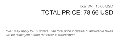
1. Tell them why new elements are being called out to them, such as the VAT applied to this European order:
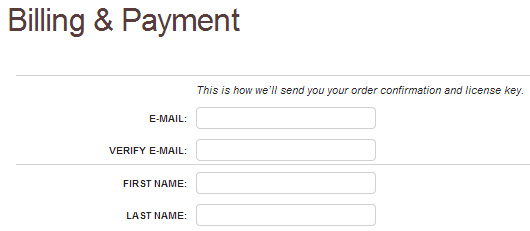
2. Let the users know why you are asking for such information:
3. Tell them what the available options are – it helps reduce friction and eliminate churn.
4. Show that you have trusted technology to insure their transaction’s safety
5. Provide support contact information in their native region and language
Keep in mind that you can influence people’s behavior without using words. Persuasive web design works if you are honest and clear with your users. Always keep the 4 types of users in mind when designing a webpage or checkout process and influence said types by providing relevant content to guide them through the four stages of their decision-making process. This unique approach to persuasive design will shift that impulse buyer into an intentional buyer, and hopefully, a repeat buyer.


