The checkout page bears a bigger stake in securing conversions than one may think. After the effort you have put into driving your prospects down the funnel to the purchase stage, it is the checkout page that can come into play to make or break the final sale.
There are many aspects of the checkout page that you should take into consideration – starting from broader points such as cart flow length/steps, cart layout, and provided payment methods, to smaller details such as the order of the elements or color of the buttons; in short, you can optimize virtually every element on the checkout page. However, as with many other business areas, you need a strategy to follow and best practices to start with for your optimization projects.
As a starting point, we’re bringing you the tried-and-tested strategies we have successfully implemented on our own clients’ checkout pages that can help you do away with conversion blockers.
1. VS REVO Group: Provide Deep Localization on the Checkout Page
By tapping into international markets and getting your products in front of global audiences, you automatically gain more opportunities for revenue. However, to successfully leverage cross-border commerce, you need to have a strong localization strategy in place – and this usually goes beyond mere translation. Areas to focus on for the checkout include the country’s preferred payment methods, display and billing, taxes, shopper flows, shopper support, date and time, as well as graphics.
If you’re already selling in foreign markets but are not seeing the desired results, take an example from VS REVO Group, a software company that develops and manages various utility software products. They wanted to expand into new and emerging markets such as Brazil, India, and China, but were lacking some localization capabilities needed to be successful in these markets.
Ultimately, they used 2Checkout’s shopping carts which were ideally adapted to each locale they were targeting. The carts were localized in terms of language, currencies, payment methods, and local processing. These enabled the company to provide a seamless purchasing process for local buyers in each market, ultimately resulting in a 17% increase in sales in Brazil, and 34% in India.
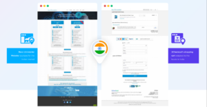
Discover how VS REVO Group fully optimized its go-to-market strategy by reading the full case study!

2. Incomedia: Localize the Cart Flow to Maximize Revenue
Did you know that shoppers from different countries show a strong preference for either a shorter or a longer cart flow? 2Checkout platform data found that shoppers’ cart flow preferences vary by country, making the length of the cart flow a key element that can be localized, along with language, billing currencies, or payment methods. By using the right cart flow length in each local market you are targeting, you can maximize revenue and cart conversion rates.
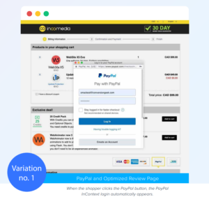
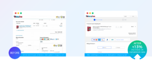
By partnering with 2Checkout’s CRO Services, Incomedia, a leading independent multimedia software company for PC users, sought to find out which cart flow would maximize their cart conversion rates. This test was performed in conjunction with a PayPal optimization with a custom logic test.
Incomedia was using a checkout with review page, so we had this as our control version. Variation 1 was similar with the control, but it also included the PayPal feature. The other variation (also including the PayPal optimizations) consisted of a shorter cart flow, with no review page.
The results confirmed that cart flow should be optimized on a per-country basis. In the case of Incomedia, countries like Germany or Italy preferred the variation with the review page, which led to improvements of 15.80% and 17.13% respectively.
Discover all of the Incomedia insights by accessing the full case study.

3. Malwarebytes: Use Upsell and Upgrade Offers to Maximize Revenue Per Visitor
Upselling is an important component of steady SaaS growth and it’s a match made in heaven with an industry based on tiered offers. The immediate benefit of upselling is the increase in long-term revenue; in the long run, however, it also improves customer retention since the users get more and more value out of the product.
One key moment in the customer journey where you can leverage upsells and upgrade offers is just before the checkout. As part of the series of conversion optimization projects conducted alongside 2Checkout’s CRO team to improve customer experience and order process, Malwarebytes sought to determine the following:
- The impact of an upsell offer on the conversion rate prior to the cart;
- The best offer types to maximize revenue (number of years, or number of devices protected by the anti-malware solution);
- Which offer style – interstitial page or banner – worked better for their customers.
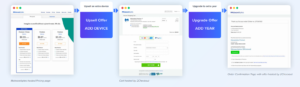
The test consisted of two variations. Variation 1 included an upsell offer (on the number of years) before the checkout. Once the customer finalized the transaction, an interstitial offer was displayed with 1-click upgrade feature for the number of devices. The thank you page included no offers, focusing on activation instead.
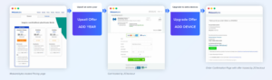
Variation 1
Variation 2 was similar to the first, but the order of the offer types was reversed. Prior to the checkout, an upsell offer was showcased for the customer on the number of devices and after the order was finalized, an interstitial upgrade offer on the number of years was prompted.
Variation 2
Finally, the control version included no upsell offer before the checkout page, but an upgrade offer for extra devices on the thank you page in the form of a banner.

Control
The winner of the test was Variation 1, which resulted in a 3.92% increase in conversion rate and a 9.16% increase in revenue per visitor (RPV) in comparison with the control version.
The takeaways here would be to always test the type and style of the upsell/upgrade offers in order to identify where your customers see more benefits – that’s the sweet spot that is bound to increase take rates and conversion rates. For Malwarebytes, it was the upselling for a longer term that made the difference, not for more devices. In terms of style, interstitial pages for offers were preferred against banners. A last lesson pertains to the fact that upsells and upgrades on the thank you page can be used at the same time, without canceling each other.
Access the full case study to discover more about how Malwarebytes optimized the checkout by testing the placement of upsell and upgrade offers.

Bonus: Looking for more strategies to upgrade your users to a higher tier? Make sure to check out this eBook on the topic!
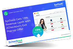
4. SysTools: Use Exit Pop-Ups to Reduce Cart Abandonment
Cart abandonment is a common issue which can occur for various reasons. These can range from factors outside your control – comparison shopping, not enough financial resources, or undecided shoppers – to small details in the shopping cart like not offering a specific payment method or having a lengthy form. The higher the rate of cart abandonment, the higher the gap it can leave in conversion rates. The good news is that you have many tactics at hand to reduce cart abandonment.
One such tactic was used by SysTools, a digital forensics company. A pop-up offer was displayed on cart abandons to help convince shoppers to conclude their purchase. This resulted in a 19% increase in revenue recovered and a 16% increase in conversion rate.

Discover the full story on how SysTools boosted its conversion rate by implementing the exit pop-up offer on the checkout page.
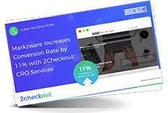
5. Markzware: Have a Holistic Look at Your Checkout Page
They say there’s always room for improvement. But how do you know what you need to improve, especially on your checkout page where you could potentially optimize every single element?
This is where heuristic analysis comes into play. As an initial step of the conversion optimization project, the heuristic analysis is conducted by CRO experts to assess a website/landing page/checkout page, etc. and identify potential areas of improvement. This method relies heavily on subject matter expertise.
When Markzware, a software developer for graphic designers, publishers, and printers, partnered with 2Checkout’s CRO Team, they had one goal in mind: to increase the global cart conversion rate by 10%.
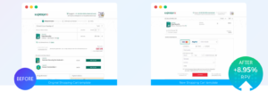
Therefore, our CRO team performed a heuristics analysis to identify potential areas of revenue leakage. On the checkout page, specifically, they found various issues like a highly visible discount coupon (which may prompt shoppers to abandon the cart and look for the coupon), a billing form that asked for street address, city, etc. (information which is not, in fact, required by the payment processor), less visible payment options and security options, lack of a progress map showing a two-page checkout, and a call-to-action that was red (which has a subconsciously negative implication like STOP/ERROR).
On the review page, they identified further issues, including a payment details form (which, according to industry best practices, should have been placed on the checkout page), no security icons, a red call-to-action button, and more.
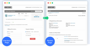
Following this assessment, we designed a template for Markzware that would address all the previously mentioned issues and use it as a test variation against the control version which was their original template. The new template resulted in a 10.78% increase in conversion rates and a 13.45% boost in revenue per visitor (RPV).
Get all the insights into how Markzware was able to exceed their original objective and increase their global cart conversion rate by over 10%, starting with a heuristics analysis, by reading the full case study.
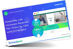
6. Kaspersky: Use the Power of Iterative Split-Testing
By now, you have learned that there are various cart elements that can be tested and optimized. Sometimes, it may take more than just a test performed on a single cart element to obtain the desired results. Shoppers have complex preferences that often mix and match, so it may take some iterations until you reach your desired outcome in terms of metrics.
The conversion optimization project that Kaspersky, a global cybersecurity and digital privacy company, conducted in partnership with our CRO team demonstrated how iterative split-testing can enable merchants to isolate and test specific elements in their shopping cart
Kaspersky wanted to increase their acquisition revenue per visitor (RPV) and recurring annual revenue by optimizing their shopping cart. To achieve this goal, we performed a series of A/B testing on the following elements:
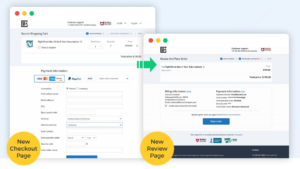
- Cart template
The control version consisted of the original two-column cart template with radio buttons for payment methods. The testing variation used a one-column template with payment buttons. This was enabled to also include the 2Checkout’s advanced PayPal features which served to optimize the user experience.
Finally, the money-back guarantee and the risk-reduction copy about reviewing the order (both important factors in the purchase decision-making) were moved closer to the call-to-action button.
This first test resulted in an 8.95% increase in revenue per visitor (RPV) with the new shopping cart template.
- Payment fields
This test was performed on the order of the fields in the payment form. The winner of the previous test was made the control in this new test – according to industry best practices, the payment form in the control listed “name” as the first field.
The test variation listed the “card number” field first. The reasoning behind this was that it would feel more natural for shoppers to enter their card information first as those fields were placed under the payment buttons with credit card logos.
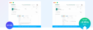
This second test revealed that moving the card number and expiry date higher on the form could increase the RPV by an additional 9.5%.
- Auto-renewal opt-in rate
The goal of the last test was to increase the percentage of shoppers that agree to auto-renew their subscription. As such, the control version showcased an auto-renew checkbox with a tool tip to explain the auto-renewal service. The variation had auto-renewal pre-selected and used an ON/OFF slider instead of a checkbox to indicate the shopper’s preference. There was also a details link that displayed more information on the auto-renewal service and opt-out options.
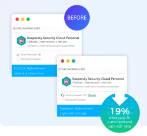
The test resulted in a 19.48% decrease in the auto-renewal opt-out rate.
After three tests, Kaspersky was able to increase revenue per visitor by 18.45% and decrease the auto-renewal opt-out rate by 19.48%
Get more insights by accessing the full case study!
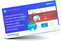
7. Backuptrans: Choose the Right eCommerce Partner to Skyrocket the Conversion Rate
Sometimes, improving your cart conversion rate is not about complex A/B testing tactics, but about partnering with the right eCommerce provider that can provide you with optimized ordering engines, including purchase flows and deep localization, that are ultimately poised to increase shoppers’ conversion rates.
At 2Checkout, we are constantly improving our ConvertPlus and Inline cart ordering engines, and following multiple conversion optimization campaigns through A/B testing and analytics, we have launched a new default design for both.
Backuptrans, a leading software developer in the cutting-edge mobile management field, switched to 2Checkout’s monetization platform and noticed an immediate improvement in their website’s cart conversion rate by 13%. This ultimately led to a doubling of revenue from their online sales!
Read the full case study to get all the insights on how Backuptrans improved its cart conversion rate!
Conclusion
Conversion Rate Optimization (CRO) projects can bring significant revenue uplift opportunities even when you think your checkout page is already performing well.
If we were to extract only one lesson from these checkout page optimization projects conducted by our clients, it would be to never stop doing tests and experimenting. Some valuable tips to keep in mind for your next optimization project include:
- Get started by isolating individual elements so you can identify what is most important to your customers
- If you serve multiple markets, focus on those with highest transaction volumes first
- Iterate often to maximize testing momentum
- Forecast revenue and ROI for every test
- Test everything
Let us know in the comment section below what tip(s) you’ll implement in your next checkout page optimization project!