As a digital marketer, conversion is one of the main things you will track in your campaigns. You probably wonder about many various ways on how to optimize conversions on a specific page. But, there is one thing that often gets overlooked by many so-called growth hackers, and that’s using text to increase conversions.
Yes, you’ve heard that right! Text copy is the backbone of every content marketing strategy. It is the form of content you see most on the Web, but it’s also closely tied with visual appeal. After all, if the text doesn’t look good, how do you expect that page to convert as you wish?
In this post, we will go through typography, its main elements, and how you can utilize effective typography to boost your sales in the long term!
What Is Typography?
Before we delve into how using text to increase conversions works, we need to find out what typography is. To keep things simple, you may consider typography as a meeting point between art and text.
Typography was introduced to most of the living world in the mid-15th century by Johannes Gutenberg and his movable type. In the computer world, typography started to get relevant thanks to Steve Jobs and his first Mac.
When the Internet was introduced to the world, the importance of typography exploded. It became one of the most important Web design components as it can help your website stand out to potential users.
The Most Important Elements Of Typography
Many people still confuse typography and fonts, which is a pretty common occurrence. In this section that expands upon the definition of typography, we will break down the six essential elements of typography:
- Typeface – Most people confuse typeface with fonts, even though these are not the same things. Consider typeface as the family that forms individual characters, letters, and numbers with the same design. Arial, Times New Roman, and Comic Sans are typefaces, and not fonts, as many would think.
- Font – So, if the typeface is a family, fonts are the family members. To put it precisely, a font is a style of typeface that has a specific size, weight, and width. For instance, Arial is a typeface; and 16pt Arial Bold is a font. Basically, fonts are the way of how you deliver a specific art form called a typeface.
- Line length – This is a distance taken up by text located between the right and left margins in the same line. Ideally, you don’t want the line length to be either too short or too long, as it can make reading the content much more awkward than desired.
- Leading – This is the vertical distance between each line of text. In most cases, you want to increase the leading to be more understandable for your users.
- Kerning – This is the white space between each character or letter. Usually, kerning is best left at default values, but you can further tailor it to test what works the best for your website.
- Tracking – This typeface element is also known as letter spacing, and it applies to a specific amount of characters and letters.
Why Is Typography Important For Web Design?
First impressions are important in our personal lives, and so is the same in the Web world. The research by Taylor & Francis Online concluded that it takes .05 seconds for users to form an opinion about a specific website.
Typography is essential as it is one of the core components of your web design. Just think it over: if people cannot read the text on your website because the words are too close together or the text size is too small, then they will most likely leave your website unsatisfied.
When you utilize poor typography on your website, it is most likely that your conversion rate will drop, and it’s the last thing you need on your plate. Even if your potential customers stay on your website that utilizes poor typography, they most likely won’t remember the message you wanted to convey to them, but the struggle it took for them to read your message.
For the reasons above, using effective typography to boost conversions is essential. With effective typography, you can optimize the process behind understanding the information you show on your website. If you format the text on your website nicely, all the focus will be set on the content and not on the struggle to understand that content.
As most people scan through Web content, using text and guiding your users with proper typography to the point of action is the right way to increase conversions!
Actionable Tips For Using Text To Increase Conversions
Now that you’ve learned something more about typography and how it helps make your web content stand out, here are some tips on how to use it to drive growth to your website!
Keep The Font Size In Mind!

Image Source: Research Gate
Font size is paramount in retaining your users and increasing the conversion rates further! Yes, our brains indeed process images tens of thousands of times faster than text, so any way of improving that procession time with text gets a warm welcome!
Take, for example, an eye-tracking study of how font size and type influence online reading. By using larger fonts, the overall text on websites tends to be read much faster.
So, if you have a text-heavy website, don’t torment your users – increase the font size! Yes, each font is different, but here is a consensus behind the font sizes for text-heavy websites:
- 16px – it is the minimum for text-heavy pages, so don’t go underneath this number! Basically, this font size is the size that browsers were intended to display on default, so it’s a no-brainer why this is a minimum.
- 18px – this is the golden average font size for text-heavy pages, making people strain their eyes less when looking in their monitor.
- 20px and more – even though it may feel too large initially, some websites perform even better with such a font size. Take Medium, for an example. They use a 21px body font size to make the millions of stories more readable for a wider audience.
Additionally, larger font sizes do tend to produce stronger emotional connections. Maybe this is the step you need to do to make your users click on that CTA button that results in a conversion?
Don’t Overuse Font Styles!

Image Source: Tealfeed
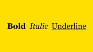
Font styles generally include: bold, italic, and underline. You can use these three to emphasize certain words or sentences. Still, you should avoid overusing them, as that is one of the most common editing mistakes we see around on all Web content.
Don’t overuse font styles over whole paragraphs. Instead, use them to point out the words that you want to resonate the most with your users. You don’t want to get yourself in a situation where you use text to increase conversions improperly.
Adjust The Line Spacing Accordingly!
We’re talking about leading here. This here is such a small thing, yet it is imperative when it comes to using text to increase conversions. When you have an audience with partial sight, they may face difficulties finding the beginning of the next line of text.
That’s why it’s a common practice to space your lines at least 25 to 30% of your font size. When doing so, you will make your text readable for virtually all readers!
Also, you should always pay attention that you add sufficient space between paragraphs. Basically, you want to group paragraphs to align with the message you want to convey in a few sentences. That way, your content will be more readable to your target audience.
You also want to pay attention to the visual hierarchy of your type. This can be done either by setting the header tags properly, but that’s not all you can do. One of the best ways to utilize visual hierarchy properly is to enlarge the most important messages your text covers. Ultimately, you want to guide the users so they can read the information in a certain order that makes sense. This will give more meaning to your overall content.
Along with all the aforementioned, utilize whitespace to bring focus on areas that you want to emphasize to your audience. That way, you will allow your design to breathe, and provide context to the places where it’s the most needed.
Avoid Widow Lines, Orphan Words & Hyphenation
Widows and orphans are pretty common terms in typesettings. They are very similar in nature, but many people confuse them for each other. Widows indicate a paragraph-ending line of text that sits alone at the beginning of the page. Orphan is a paragraph-opening line that sits at the end of a certain page. Both of these can break the readability of the text, especially in Web design.
Well, fixing these two issues isn’t that difficult, and it all comes to the above tip. You can either rewrite a paragraph to fit into the big picture or adjust the leading and spacing to create tighter paragraphs.
Also, hyphenation is quite a common occurrence in Web design and can make or break the whole typography on your site. Basically, hyphenation is using a dash to split a word (for instance: dog-friendly). When it becomes a problem is in situations where you need to use a dash to break the word from the end of the line. Instead of doing that, just pull the given word in a new line so you don’t break the readability altogether!
Don’t Overlook The Text Alignment!
Text alignment often goes overlooked when it comes to text in Web design. But, if you do it right, it works wonders when it comes to processing information. Here are some tips to follow when it comes to text alignment in Web design:
- Avoid centering paragraphs. While some would argue that centering whole paragraphs may seem artsier, what they are doing is the complete opposite. As most of us in Western societies learn to read from left to right, it is in our nature to travel to the beginning of each line. When you center the paragraph, it just makes it harder for our brains to process all that information.
- Center only when you want to emphasize a message. Still, centering a paragraph is more than welcome when your goal is to place focus on a certain passage of text. It creates a contrast that immediately transfers the message to your readers. Centering text is also useful for headers and quotes.
Pair Typefaces That Look Cool Together!

Image Source: Creative Bloq
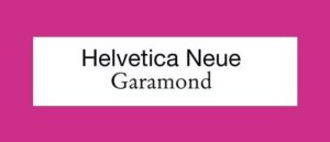
When you use just one typeface throughout your website, things may get a tad boring. Still, that doesn’t mean you should use ten different typefaces on your website. Simplicity is key here, but don’t be afraid to experiment a bit. After all, you want your content to look as attractive as possible, right?
One of the rules when it comes to pairing typefaces on websites is to use no more than two or three typefaces simultaneously. Today, with services like Google Fonts, more typefaces can be rendered than ever before. While this may get a bit overwhelming, here is a list of 36 perfect font pairings to inspire you!
With a vast amount of choices for choosing typefaces and fonts, you can further tailor your text to radiate with the unique personality of your business. Do you want to look creative or traditional? You can do both of these tones and much more with the proper choice of typeface. Don’t overlook it, as it is one of the best ways of using text to increase conversions!
Know When To Differentiate Sans-Serif & Serif Fonts Accordingly!
Closely tied to the point above are the two main types: the Sans-Serif and Serif. Some would argue for the one, some for the other. The bottom line here is that there is no concrete research that suggests that Sans-Serif is better than Serif and vice-versa. But, that doesn’t mean that there are some conventions to follow:
- Sans-serif is easier to read and is better for the body copy – when it comes to the body of online content, sans serif fonts work the best here. That’s because this type is simple and requires less time from your users to decipher the message you are trying to convey.
- Serif is better for headlines – even though Serif is more complex than Sans-Serif, that is precisely the reason why you want to use it for your headlines. Serif oozes with character, and you want that character to outline your main points with your online content.
When you balance these two types, you can make visually interesting content that will attract more users to read your whole content piece and perform the conversion you’re waiting for!
Choose The Type That Fits Your Message
People indeed tie typefaces to different personalities, according to the study conducted by Eva R. Brumberger. Most typeface characteristics can be divided into three categories: directness, elegance, and friendliness.
According to the point made above, consider what kind of message you want to convey with your website and branding. Do you want to sound professional or playful? Or, maybe you want to sound creative and playful? Set the typeface accordingly, and you will attract the right kind of people.
One field of online business where this comes in handy is email marketing. Based on a study from 2019, for every $1 you spend on email marketing, an average ROI is $42! That’s a huge number, and it’s really not a wonder that many online-based businesses focus on email marketing strategies to attract new customers.
Hence, email marketing is a very competitive field, where every little detail matters. One of the great ways to stand out for your customers is to utilize the right typography according to the message you want to send!
But, as more businesses utilize email marketing to attract the right kind of audience, scaling is more important than ever. Also, if your email list is full of different individuals, such as professionals and day-to-day consumers, creating templates manually will be time-consuming at best.
Thankfully, there are dozens of free email marketing services that will help save you time on operative tasks, and enable you to plan and strategize further for the growth of your business! Most of these will offer email templates, email automation, and reporting to track your email marketing campaigns.
Use Contrast To Your Advantage

Image Source: 3.7 Designs
Why do you think road signs are so noticeable to all people? They stand out from the rest of the environment, making us assume that these elements are important. That’s the main reason why we look at such elements first.
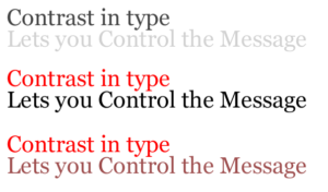
The same can be applied to Web design. Using text to increase conversions sometimes can be as simple as utilizing contrast to your advantage. What you want to do here basically is to increase readability so that your users retain longer on your content.
One of the common ways to do so is to create the right amount of contrast between your text and background. There is an ongoing debate between two types of contrast:
- White text on dark background
- Black text on white background
While the white text on a dark background (or the “Dark Mode”) has its advantages, research shows that black text on a light background (or the “Light Mode”) leads to better performance most of the time.
Still, the “Dark Mode” can benefit those users that read your content in low-light conditions. So, why not include both text contrast modes and see what happens with your conversions?
Consider The Age Of Your Users
According to Statista, the demography of Internet users is the following:
- 18 to 24 – 18 percent
- 25 to 34 – 32 percent
- 35 to 44 – 19 percent
- 45 to 54 – 14 percent
- 55 to 64 – 10 percent
- 65 and over – 7 percent
Now, take into consideration the fact from CDC that approximately 12 million people that are 40 years old and over have vision impairment. Basically, if you don’t optimize the text on your online content to be readable for people with visual impairment, you’ll be missing out on 50% of the Internet users.
Typography Is Just The Tip Of The Iceberg!
Of course, using text and typography won’t be the only things that will increase conversions in your case. You may need to repurpose your content altogether or target better keywords for which you can rank easier.
The thing is, being creative with conversion optimization is what will set you apart from the competition in the long run. And the thing that might set you apart is maybe just fine-tuning your typography!
If you can’t do it alone, you can always find web designers online to transform your Web content into a visual masterpiece. After all, people these days value visual content more than just pure text.
About the Author

Robert’s passion has always been web tools that make your life easier. That’s why he founded the WebsiteToolTester, where you can find reviews and tutorials for the world’s best website builders and e-commerce platforms.


