B2B eCommerce revenues are expected to double this year, with 55% of B2B buyers completing at least half of their purchases online. Buyer preferences are constantly changing and adjusting to the trends generated by digitalization, and B2B buyers are no exception. So it is no surprise that in 2020 the online sales channel and online customer experience (CX) will account for the main areas where B2B companies will be able to create differentiation.
Considering these market opportunities, you should start leveraging and optimizing your B2B website. As a B2B business, your website is likely the most effective in terms of demand generation. So, to generate a seamless customer experience, there are some general features that your prime touchpoint should tick off the list, much like any B2C website.
And, while it is essentially individuals that are actually making the buying decision, there are some additional particularities shaped by the fact that those individuals make purchases for their companies.
Here are 10 features your B2B website needs to have in place to effectively meet those rising customer expectations.
0. Customer-centric website
Customer experience will be the main focus of online businesses this year. In an online market, where sadly most B2B websites create experiences centered more around themselves (their capabilities, their achievements, and their story) than around their customer, it is no wonder that customer experience becomes the basis for differentiation.
So, what does it take to become customer-centric?
First, you need to have a two-fold understanding – on the one hand, of who you are and what experience you will provide and, on the other hand, of who your customers are and their intent (what are they looking for, really?).
It’s of utmost importance for you to build the whole website, from a content and a technical perspective, with the ideal personas and client profile(s) in mind. To do this, start by mapping the customer journey from discovery all the way through exploration, consideration, trial, engagement, and growth. You can gain an understanding of the needs and pain points that your customers experience during each stage and then leverage each stage accordingly via the website.
Don’t worry if you notice that the journey is not linear – it’s perfectly normal for your customers to repeat certain steps or to get stuck. Those will also be opportunities for optimization.
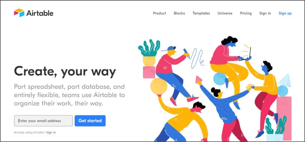
By gaining the necessary customer insights, you can design your website so that it shows your prospects and customers how your solution can address their needs and how it helps them achieve desired outcomes.
Present your product or solution for different categories of buyers, with overviews available in terms of prospects’ different industry, size or the person’s role within the company, to achieve a customer-centric direction. Building all this with personas in mind will help greatly.
Buyer personas are a fictional profile of your ideal target customer based on extensive research. Having your buyer personas in place will enable you to craft the appropriate content for each of them and reach the content customization level expected by your prospects.
In the end, the trick is to demonstrate empathy and invite your visitors to engage in conversation, showing you are actively listening, understanding, and working out a solution for their needs.
1. B2B commerce self-service functionalities
Gartner predicted that by 2020, customers will self-manage 85% of their relationship with a company. As hinted before, obsolete cold-calling or even reordering over the phone with sales rep won’t do you any justice. As digital transformation is ingrained into every business area, buyers’ expectations shift as well.
B2B customers are comfortable having control over their purchases.
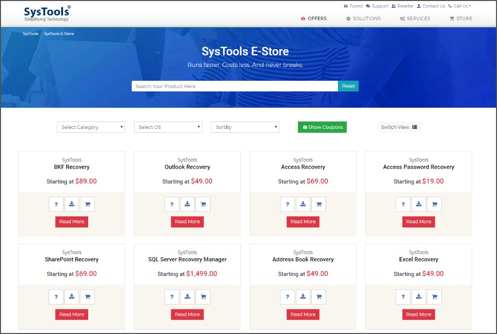
Self-service portals or apps address this new need allowing them to order on their own terms. By integrating your website with an eCommerce platform, your customers will be able to research your products, ask for quotes, place orders and reorders quickly (irrespective of time and location), check order status, gain access to a Knowledge Base, etc.
However, don’t fall into the pitfall of automating everything – the key is to balance the digital and the human interaction. It’s enough to automate only those routine or procedural tasks that can be done by the customer without interacting with a sales rep. This way, a lot of time is saved for both parties.
But in the end, B2B is based on developing and nurturing strong relationships with the customers and, for this purpose, more personal interactions with the sales team can not be fully replaced by digital solutions.
2. Easy connection to the sales team
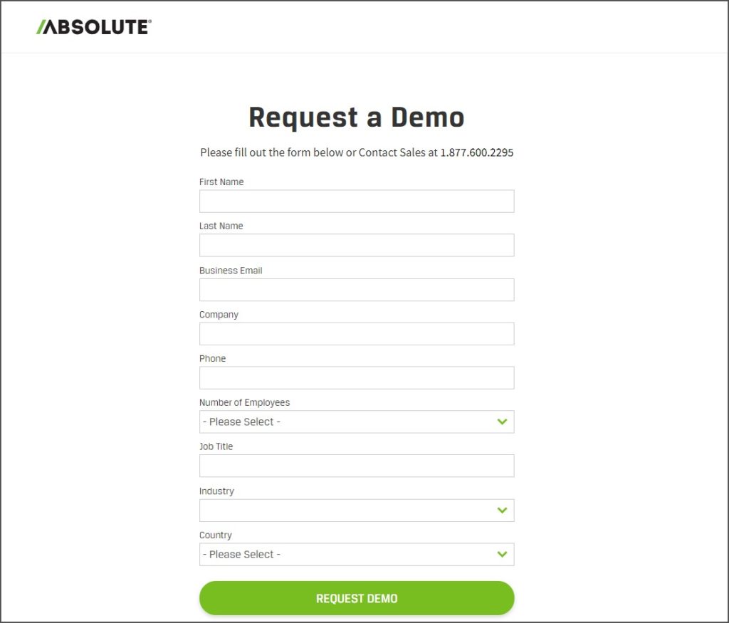
This can be tricky. Many companies think chatbot pop-ups are a smart move, but they might actually seem intrusive. You want to avoid these pop-ups that appear immediately after a web session starts, asking visitors who may not even be leads to talk to a sales representative. These are the modern equivalent of the door-to-door salesperson showing up uninvited on your doorstep.
Instead, try providing a non-intrusive message letting visitors know you’re there to answer their questions when they are ready.
3. Customers’ language
No, this one is not about trying to translate your website copy into your customers’ native languages (although that type of localization is desirable, too). It is actually strongly linked to the customer-centricity feature discussed above.
After having understood the business needs and objectives of your customers, you need to create website copy around those outcomes so they can easily understand that your solution is appropriate for them. Most of the time, they are aware of their problem or need, but they don’t associate it with your solution (or even with your product category). That’s why you should fill in this gap by helping them, on their terms, understand why your product or service is relevant.
In fact, all of this comes down to translating your product capabilities into their desired outcomes. While doing so, make sure to avoid industry jargon that is difficult to digest; keep the language simple and precise.
4. Landing pages
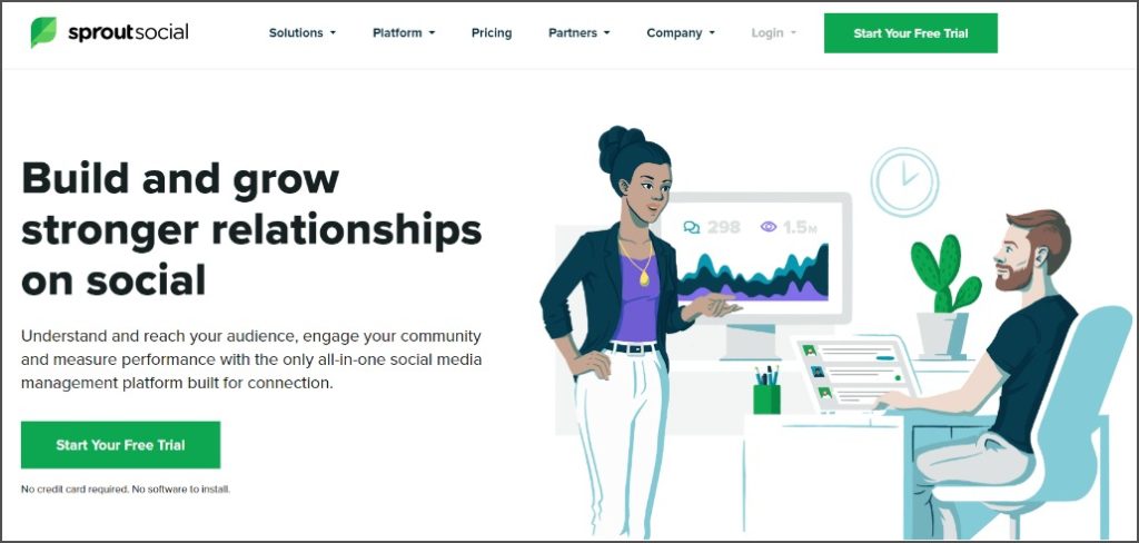
Unlike normal website pages, which have multiple goals, the landing page’s sole purpose is to drive conversions, making it an essential part of any marketing campaign. With 68% of B2B businesses using landing pages to acquire leads, they are usually designed to be campaign-specific, most of them including only one link as a call-to-action (CTA).
The types of conversions they can generate range from signup and registration all the way to purchase.
As a B2B website, you want to implement your landing page for two main reasons.
First, they help you acquire new leads. In fact, landing pages are the door to gated content – in exchange for premium resources you have on your website (such as webinars, eBooks, whitepapers etc.), interested visitors need to fill out a form, providing information such as name, email address, or company.
Secondly, once you’ve acquired new leads, you can leverage this information in order to further nurture them and provide more targeted content depending on their stage in the buyer journey (interest, consideration, or intent). Given that 96% of your website visitors aren’t ready to buy, lead nurturing is key to converting them.
Landing pages can also be leveraged to motivate existing prospects to move further in the sales funnel – as a result of an email campaign, your prospects can access a landing page with a limited offer.
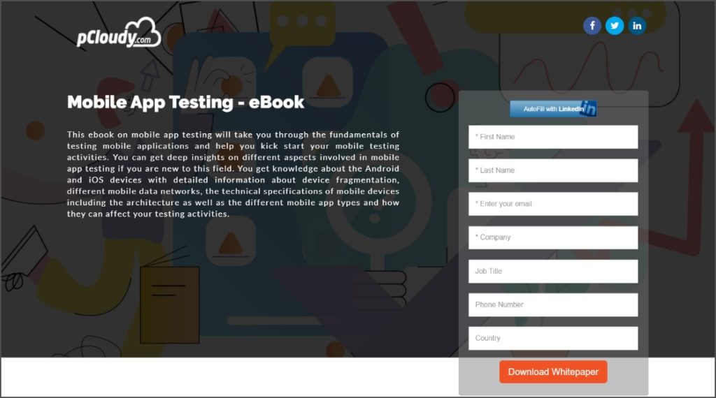
To put it simply, it’s time to start building and leveraging landing pages, as they are a simple and yet very effective tool for your lead generation and sales goals.
5. Calls-to-action (CTAs)
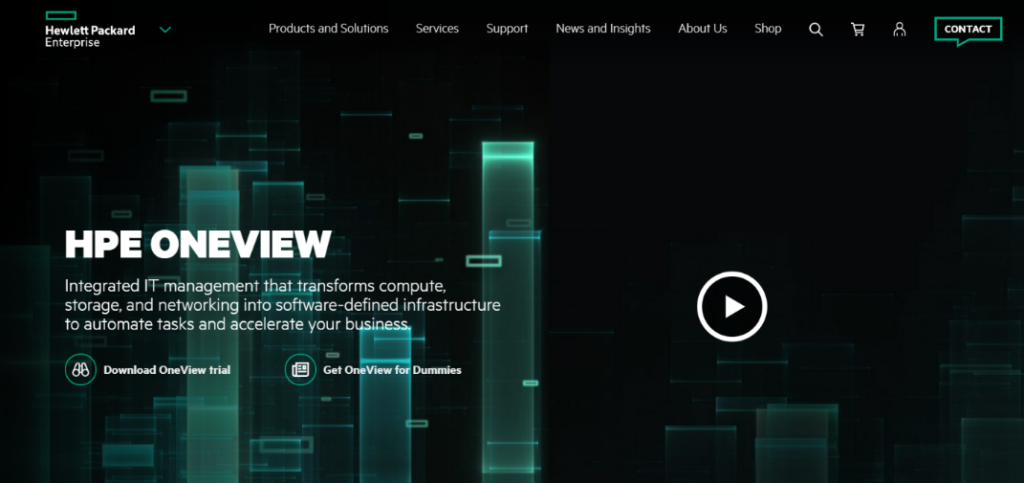
Calls-to-action (CTAs) are also an essential component of companies’ lead generation efforts, and, for that matter, of any inbound marketing strategy. As with landing pages (where they are, in fact, featured), the main purpose of calls-to-action is to drive conversions. Effective calls-to-action result in prospects proactively making a desired action. Sounds great, right?
As a starting point, you should consider your conversion goal – a webinar registration requires different messaging than a trial download. However, designing compelling CTAs requires an ongoing improvement process in terms of message copy, design, and placement on the page. A/B testing will become your best friend, helping you compare the way visitors respond to different variations in your CTAs.
In the end, calls-to-action should be clear and specific, so that visitors understand what they need to do to achieve the desired action.
6. Flexible ordering
The purchasing patterns of B2B buyers are quite different than those of the B2C ones. You must ensure that your eCommerce platform supports these must-have features:
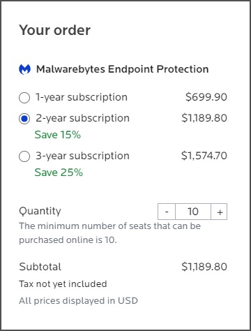
- Bulk ordering and discounts – Most of the time, B2B customers order large quantities, so it is crucial to simplify this tedious and sometimes routine task by optimizing the checkout process with the necessary built-in functionalities. You may want to consider the possibility of dynamic prices, changing in real-time, according to certain criteria specified by the buyer. Volume discounts or total order discounts based either on the quantity or amount ordered should be available as well.
- Minimum order quantity – Many B2B vendors impose such a restriction in order to maintain their profit margins. Adopt it if it makes sense for your market strategy.
- One-click reordering – Reordering is quite a repetitive and routine task. By enabling the one-click reordering feature, your customers’ previous order information will be saved so their next purchase can be completed in one click.
- Automatic renewals – why settle on one-click reordering? Package your services and even your physical goods as subscriptions and entice your customers to switch to auto-renewals for convenience and speed.
7. Educational content
Almost two-thirds of B2B buyers cite informational content as a notable differentiator for winning vendors. Conductor’s study on the impact of educational content on customers further revealed that visitors are 131% more likely to buy from that brand after having consumed its content. Matching this trend, last year, educational content ranked second among methods used by B2B content marketers to nurture their audience, with the budgets allocated for content creation also having increased.
Therefore, investing resources in educating your customers through blog posts, eBooks, webinars, infographics, or whitepapers is essential. These pieces of content demonstrate that you understand your customers’ needs and challenges.
The B2B customer is more rational than the B2C one, plus there may be more stakeholders involved, so they need extra resources to make an informed decision. In addition to providing extra value to customers, educational content can be used for conversion purposes (gated content, as explained above) and for building a reputation as a thought-leader. If done right, your SEO will also benefit from this.
However, the B2B industry comes with an extra layer of complexity because customer needs vary depending on their size, industry, and roles. In fact, 68% of B2B buyers want content organized by issue or pain points and 59%, organized by industry or vertical. As such, a common practice of top B2B marketers is to organize the website content based on these variables in order to deliver targeted experiences that add real value.

8. Client success stories
For B2B buyers, case studies are the most valuable content format. Maybe nothing can advocate more effectively for your solution’s effectiveness than your client success stories.
Educational content is meant to address rational needs in the purchase decision process, therefore consumed more often in the early and mid-stages of the buyer journey.
Although they are more results-oriented, customer testimonials – especially video testimonials – and case studies appeal to empathy and preferred in the later stages. They help prospects understand how your solution helped other industry peers, adding a layer of credibility and trustworthiness to the brand.
The story format is also bound to foster engagement and humanize the brand. Hinting back to B2B buyers’ preferences regarding organized content, you should also filter the case studies by industry, business type, and needs.
Moreover, customer success stories offer a win-win situation as they are also a way of building and strengthening your relationship with existing customers.
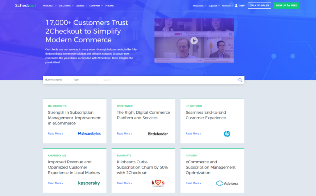
You can go for one-pagers, case studies, or video testimonials, and feature these further in other pieces of content, for example, invite a customer to speak at a webinar, or on a discussion panel, embed a video testimonial into a company presentation and so on.
9. Pricing pages
B2B pricing models are quite complex but if you want to also sell with your website, and not just collect leads, a separate pricing page is a must. There are a few key aspects that you need to address in order to keep your pricing page simple, transparent, and trustworthy.
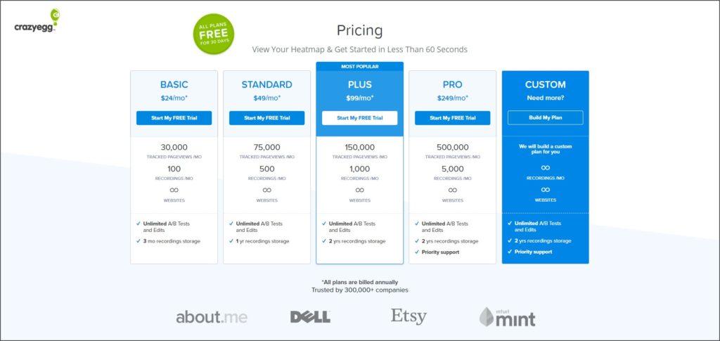
First things first, provide the right number of pricing options, i.e. the pricing tiers or packages designed for your unique buyer personas. If we take the software and SaaS vertical as an example, although there are many factors that can influence the number of plans you offer, it seems that the industry’s golden number is three. The reasoning behind this is quite simple, addressing, in very broad terms, low, medium, and high customer tiers.
Another aspect to keep in mind would be the ordering of the plans. Because most people read from left to right, displaying prices from low to high is the norm.
You may also consider including annual packages. By offering discounts to the next annual renewal, you can reduce up to 6.5% of voluntary churn. Free trials are also important because they allow customers to test the product before deciding to commit.
Don’t forget to highlight a specific plan. Customers want guidance, so revealing the most popular plan chosen by similar users can significantly help them in their decision-making process.
As the prices of the plans increase, it is important to provide the option to contact sales for more information. Typically, the most expensive plans (the enterprise ones) require customizations based on the customers’ specific needs.
Social proof can be also helpful to build trust in the eyes of potential customers. In this regard, you should consider listing some of your most high-profile clients and their testimonials. A single line of testimonial can convert an undecided visitor into a paying customer. Emphasizing security certificates is of paramount importance when building trust.
10. Sign-up page
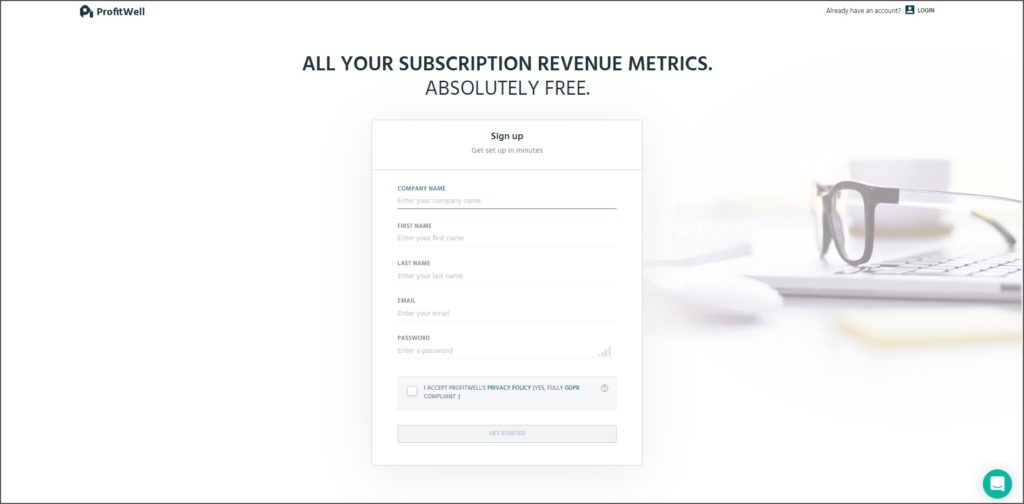
Sign-up pages are, essentially, still landing pages (LPs). Their main purpose is to drive registration for your solution. The LPs hinted before are aimed at lead generation and nurturing, whereas the sign-up pages are the last step in the purchase funnel.
When designing these pages, the focus should be on providing a frictionless conversion experience. That’s why they are mostly pretty simple – a benefit-oriented headline, a smart call-to-action, and a few fields to fill in. To further tweak it, you might want to consider social autofill, which is bound to increase conversion rates.
Conclusion
And that’s a wrap! As you’ve probably noticed by now, most of these features are interconnected, requiring a great deal of planning before being implemented. Your customers and their lifecycle stage should guide you in designing, building, and optimizing your B2B website.
Design your website so that prospects naturally experience all of the purchase funnel stages – they first want to do their own research on the solution (and remain anonymous), then read educational content (which, if effectively done, will convert them into leads), and only when they decide that the product is appropriate for their needs, start engaging with the sales team. From here on, the sales team should be able to provide them with more relevant information.
Ultimately, you are addressing another company. So, you might as well ask yourself “What do I expect from the websites of my business partners?”
Finally, a quick shoutout to the B2B buyers reading this – let us know in the comments below some of your favorite features when navigating B2B websites.
Check out also the infographic on this topic, for a quick, visual overview:

