eCommerce has grown tremendously during the past few years, and it will continue to grow as companies become more and more interested in providing a better online shopping experience for their customers. Shoppers are now used to placing their orders from multiple touchpoints, and the majority of them rely on their mobile devices to do so. More than that, sometimes shoppers start from a mobile device and then finalize the order later from a laptop, or vice versa.
Therefore, the users’ need for a seamless shopping experience across devices is now more obvious than ever.
As online shoppers’ preferences are constantly changing, meeting their needs means vendors have to follow and apply the appropriate design trends for their specific industry. For the SaaS industry, the stakes of getting design just right are even higher. A big part of convincing customers to pay for an intangible service is conveying the right message, and your visual look is half the job.
With that being said, let’s dive in and see what 2020 has in store for eCommerce design and UX.
01. Minimalism
Minimalism is a trend that has been with us for a long time now, and every year it just keeps evolving. “Less is more” is a phrase that summarizes very well what minimalism is all about. Offering an uncomplicated experience, minimalism is elegant, simple, and meaningful.
So what does minimalism stand for this year?
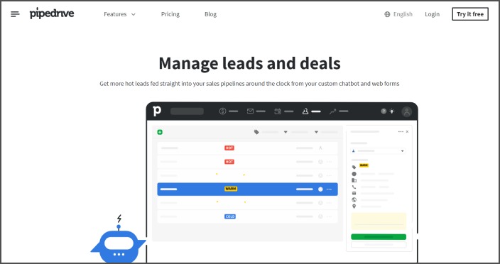
In 2020, whitespace is being used even more to make interfaces look elegant and sophisticated. The secret is to use it carefully without making the layout look and feel empty.
A great example comes from Pipedrive, as they managed to keep their interface meaningful and simple.
02. Asymmetrical Layouts
In the past years design trends have been focused a lot on symmetry, but this year we might see a real comeback of asymmetrical layouts.
This technique allows you to guide your user’s journey through your website in a more dynamical and creative way. All symmetrical layouts follow a pre-defined grid for placing elements throughout the page, while asymmetrical layouts allow you to break that grid and get wild with your layout. Use this freedom wisely and the results can be astonishing.
When done right, asymmetry works because it succeeds to inspire a more authentic overall look. These types of layouts tend to be harder to produce, but their utility is uncontested. On one hand, they are sometimes more visually stunning, thus managing to create more visual tension. On the other hand, they can be useful in your overall UX approach, as the asymmetry can point to a focal point of interest in your layout.
03. Material Design
In past years, we’ve seen a lot of websites created using Google’s Material Design as a guide for their visual, motion, and interaction design across platforms and devices. What they tend to have in common are their grid-based layouts, their use of animations, transitions, padding, lighting, and shadow effects, which all make a stronger visual impact.
This year, material design will continue to gain ground, and it will help you deliver a much more engaging user experience to your customers. This will bring even more customization and advanced interactivity to your eCommerce website.
04. Animations and Motion Design
Animated content has the ability to explain a complex concept in a very simple and interactive way, and can also make an experience more memorable. That’s why this year we will see animations in almost any context: logos, illustrations, UI elements, and so on.
Animations can enhance the interaction with any given interface, but it’s important to make sure that the users don’t get mesmerized by it and can still focus with ease on the content.
Source: dribbble.com
05. Micro-interactions
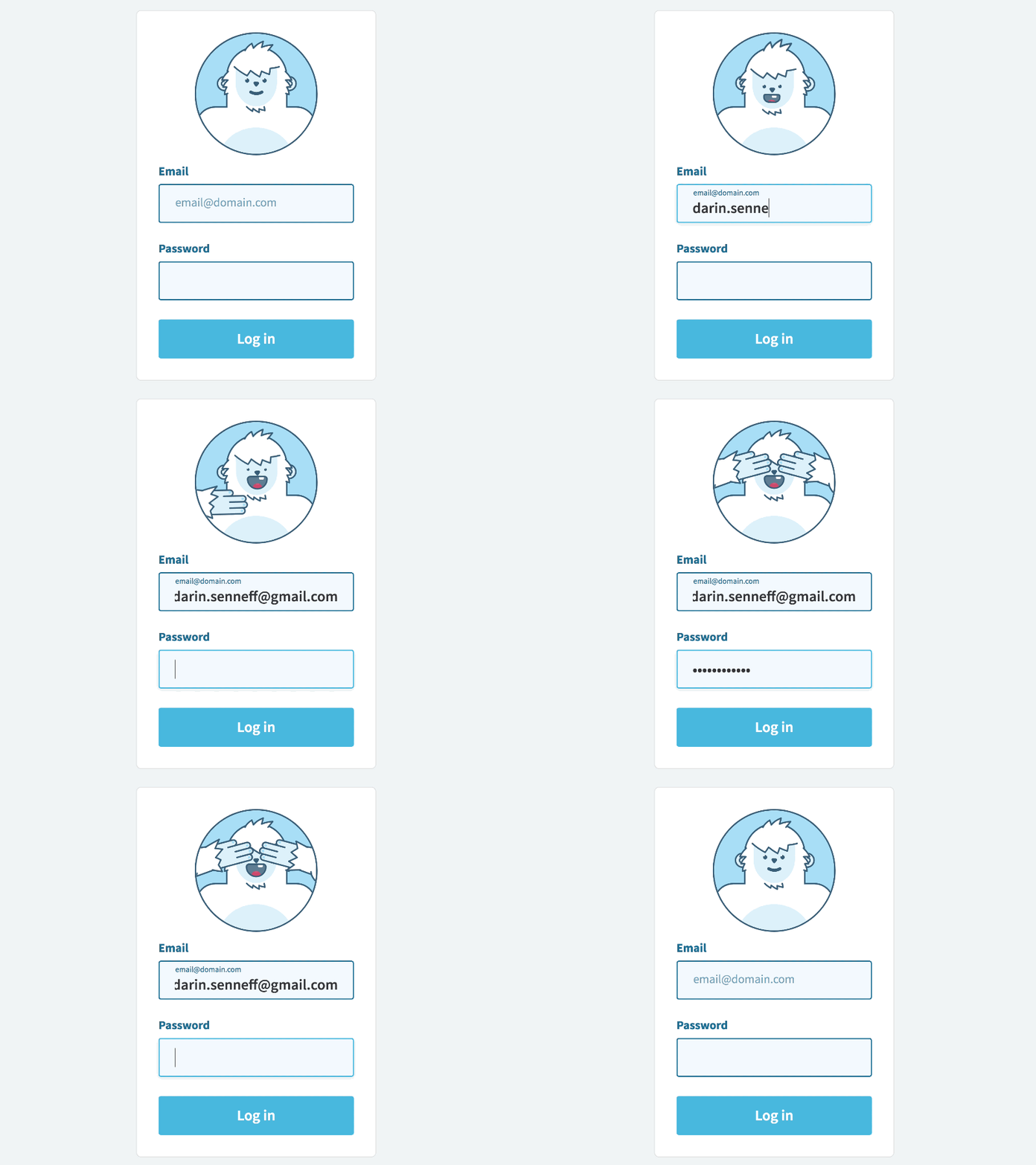
We’ve talked about animations at a large scale, but we’ve also seen some great micro-interaction examples in the past couple of months.
Micro-interactions succeed in communicating status and provide instant and relevant feedback about the users’ actions. These small design elements can bring real delight to the users, and make the interface more human by adding an emotional layer to it. Overall, micro-interactions can enhance the entire customer experience, making it feel more personal.
06. Bright Colors
In the last couple of years, bright colors have been an important design trend, and it seems they will continue to be used for a while.
Used wisely, colors can help convey messages and create a better browsing and shopping experience. Using trending colors keeps your website fresh and welcoming. This is also why we’ve probably been seeing a lot of new color-generator sites released, like Adobe Color Wheel and Coolors.
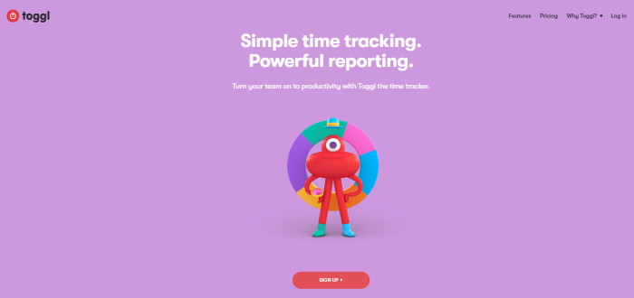
It’s therefore very important to understand how colors work, how to harness their power, and how to make the right emotions come to life. This article can help you choose a color that will suit your brand the best.
07. Oversized Bold Typography
Using bold typography when designing a website makes your message more clear and easier to understand. In some cases, it even replaces the whole background image, becoming itself a strong and self-sufficient visual element.
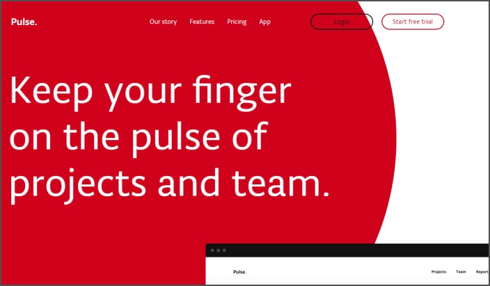
This trend also complements others that we’ve presented, like minimalism, asymmetrical design, and motion design.
08. 3D Modeling and Rendering
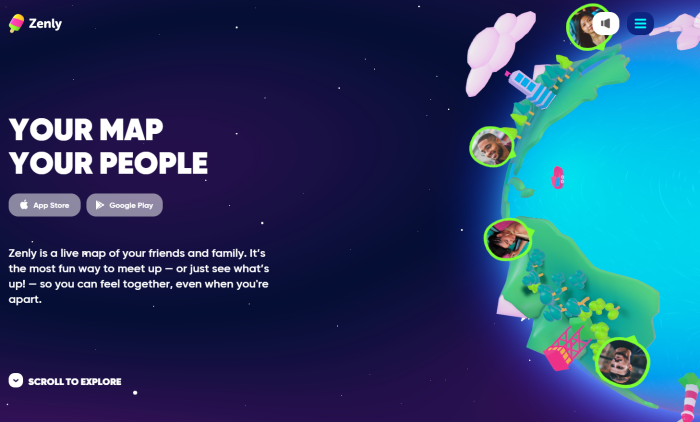
In 2020, we will see more 3D-rendered images, illustrations, and animations, as they offer more depth and details, making the design more realistic. By using 3D-rendered models together with shapes, bright colors, and bold typography, you can achieve an elegant and high-quality design.
The folks at Zen.ly have a great website that is highly interactive, making you feel part of their world, in a way.
09. Accessibility
In an eCommerce business, it’s important to reach as many customers as you can. Limiting access to whole categories of users would be bad for business. By not making your website accessible for persons with disabilities, for example, you lose potential clients.
Usually, you make your website more accessible by refining the user experience. For example, including text-to-speech features can benefit those with disabilities, while also improving the experience for the rest of the users and boosting overall engagement.
Source: dribbble.com
10. Better Personalization
Personalization uses AI and Machine Learning to gather data, and then uses it to offer personalized content for each user. Understanding the behavior of individuals can offer valuable insights that will help us deliver more relevant content, based on each user’s preferences.
This can be a very powerful tool, so we expect improved personalization will be used more and more in 2020.
A Final Word
We are excited to see how web design trends evolve every year, and we think 2020 will bring even more opportunities to improve the online shopping experience. SaaS companies have many great practices to choose from to build a more inviting and relatable visual experience.
We believe that this year will be marked by the use of animations and micro-interactions to deliver a much more engaging user experience. Stay on top of this year’s design trends, and find new ways to take your eCommerce business to the next level.
For more such ways, make sure to also check out this article on growth hacking tips from the experts.

