Updated in October 2021.
We’ve all been there.
Whether you call it window shopping, comparing prices, exploring gift options, or just mere curiosity, it’s often followed by abandoning the checkout process.
But what is shopping cart abandonment, exactly? It’s the process that takes place when a potential customer browsed through your products, added a few of them to their online cart, but when they reach the checkout point, they drop out before completing the purchase.
How to calculate your shopping cart abandonment rate
To calculate the rate, you divide your total transactions completed by transactions initiated. The result will give you the percentage rate of the site visitors who intended to make the purchase but haven’t actually completed the process.
In a study conducted by the Baymard Institute, it was shown that the average shopping cart abandonment rate in 2021 has reached 69.80%. The top reasons why customers abandon their carts during the checkout process are: high extra costs (such as tax and shipping), the need to create an account to finish the payment process, and slow delivery time.
In this post, we will focus on other important causes behind cart abandonment, which we consider to be preventable. Our list of reasons for why shoppers abandon their carts is put together based on a series of e-commerce studies and our own software and SaaS clients. Not only that, but we will also provide easy “fixes” for some of these abandonment triggers.
Bonus: Check out our tips on how to choose a shopping cart that converts.
Let’s take a look at some of the most common reasons for cart abandonment and how you can bring back users who abandoned their carts.
1. Lack of Perceived Value
Too often, users don’t understand the real value of your product. They give up on their purchase during long or complicated checkout processes because, deep down, they feel that what they’re about to acquire is just not worth it. This can usually be prevented by reducing perceived risk through money-back guarantees (to remove value hesitations) and by communicating trustworthiness with a well-known security icon.
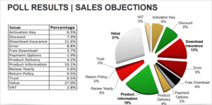
Movavi conducted a survey to understand why shoppers don’t complete purchases and found that the major reason, accounting for 27% of objections, wasn’t related to trust or security, but the perceived value of the product. As a result, Movavi worked on improving its perceived value while also communicating with a bigger emphasis on t site security.
The study also showed that displaying too much information about a product on the checkout page can actually be harmful rather than helpful. Instead, product details should be communicated upstream in the purchase funnel. Your users will respond positively to a cleaner-looking cart with less text and a lower cognitive load.
2. Lack of Reassurance
Hesitation and uncertainty are some of the biggest enemies of eCommerce merchants. Usually, shoppers have to take your claims for granted and hope for the best when purchasing your product. Offering some kind of insurance reduces the potential objections a prospect might have when buying.
Interestingly, Movavi found out that its own Download Insurance Service (DIS) was one of the main reasons for shopping cart abandonment among its customers. Movavi wanted to test the best way to display the service on the checkout page and tried two versions:
Variation 1 offered a more detailed explanation for the Download Insurance Service and allowed the user to “opt-in” to the service.
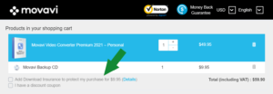
Variation 2 included a Download Insurance Service opt-out but still offered in-depth information about the service.
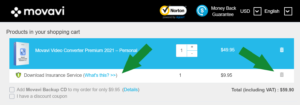
Which variation won? Variation 2 was the best performer, with the following outcomes:
- Highest attach rate for Download Insurance Service
- Highest attach rate for Backup CD
- Highest revenue per visitor (RPV)
- Similar user experience to control (low-risk change)
What is the main takeaway from this test? Users seem to respond better to the Download Insurance Service when there is an explanation alongside the product. They don’t necessarily respond negatively to having DIS automatically added to the cart, but they become less responsive to having it added without an ample description.
These learnings allowed Movavi to continue offering Download Insurance Service as a product and maximize both conversion rates and average order value.
TIP: More users are persuaded to buy when you “reverse risk” with a money-back guarantee, so use this opportunity to your advantage. Displaying information about your refund policy will also help reassure users. Adding icons showing your “Satisfaction Guarantee” or a “30-Day Money Back Guarantee” can remove hesitation and reduce risk by reassuring buyers that they have recourse if they don’t like the product. These guarantees show that you care about customer satisfaction and may remove the doubts that can trigger cart abandonment.
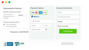
To further boost trust, you can display customer support contact information such as a 24/7 local toll-free phone number at the very top of the page. The footer can include additional details such as email, instant messaging, or live chat, and social networks. Shoppers will trust you more when they can see how easy it is for them to reach you through a variety of channels.


Finally, when using an eCommerce provider as your merchant of record, leverage the credibility of your eCommerce partner by co-branding the cart page and adding their logo to the header. This is especially important because the users need to understand that by clicking on the buy button will redirect them to a third-party eCommerce provider.

3. Cart Errors
Even if you have the best IT team by your side, from time to time your website might crash, or your checkout page might display an error. Shoppers are very sensitive to these situations, so they may give up on buying a certain product or abandon your company altogether if something goes wrong – even if it was a one-time only episode.
As you improve your checkout process, keep in mind that system-generated error messages need to be read and understood – by actual people. Display only clear error info and actionable fixes that will help shoppers resolve an issue. Provide visually distinctive cues when errors are generated and when they’re resolved.
TIP: Make sure you have a team monitoring checkout pages to prevent small mistakes from affecting your conversions. You can also customize recovery actions based on the type of errors that occur. For example, to fix an “invalid signature or link expired!” error in the shopping cart, you can set up an error event trigger with a third-party app (such as Google Analytics) that can solve the problem faster and more efficiently and also generate specific follow-ups.
4. Price Research
Another key reason shoppers abandon their cart is an artifact of “window shopping” or “comparison shopping,” where they don’t feel sufficiently compelled to complete the transaction.
In this case, users are checking out your pricing or comparing you with your competitors. To create a sense of urgency and avoid losing potential buyers, try to recover these potential cart abandons with an offer they can’t refuse. Use exit pop-ups to emphasize a limited time offer for a product in their shopping cart.
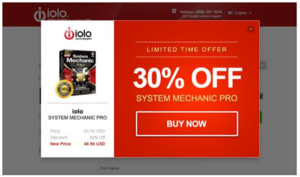
You can also use remarketing emails to let these shoppers know about your offer, in case they leave your website without completing their order — just remember to capture contact information before users reach the cart. Remarketing is especially effective if the shopper’s initial intent was to purchase later or for users who simply walked away from their computer and abandoned the session. On average, about 2 to 3% of your software revenue can be recovered easily with follow-up emails.
TIP: As a rule of thumb, the first follow-up email should reach potential customers within an hour of cart abandonment in order to be most effective. Approximately four out of every ten customers open messages related to abandoned carts, so send your first email within 1 hour, the next after 24 hours, and the third one after 48 hours.
You can use ratings to push your products in an email, not just the product name with its price and image. Adding written reviews and the ratings previous shoppers gave to your product might persuade your indecisive customer to actually complete their purchase. Fear of missing out (FOMO) is a real thing.
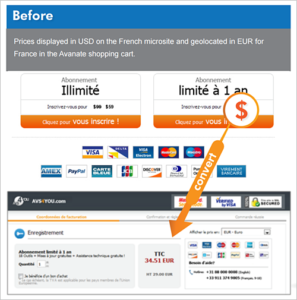
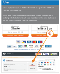
Another aspect that you need to take into account is price consistency among your website and your cart pages. This is a common mistake and can be easily avoided by properly integrating your systems and synchronizing changes in real time. Price differences can be the result of poor localization as well.
5. Not Enough Payment Options
If you’re only offering a single payment option (or very few choices), you’re putting unnecessary obstacles between your prospects and your revenue. Offering more payment options decreases the shopping cart abandonment rate by letting people pay the way they prefer.
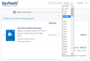
For instance, SysTools offers multi-currency support, which means international visitors can understand the price and pay using their preferred currency.
You can also try integrating local payment methods. In some countries, the banking penetration is still low, but mobile internet access allows growing populations of shoppers to enter and browse through eCommerce markets. As an example, installments on local cards or payments initiated online but completed offline are growing in adoption rates and becoming more popular – for instance, the use of Boleto Bancario in Brazil or Konbini in Japan.
TIP: 2Checkout Global Payments enables you to sell globally and settle payments seamlessly while giving shoppers a secure localized buying experience with more than 45 payment methods and 130 currencies.
Some of our clients witnessed growth in their conversion rates by adding PayPal Express as a payment option in their cart. We have also encountered situations when customizing carts for different markets with the local top 3 payment methods of choice reduced shopping cart abandonment. The conclusion? Users appreciate the diversity in payment methods available and could finish a purchase if their preferred payment method is available in the cart.
6. Lengthy Forms or Cumbersome Checkout
Lengthy forms or arduous checkout processes can represent other reasons why customers abandon shopping carts. Due to the amount of information online, shoppers have a short attention span and will abandon a purchase if it takes too much of their time or if they find the checkout process too difficult to follow. Avoid this by making the purchase process as efficient as possible. Note: this means efficient, not just short.
Shoppers prefer a shorter or longer cart flow based on best practices and cultural norms in their country. In some markets, such as the US (also the biggest software market in the world), a short purchase flow is preferred. In other locales, such as the German online market, a checkout flow with several steps is sometimes preferred. The best checkout flow will vary by market. Just by adding a review page in your checkout process, depending on the shopper’s location, could prevent cart abandonment and lead to a purchase.
One of the biggest factors in optimizing cart flow and decreasing shopping cart abandonment is the total length of the purchase funnel or the total number of pages that the user has to click through in order to complete their purchase.
Visicom Media, the creator of ManyCam webcam software and screen recorder for live streams and video chats, concluded that looking only at your overall global market is not enough to improve the purchase funnel. A drill-down into country-level data reveals the need for a localized experience throughout the entire purchase flow and a customized cart template, not simply for language, currencies, and payment methods. The key lies in cart localization, which implies tailoring your cart to different cultures, according to your customer’s shopping habits. If you optimize the cart and the funnel for each country, you will maximize, in turn, your global revenue.
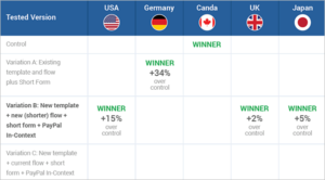
Excerpt from the 2Checkout (now Verifone) case study on Visicom Media’s ManyCam.
Another way to accelerate the checkout process is with relevant visual cues, such as thumbnail images of the product, to assure the shopper that they’ve added the correct item to the cart. When shoppers enter their information in a form field, you can display a checkmark to generate positive momentum.
TIP: Adapt the checkout form by requiring only vital information and show a progress bar to let customers know how many steps are needed to complete the purchase. If you have the resources, customize the purchase flow and shopping cart for each market, or at least focus on your main markets to maximize sales.
7. Concerns about Trust and Security
Now more than ever, our security is being threatened by malware and other online threats. It’s not just using or downloading pirated software that can get you into trouble; simply visiting a suspicious website can cause problems as well.
When it comes to credit card data or other payment details and personal information, shoppers are very cautious and want to be reassured that their data is being handled securely. Users won’t enter their credit card details on a certain page unless they trust that page.
In order to build trust, inform your shoppers that their online transactions are secure and their private information is protected.
You can use an SSL/TLS certificate that will also automatically display the safe padlock icon in the address bar of the browser. This is a sign that your shoppers will associate with secure transactions.
Add a well-known trust mark from an organization such as Norton Security, VeriSign, ScanAlert, or Better Business Bureau, and feature payment method logos which your users recognize and trust like Visa, Mastercard, or PayPal. These steps can also comfort shoppers and decrease eCommerce cart abandonment while used as visual cues on the cart pages.
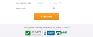
In addition to these trust marks, make sure to add a phone number or a live chat option available on each page. People usually trust websites that offer the possibility of some human interaction.
8. Lack of an omnichannel strategy
A very common situation that many shoppers find themselves in is browsing for products on a certain device, such as their desktop computer, adding the product to the shopping cart, and then trying to finalize the process using another device, such as a mobile app.
If these two experiences are not connected, and the merchant isn’t using an omnichannel solution, it can ruin the shopper’s experience and discourage them from finalizing the purchase. Make sure you are using an omnichannel solution so that all your data is stored in one place and the end-user experience is seamless. This way, your shoppers will see that all the items selected in the cart on their desktop computer are still stored in their mobile shopping cart, making the buying process much more fluid.
Mobile app push notifications can also be of great help in reducing your cart abandonment rates. By sending out notifications or even SMS abandonment cart reminders, you can reach out to your potential customers more efficiently and give them a nudge to finalize their checkout process. This way, your message will have a potentially better reach. For best results, add an incentive such as a discount code to your message, and you could notice a significant growth in your conversion rates.
Another tip to improve your omnichannel strategy is to use digital advertising campaigns to cross-promote your brand to the customers who have recently visited your website but haven’t finished a transaction yet. Try using Google Ads and Facebook Ads or other relevant platforms – and coordinate your TOFU (top of the funnel), MOFU (middle of the funnel), BOFU (bottom of the funnel), and retarget ads to get your message out there in a logical manner based on your purchase journey.
The secret to omnichannel strategy is to be present on multiple channels, at all times, with a unified strategy.
Now that you’ve seen some of the reasons people abandon carts, are you ready for more? If you’re interested in going deeper into best practices that can boost sales, check out this webinar with actionable advice on how to increase your revenue with conversion rate optimization.

