I recently attended the first ConversionXL conference, held near Austin, Texas, right before SXSW. Organized by Peep Laja and company from Markitekt, the ConversionXL event brought together about 300 digital marketers from various industries to talk about everything related to conversion rate optimization.

It introduced some interesting concepts that may be counterintuitive for those who are seasoned in the ways of CRO. Here are the key takeaways from the event:
It’s not about Conversion. It’s about Growth.
One of the first big lessons was that increasing conversion rates isn’t (necessarily) the goal of our work. Growth is. Andre Morys of Web Arts pointed out that the easy way to increase conversion rates is to lower price – pretty simple, right? Instead, we need to talk about optimization at a higher level, and go beyond conversion rate to consider metrics like average order value and overall revenue.
So perhaps it should be called “Growth Optimization”?
A New Kind of A.D.D.
We have all tried to optimize landing pages to increase conversion rates, whether it’s a lead gen form or a first step in the purchase funnel. Oli Gardner of Unbounce proposed a new type of A.D.D., or “Attention Driven Design,” that asks optimizers to focus on a single element when building landing pages. Designing “around the form” has proven to increase conversion rates by 15 percent.Tweet One of Oli’s best tips was to make a 100-pixel circle around the CTA and delete everything in it. This helps reduce the attention ratio and eliminates the potential for distraction.
Tests Fail. Optimizers do not.
According to Yuan Wright, Director of Analytics at Electronic Arts, there are only three possible outcomes for a test:
- It helps the business
- It doesn’t help the business
- It doesn’t matter
We have all seen a test that had inconclusive results or a variation that did not beat the Control. In fact, about 25 percent of tests fail according to Brooks Bell. Tweet We can still learn from these results and apply the insights to future tests. Understanding why a treatment did not work is as important as understanding why it worked.
So, as optimizers, what should we consider an epic fail?
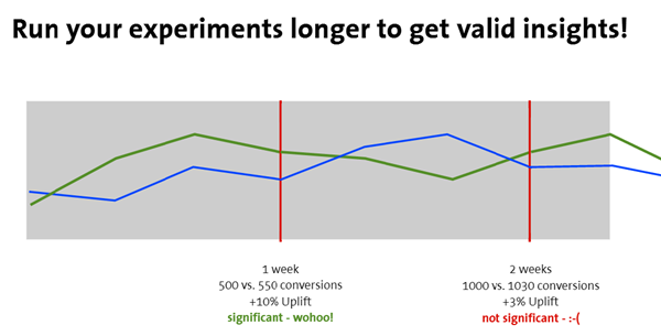
The worst mistake an optimizer can make is to stop a test too early – before the true winner is actually clear. The rule of thumb has always been to wait for a 95 percent confidence level and run the test for at least two weeks. Tweet Brian Massey of Conversion Sciences recommended we go beyond these minimums, and look for other indicators and patterns before calling a winner.
For example, if the lines are not converging, keep the test running. Here is a great example of a test progression over two weeks, demonstrating how results can change over time and the risk of calling a test too soon – even if it reached statistical significance in week one.

Think like a Psychologist, not a Data Analyst
Most conversion rate optimizers (myself included!) are passionate about the numbers. Spreadsheets do not drive growth. We must understand what is most important to the shopper and what motivates their behavior in order to increase revenue over time.
Michael Summers of PayPal emphasized qualitative research over quantitative. Watching how users interact with web pages is more meaningful than looking at clickmaps or heatmaps. Tools such as Inspectlet or SessionCam provide session recordings for those of us that do not have user-testing labs with retina scanning.
Andre Morys of Web Arts pointed out that something as simple as providing a green checkmark when a user fills in a form correctly creates an emotional incentive to continue the process. By understanding user motivation, we can design websites that will lead to improved conversion rates, order value, and ultimately drive growth.
ConversionXL was a thought provoking event that provided a great mix of strategic and tactical insights. Did you attend ConversionXL? What were some of your favorite takeaways?


