
Models based on subscription have been tremendously popular and successful in recent years. There’s no denying that a subscription-based approach can be the right path for a business wishing to monetize its content, whether it be a streaming service, a SaaS operation, or online publications.
However, there are several key elements a business has to get right in order for the subscription model to work. One of these is the subscription page itself. We’ll give you a list of tips to get your subscription pages doing all they need to do. But before that, we’ll reach a definition, so we’re all on the same page, subscription or otherwise.
What Is a Subscription Page?

Screenshot sourced from nytimes.com
Imagine a brick-and-mortar bookstore. It doesn’t charge per book: once a customer’s inside, they can pick up any book they like and take it home with them. So, like a library, except the customer gets to keep the books forever. There is, however, a charge on the door that the customer has to pay before they enter.
It’s here that the customer makes their purchase. So, this particular store owner has to concentrate their attention on this entrance, making it as attractive and enticing as possible to the prospective buyer. Now, consider that there are numerous other bookstores of this kind on the very same street. It’s yet more important to entice customers to pay for entry into that store over and above all others.
This is very much the situation with a subscription page. Behind it lies a wealth of material that a customer can access, but only once they agree to pay the initial fee, AKA the subscription.
5 Steps to Optimize Your Subscription Pages
So, a subscription page is the key point at which a customer will opt-in. There are several aspects to it that should be in place so that it performs optimally.
1. Be clear
Subscription pages need to capture a customer’s details. It stands to reason, then, that a subscription page has to make this intention clear, and be well-designed so that a customer can clearly see what’s required and where to enter it.
There should also be clear information on what the organization will do with the details, and an unambiguous approval method wherein the customer confirms that they are OK with it.
Also, make the whole process of reading, understanding, and acting on the subscription pages as easy as possible for the customer. They shouldn’t have to wallow about too much in reams of information in order to make their decision. Set out the facts, illustrate how they will apply to the customer and make the next step as clear as you can.
The more basic you can make things, the better. Take this example from firstleaf.com. A lot of people are nervous about the world of wine. There’s a lot to know and a lot to get wrong. This is why this first question is set just right.
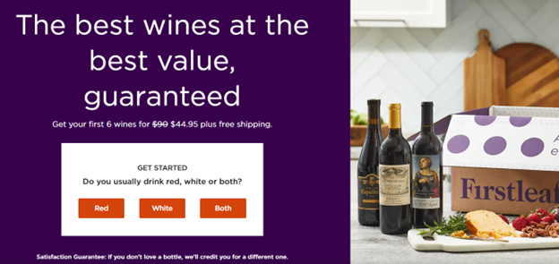
Screenshot sourced from firstleaf.com
Things can get a little more detailed as the customer progresses, but it’s important not to put them off right away.
If you’re offering a free trial, be ultra-clear about what this entails and the limitations therein. A free trial can be a great way of demonstrating what you’re selling and can result in many conversions from trial to paid. But you have to be clear about what’s on offer.
One final tip: use drop-downs wherever possible. It’s overlooked more often than you’d think just how vital these aids are, especially to the customer using a mobile device. On such finer points will subscriptions sell or fail.
2. Highlight the benefits
OK, let’s go back to the bookstore. The canny manager will put their biggest hitters in a prominent spot by the door, so that customers can factor these enticements into their decision on whether to subscribe. It’s no good just having esoteric and/or wildly unpopular titles proudly displayed in the hope that you’ll get broad appeal.
So, with a subscription page, it’s important to promote to the customer just how they’ll benefit by signing up for the service on offer. However, beware of hyperbole. Nothing spells trouble and plain puts people off like unwarranted eulogizing. Think about what’s being offered, and sell it realistically. Is it unfettered access to the treasures beyond the page? Or is it a small time saving?
Put yourself in the shoes of your target customer and explain succinctly how your service will solve their particular problems. This is very much the secret to any marketing. You’re just sticking it succinctly and clearly on your subscription page.
Let’s say you’re dealing with customers setting up a digital presence and they’re concerned in particular about SEO. This is where you can talk about such aspects of your service as keyword research and B2B link building, and explain how a subscription will consequently resolve all their challenges in this area.
Finally, a great option when it comes to communicating benefits to customers is to use social proof, such as this example here from Naya Premium Coffee:
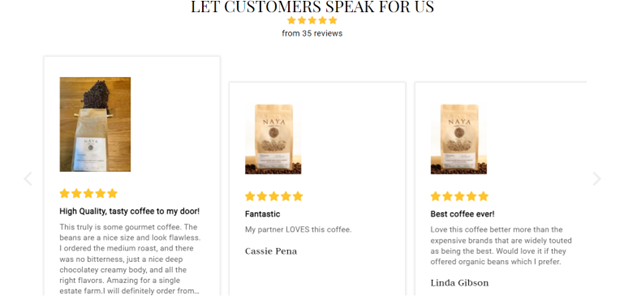
Screenshot sourced from nayapremiumcoffee.com
3. Consider your customer
You should not just appraise your subscription pages for clarity, but for their ability to chime with the kind of customer you’re looking to attract.
If you have a streaming service that deals exclusively in the latest urban music drops, you’re going to be looking to attract customers who respond more readily to informal expressions and vernacular than they might to ultra-precise and strictly formal grammatical constructions.
So, make sure that the wording on the subscription page suits your target customer. And remember that your site and service should be brand-consistent. Any discordance between what you’re selling and how you sell it will stick out a mile.
4. Give subscription tiers
One of the most successful ways to offer subscriptions is to set out a tiered membership approach. You know the kind of thing—pay the minimum just to get, say, entry-level website content services, or pay the maximum to get the full range of B2B SaaS content marketing services.
Mid-range membership level options are usually available for those who want a level of service somewhere in the middle.
Here’s a well-set out example of a tiered-offer subscription page.
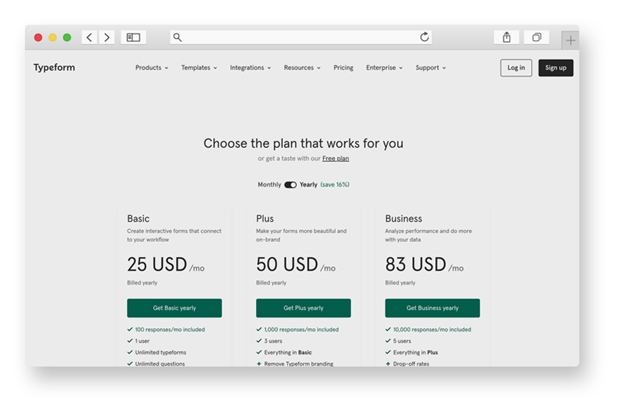
Screenshot sourced from Typeform
The key benefit of this approach is that customers can titrate their membership option to a level that suits them. The trouble with the alternative, i.e. the all-or-nothing approach, is that too often it results in nothing when a customer realizes that a lot of what’s being offered is superfluous to requirements. Tiers allow a customers to buy pretty much just what they need.
However, the other nice thing about a tiered membership is that it sets out higher subscription options as possibilities for the future. You can reach a customer opting for the minimum subscription level with promotional material illustrating how an upgrade might suit them in due course, and then make it easy for them to switch subscription plans.
5. Keep them current
Subscription pages have to be up-to-date. By this, we mean three things. Firstly, they have to reflect and promote the latest products and services in order for them to stay relevant to your business offer.
Secondly, they have to comply with the latest statutory provisions that might apply. A key consideration is, of course, data security, so you need to ensure that your subscription pages are up-to-date in terms of their legal frameworks. This is to ensure that you stay on the right side of the law (and free of financial penalty and even imprisonment) and that you do the right thing with your customers’ data.
Finally, they need overhauling from time to time so that the phrasing stays as potent as it needs to be to land with your potential customers. For this reason, it’s wise to come to it with as fresh eyes as you can muster and read them through as if it were your first time. If you can do this every year, that would be a great benefit.
Of course, you can always seek out information along these lines by surveying your current subscribers. Zero-party data can be extremely useful in helping you to understand how to stay relevant and how to retain your existing subscribers. And subscribers can be rewarded for their efforts with perhaps an extension on their subscription or a free time-limited upgrade (or maybe a gift card).
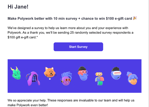
Screenshot sourced from Polywork
Make your subscription pages irresistible
We’ve seen how you can give your subscription pages the best chance of succeeding. Using clarity, thinking about your customer, keeping content up-to-date and compelling will all help your subscription pages doing all they can to help your company thrive.
One point to end on. Remember that, in all likelihood, the person viewing your subscription pages is already almost over the conversion line. They’re clearly interested, and not just in a passive way. They’ve taken the trouble to actually check you out and they’re on the verge of signing up. So, it’s very much a case of just helping them along that road. Your subscription pages are there to allow customers to do what they want to do. So, just let them!
About Author

Nick Brown is the founder & CEO of Accelerate Agency, the SaaS SEO growth agency. Nick has launched several successful online businesses, writes for Forbes, published a book and has grown accelerate from a UK-based agency to a company that now operates across US, APAC and EMEA. Here is his LinkedIn.