If you’re a B2C eCommerce business that’s targeting the 1.92 billion digital buyers worldwide, then your website is one of the most important business assets you own. Much like the brick and mortar’s appeal resides in the building itself, for eCommerce, the site draws customers in and either hooks or puts them off with its shopping experience.
Websites have come a long way since the first one saw the light of day in 1988. While they may seem simpler and more accessible, the reality is it takes a certain level of complexity for a website’s look and feel to generate an effortless journey for the user. Particularly in eCommerce, where most users nowadays expect a predictable browsing experience, a site’s structure will have a big impact on your online business’ potential to close sales.
Bonus: Check out these top 10 features for your B2B eCommerce site.
What are the main features that users need when browsing e-shops? Read on and check whether your business is ticking off all of these 10 eCommerce must-haves. If not, it might be time for a site upgrade and some new dev work.
0. Responsive design
The first item is dictated by common sense. Starting our list is a site’s mobile-first structure, also known as its responsive layout. We’re not actually counting it towards our 10 features because, let’s face it, if you’re not mobile by now, chances are you’re not a legitimate player in your category (sorry).
At present, mobile traffic accounts for 67% of total worldwide eCommerce traffic and this number is expected to reach 73% within the next two years. This trend is that largely fueled by the younger, mobile-native generations, for whom mobile has been dubbed their new primetime. About 53% of teens already shop via their phones, by comparison to just 43% of their friends who are 25 years and older.
At present, mobile commerce is an $800 billion market, with some businesses registering the majority of their sales on mobile. Shopify, for example, recorded 66% of last year’s Black Friday-Cyber Monday sales on mobile. That’s a staggering $ 1 billion of mobile sales over just the course of one weekend.

Given these user preferences for mobile browsing and shopping, it’s imperative nowadays that your site offer an impeccable mobile experience, so that customers feel at ease to browse and finalize transactions in your shop. If you’re not there yet, talk to your dev team or collaborators ASAP and start planning for a mobile upgrade.
1. Product filter and comparison options
Even if you’re only showcasing a handful of products or services on your site, it’s important to give the user the option to view these according to relevant criteria by category. The goal of filtering is to enable a user to get to their intended query faster, therefore speeding up the checkout process. In spite of its important role, about 40% of ecommerce sites still don’t have category-specific filtering options today.
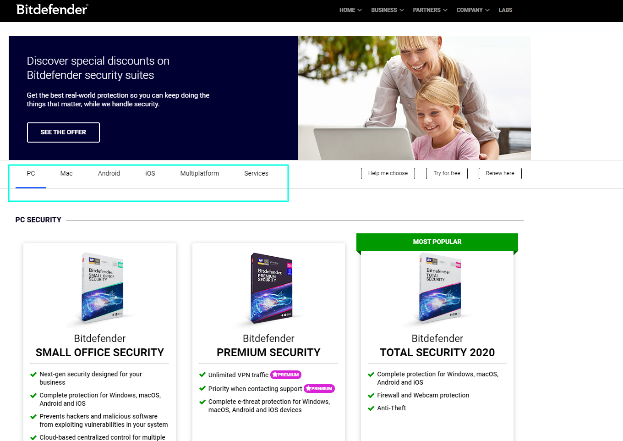
Bitdefender allows users to choose their OS, to show the brand’s most relevant products.
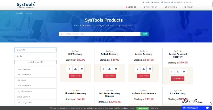
SysTools’ site also permits choice of OS and even product category.
Consider introducing filters for things like switching between multiple product categories, sorting in relation to price, indicating product quality, and sorting depending on social validation (popularity). If your site features multiple products/services or tiered offerings, include a comparison feature. This way the user will be able to easily notice the differences between similar items in your portfolio.
2. Search function
You may feel like your site is the most intuitive destination ever, but for a first-time user it might be closer in perception to Babylon. On average, it takes about 15 seconds for a user to decide whether the information needed is available on your site. Even if the layout is not clear from the start, often a search option will allow the resilient user to manually seek out their intended results.
When there is no option for searching, users may end up feeling frustrated. This risk is that much greater in SaaS, where product novelty or an abundance of information can make it hard for a user to navigate their way around your site. In cases like this, an on-site search function is an easy way for the visitor to find targeted information, instead of digging around your site with building frustration.
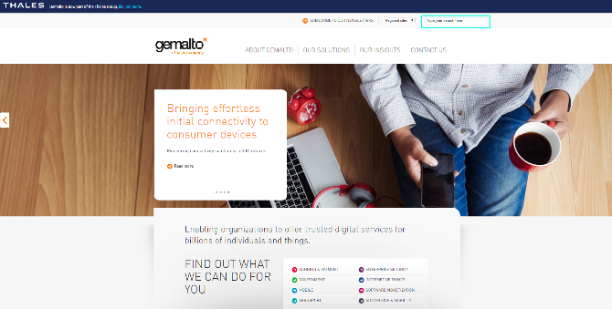
Cybersecurity company Gemalto places its search feature at the top of its site, so it is visible to users who don’t have the time to read the LP’s carousel.
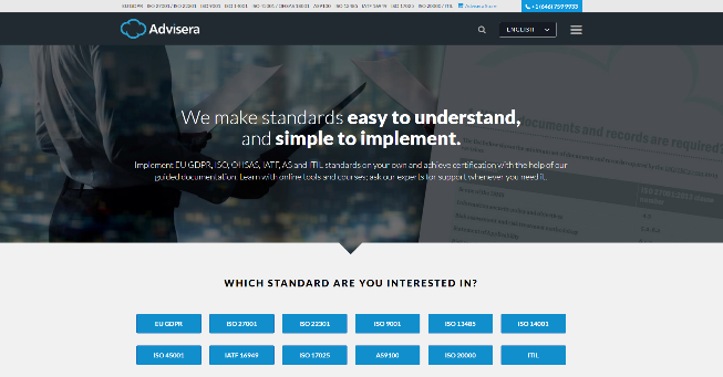
Advisera offers consultancy and implementation in an abundance of standards. Beyond listing these in several places, Advisera also includes a search bar, for quicker results.
3. Geolocation
Not being relevant is one of the main dangers brands face today. Geolocation is the site feature that permits your business to be relevant in all of the different markets in which you’re active. By utilizing your visitors’ geographic location, obtained via device IP, geolocation enables serving them content personalized to their language and currency options. The goal of geolocation is to personalize the visitor experience so that they have a sense of familiarity and predictability from the moment their visit begins.

For merchants who are active in more than one country, having geolocation features on their site is mandatory. Even if you use English for all the markets you are selling into (because you’re new at cross-border, or don’t have enough resources), there are bound to be some variations that require different content/items to be shown to different visitors. Especially when it comes to checkout and payments, it is important to use geolocation. Customers are at least 70% more likely to purchase if the shopping cart is displayed in their native language and their preferred payment method is listed as an option. Geolocation is one of the first features a business owner introduces to create relatability with the user. Used in combination with other user demographic or psychological data, geolocation enhances personalization and improves conversion rates.
4. Optimized cart
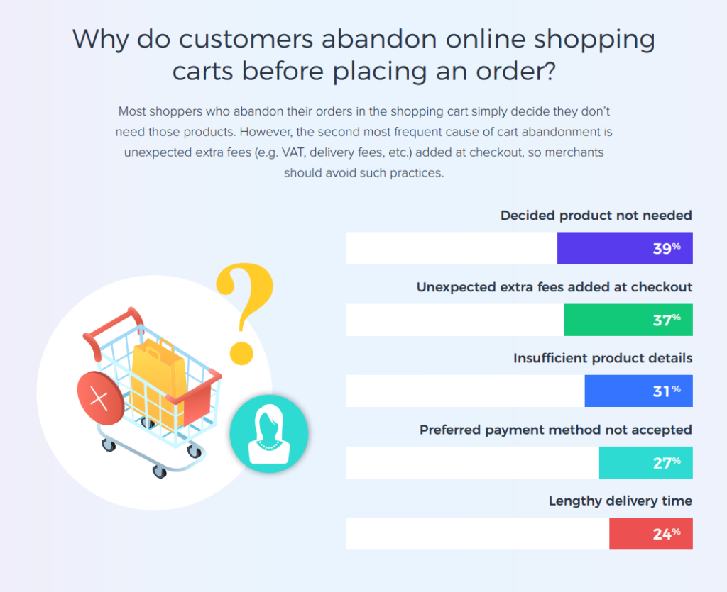
The shopping cart experience is one of the most important parts of any eCommerce site, although many merchants still underestimate its power. Around 70% of all carts are abandoned each year and many of the reasons behind this are related to how the site manages users’ expectations of the shopping experience.
Your site’s cart is not something to be decided during setup and then forgotten about. Managing a high-performing cart involves continuous testing, tweaking, and re-work, to always stay on top of customer needs and market trends. Beyond offering user-preferred payment methods (covered by point 6), your cart also needs to be optimized in terms of flow, layout, and information shown. Start with industry practices and category preferences when designing your e-store cart and then adapt based on your customers’ behavior.
Flow-wise, your shopping cart should include just the right number of steps so that visitors perceive the process as effortless, yet professional. Some industries are better suited to 3-step shopping carts (Basket page à Review page à Thank you page), whereas others convert better with a 2-step flow (Basket page à Thank you page).
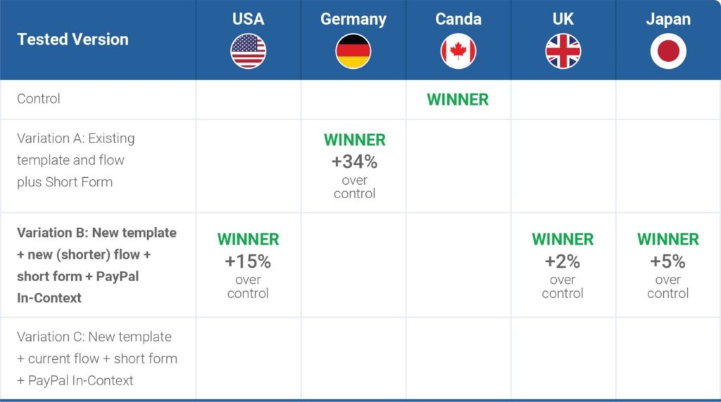
Market specifics also impact preference for one checkout flow size or another. In 2Checkout’s ManyCam case study, we were able to isolate specific preferences for flow length in five of our clients markets – while American customers preferred a shorter flow, those in Germany opted for the longer version.
From a privacy perspective, legal regulations require that your brand collects the minimum amount of information for an intended purpose. From a layout perspective, testing is also required to best assess what type of information customers are willing to share during the checkout flow. For tips on how to test your cart, check out information on “testing like you mean it” here.
Be sure to also test all other types of information expected by customers in your checkout flow. Some merchants obtain better conversion rates by recommending upsell/cross-sell items in their flow; for others, extra recommendations may even decrease conversion rates. Most users expect payment information to be visibly highlighted during checkout. But you won’t know for sure what works best until you test. Other types of information that your visitors may expect during checkout can include: delivery/fulfillment information, mentions of money-back guarantees, contact details for your brand and for your payment processor, and others.
5. Advanced payment options
If your website does not currently support multiple payments, that means you already know what your next urgent site implementation must be. Scare tactics aside, the feature of offering several alternatives for payments is mandatory in the 21st century. Your store must feature your customers’ preferred payment methods to increase the chances to convert. In online retail alone, it is estimated that around 50% of cart abandonment is due to missing payment methods during checkout.
It’s essential therefore that you take the time to review your audience’s preferred means of payment, in all markets where you’re selling. At present, 63% of global shoppers prefer debit and credit cards, while mobile payments are the option of choice for 12% of online buyers, as evidenced in 2Checkout’s 2019 Shopper Survey.
To ensure appropriate payment options, adapted to each of your market’s specifics, consider working with a reputable payment processor or gateway. 2Checkout offers 45+payment methods and 100 display and billing currencies. You can read about all options in our Payment Methods Solution Brief.
6. Contact page
It may sound like a no-brainer, but including a web page with information about how to get in touch with your team is expected by all clients. A study by KPMG from 2017 found that the ability to effortlessly contact a brand online is the most important trust signal sought by clients – 51% of customers feel that companies that make it easy to contact them are trustworthy.
Your contact page should include modern, swift means to interact with your representatives, such as phone numbers, an email address, and even on-site chat features if your customers’ profile calls for it. 2Checkout’s 2019 Shopper Survey uncovered that 62% of shoppers expect to find an email address on a company’s contact page, whereas almost 40% are expecting online chat options.
Feel free to also link to your social profiles on this page, if you’re encouraging dialogue on those channels as well. An on-page contact form is also an option, but be sure to personalize it so that the user gets closure after hitting send – an auto-reply email or a brand-personalized confirmation message will assure the visitor that their message has reached the intended destination. If possible, use these automated replies to also set clear expectations on the timeframe needed for replies to come.
When it comes to contacting your team, your audience will want to reach out to them with product-related questions. They may have purchase queries, shipping questions, or even how-to needs, which you could easily address by setting up a support page where these answers are readily available.
7. FAQ page or Knowledge Center
By now, it’s probably obvious that the majority of elements needed on a site serve the role of enhancing a user’s journey and making them feel safe and reassured until the transaction is concluded. An FAQ page or a Knowledge Center area is another pro-active approach of reassuring site visitors who require extra information while browsing.
Such landing pages also help in automating certain client touchpoints, which implies less operational resources needed to answer the same client questions. Last but not least, product documentation and FAQs also help in communicating the scale of your brand and the professional orientation that is specific to your e-store.
You wouldn’t want visitors leaving your site mid-purchase to browse online for answers, would you?
Be pro-active with product and delivery information.
Beyond their help in customer reassurance and sale conclusion, FAQ pages and Knowledge Centers can be your first step towards developing a customer training portal. The newer the category you’re in, the more you’ll have to invest in education for prospective clients, especially among those that actually make it to your site.
8. Trust seals and social proof
Your online store needs to be perceived as a space of trust for visitors to feel at ease to complete their purchases. It is common practice to inspire this mood via the use of trust seals, partner logos, social proof, and user testimonials on-site.
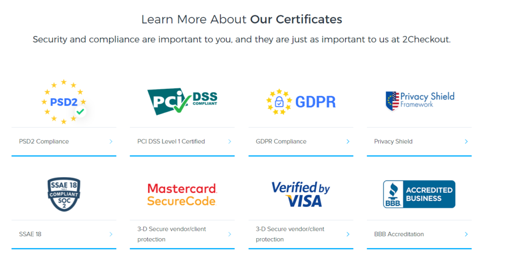
Trust seals include partner logos from other authorities, whose positive general perception is expected to apply your brand as well. They can be anything from standards you’re accredited for (ISO 9001, for example, attesting your quality-management orientation), to partner institutions (a Better Business Bureau logo, for example), to logos of accepted payment methods (Mastercard or American Express, for example). Your site can also feature preeminent client logos, if your portfolio already includes big names, for a better emphasis of your authority in the category.
Social proof and mentions should also be included on your landing pages, as they usually succeed in inspiring more legitimacy within the category. Consider including user-generated content, links to social media channels with follower count, and social media post previews, to connect with visitors on an emotional level and further humanize your brand.
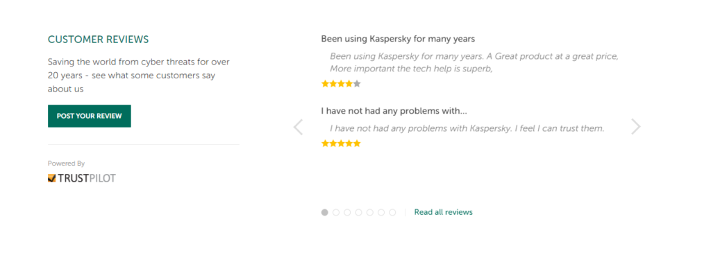
Testimonials are also a highly useful inclusion, given that 55% of shoppers read reviews before committing to a purchase. Instead of having visitors bounce, searching the web for mentions of your brand, be proactive and offer those reviews on-site, while they are browsing there.
9. User account
While user accounts are not mandatory for selling online, they are a great means to track your customers and communicate with them in a more personalized way. Your goal with user accounts is to convince your buyers to register for an account on your site, without making it a mandatory step for purchase. It is important not to force account creation on the user directly during purchase, as this has been shown to lead to diminished conversion rates of up to 35%. By contrast, simply recommend creation of a user account, while offering special benefits in return (extra discounts for future purchases, exclusive access to special user-only deals, no transportation or setup fees, etc.).
Whatever approach you choose, try not to spam the visitor with lengthy forms to complete, instead collecting only the primary information needed. After all, any other information required from the user will subsequently give you an extra touchpoint opportunity.

If you feature user account creation functions on your site, don’t forget to educate the user on what their account can do for them. Showcase account functionalities via email or site tutorial, ensuring that all relevant business functions are presented – teach them how to add to their wish list, how to share desirable products with others, how to review past purchases or ongoing subscriptions, how to opt out, and so on.
10. Optimized Product Page
The aim of your product page is to convince the visitor that the product or service offered is just the right one for their needs. Your goal here is to answer product queries in an efficient and timely manner.
Does the user expect to see product pictures? Consider including a variety of high-quality product images, from different angles. If you’re selling SaaS, be sure to showcase screenshots from your desktop or mobile platform, to give the user a feel of what to expect from the product. Ensure that you optimize all image sizes for fast web-browsing – 39% of users claim they stop engaging with a site if the images are hard to load, according to Adobe.
Does your offering include several variants for the same item? Display selection and filter features as well as clear instructions and any potential accessories visitors usually buy with that specific product.
Are you currently running a promotion for the item? Be sure to feature clear, visible calls-to-action, guiding the user in their experience on the page, essentially telling them what do without being imposing or pushy.
Conclusion
And there you have it, our inclusive top 10 list of all things mandatory for an ecommerce website in 2020 and beyond. Ensuring these requirements are met may improve your bottom line over time and will surely upgrade your visitors’ experience and keep them coming back for more.
What features have you found to have the highest impact in customer on-site metrics on your site? Let us know in the comments below. Once you’ve worked on these features, you’re free to start drawing in more traffic to your site, as you work towards better conversions.
You’ve got your website live and ready to go?! Then it’s time to check out these tips and best practices on how create a top product page in order to boost your conversions!
Check out also the infographic on this topic, for a quick, visual overview: