You have invested time and resources into making your digital product (web, app) happen. We’re talking about conceptualizing, designing, understanding the user’s needs, and trying to turn them into functionalities.
You have put in place a strategy to implement a methodology of constant optimization that ensures both yourself and your users have a better browsing experience, better content, and better web architecture. What are your next steps? You set your goals and start brainstorming, A/B testing, analyzing, and iterating until when? You start seeing that your initiatives or experiments are less impactful as time goes by. Why is that?
Many of you reading this blog post may have encountered this problem, I have encountered it myself. And many times, within our strategies, roadmaps, effort-impact matrix, we discover that we have been ignoring small changes that, a priori we may think are not relevant or could lead to growth. But let’s not fool ourselves, they are what give life to our product and elevate our components in terms of design and usability. I’m talking about micro interactions.
What are micro interactions?
A more formal definition by Nielsen Norman Group is:
“Micro interactions are trigger-feedback pairs in which the trigger can be a user action or an alteration in the system’s state; and the feedback is a narrowly targeted response to the trigger, and is communicated through small, highly contextual, usually visual, changes in the user interface.”
In simpler terms, micro interactions support the user by providing feedback and displaying information in a clear way, while preventing errors in their digital journey.
Here are some examples to better understand what I’m talking about. Think about the response of your device when swiping down to refresh the data, or when you’re liking content, or the way a menu slides in when tapped, the scroll bar when you are scrolling down, the hovering over a button. All of these actions seem simple and smooth when properly designed and these are what micro interactions actually are.

Why are micro interactions important?
Now that we know what they are, let’s think of an example: you are purchasing something online, you click on the ‘Place Order’ button, and nothing happens.
There are several questions that will cross your mind in less than 10 seconds: Have I filled out all the fields correctly? Is the button not working? Have I forgotten something? Is this a fake website? Should I click on the button again?
In this scenario, how can you make sure that the user does not get frustrated or abandons their journey? There might be other elements to explore here, but since we are talking about micro interactions, let’s try to tackle each one of them.
1. Form fill validations for error prevention
By adding an inline validation message when filling the form, green checks when the user has done it correctly, or displaying error messages when the input from the user is wrong – this will help reduce the feeling of uncertainty and will reassure the user that all the information provided in the form is correct or that they might need to review something.
2. Provide Immediate feedback
When designing your CTAs, make sure you are providing the right feedback for them, such as a different status for the buttons that will support and guide the user. For example, something to indicate to the user that they cannot go to the next step and, if the previous step has been finished correctly, the user will know where to look next.
On the other hand, once all the inputs are correctly filled in, display a clear enabled CTA to indicate that the user can go to the next step and that the action has been correctly completed.
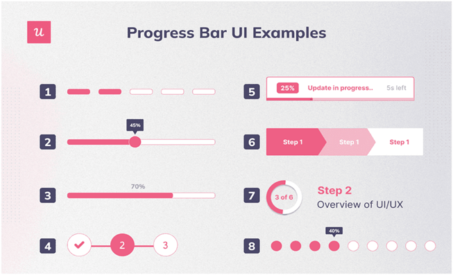
3. Progress bar
Let’s take a checkout process that has several steps for a shopper to go through. In this case, it is important to clearly state in which page or at which step the user is in the flow and how far away from completing the action they are.

Source: JavaScript in Plain English
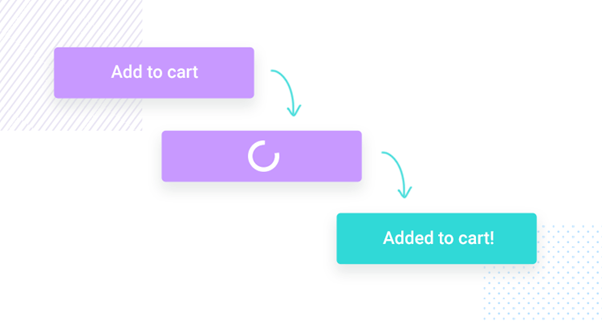
4. Loaders and loading spinners
One issue that might generate uncertainty when clicking on a CTA button is the lack of information when the order is being processed right in front of us. Therefore, in connection with the need of ‘providing immediate feedback’, you should include loaders with displayed messages so the user can understand what is happening.
In this scenario, the user will click on the ‘Place Order’ button, and they should see a message with a loader indicating that the order is being processed. With are reassuring them that something is happening until the completion of their order, while removing insecurity or lack of trust in the website or product.

How can we further polish the design and user experience through micro interactions?
Hover animations
Hover animations are a valuable resource when it comes to providing additional information. A tooltip is one of the handiest examples that comes to mind. Also, make sure you change the cursor shape or design when the user hovers over an element and turn it into a good micro interaction.
This way, your shoppers will know which elements are clickable and actionable and will interact with them in the way your product intends for them to do so.

Source: Code my UI
Toggle Switches
In line with the idea of offering an immediate response, toggle switches are a digital on/off switch that are usually one of the best options for changing the state of functionalities or your user’s preferences depending on the number of options given. This will simplify your users’ journey super quickly.
What is the impact of these micro interactions when it comes to Conversion Rate Optimization?
We have seen in the previous examples the benefits directly associated from including well designed micro interactions, benefits such as:
- Better user engagement
- Improved usability
- Errors prevention
- User guidance
- Reduced frustration and friction
- Better understanding of the product
By taking care of micro interactions, you will see a positive impact on your Conversion Rates and another metric that will be impacted by optimizing your micro interactions will be a lower Exit Rate.
Conclusion
As the book Micro interactions says, “The difference between a good product and a great one are its details: the micro interactions that make up the small moments inside and around features.”
By understanding micro interactions, the role they play in your product strategy and not underestimating them, you can make a positive impact on the user journey, on how your shoppers engage with your product and ultimately generate revenue growth.


