How high is your shopping cart conversion rate? Is it 30 or less? 40? 60? One day a client asked me: what exactly makes a conversion rate to be smaller or higher? Is it the number of steps, the security logos, the product images, adding/removing cross selling? Unfortunately, there is no such thing as a secret formula to it. However, we have found that the absence of 3 elements can influence in a negative way your shopping cart conversion rate: trust, confidence and security.
On trust, confidence and security
Trust comes from the experience with the shopping cart itself. Most of the users don’t care about technicalities or 3rd parties and so on, but when they find themselves in a cart that doesn’t look like anything on your website, some of them will hesitate to trust it. A feeling that something might be wrong could take over. It’s common sense after all. In all the tests we’ve done, the better the customized cart was (in terms of look and feel), the higher the conversion rate.
Confidence comes from the feeling that everything is straight forward. No elements that can generate doubt. So, before deciding to offer by default Backup CD or Download Insurance in the cart, test it. Sometimes it works, sometimes doesn’t.
The security element is a little bit more sensitive. To accomplish a sense of security, you will most definitely need the mandatory secured elements in the browser. After that, you can start testing security logos, payment methods logos, revealing information on how the payment goes and so on.
Let’s get something clear: the higher the conversion rate for a client, the more sales they have, the more commission we get :). So it would be plain “not very smart of us” to neglect this aspect. That’s why we have a dedicated team working on shopping cart A/B testing and customizations for our clients. Once the test results are validated, we include it as an option for everybody – either as a shopping cart feature or widget.
Today we are proud to let the first widget out into the wild
It’s a widget that tries to assure the security element, and we call it simply: Who is Avangate?
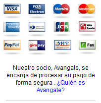
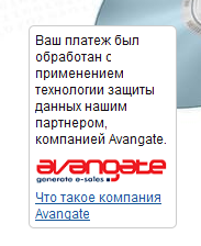
Research into the Avangate shopping carts used by software vendors led us to the discovery of a first pattern. The more clear it was for customers they were buying through a 3rd party, the bigger their trust, reflected into higher chances of finishing a buying process. So, naturally we had to test it. We have come up with the “Who is Avangate?” widget that everyone can now include in their shopping cart. Here are a couple of examples from our tests (yes, it’s multi-language supported):
The goal of this widget is to let people know they are buying from a secure third party, without having to leave the shopping cart. The information is shown only to users interested in learning about Avangate (they click on the link), while the rest of them are not being disturbed from the buying process.
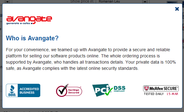
When users click on the Who is Avangate link, the following overlay is displayed:
Results
The best results we obtained through our testings were of 3% increases in conversion rate for the templates using this widget. However, not all the tests came with the same result. In some, the increase was lower than that. It all depends on the audience of each shopping cart. According to the tests we have conducted, it’s safe to state that the more visitors trust the website they are buying from, the less impact of the above widget. So far, none of the tests we’ve implemented had a negative impact on the shopping cart.
Therefore, I invite you to take the challenge and start an A/B testing campaign with this widget on your shopping cart as well. The worst that can happen is to see a little bit more cash in your account. :)
For deploying this for your shopping cart just contact your account or write to us directly at info@avangate.com.


