

Mobile eCommerce is growing fast—it’s expected to account for 72.9% of total eCommerce sales worldwide by 2021.
To keep up with this growth and boost mobile conversions, you need to optimize your website or app to meet your users’ needs.

Make no mistake, mobile users’ needs are quite different from those of desktop users. To design better mobile experiences for your users, you need to be aware of the context of mobile interaction.
Nadav Savio and Jared Braiterman presented the overlapping spheres of context in which the mobile interactions take place in their paper “Design Sketch: The Context of Mobile Interaction.” Understanding the context means taking into account things like the user’s culture, environment, activity, goals, attention span, tasks, device and internet connection speed. As you can see, there are a lot of factors to consider, but all of this information will ultimately help you more accurately determine the features and the usability of your mobile offering.
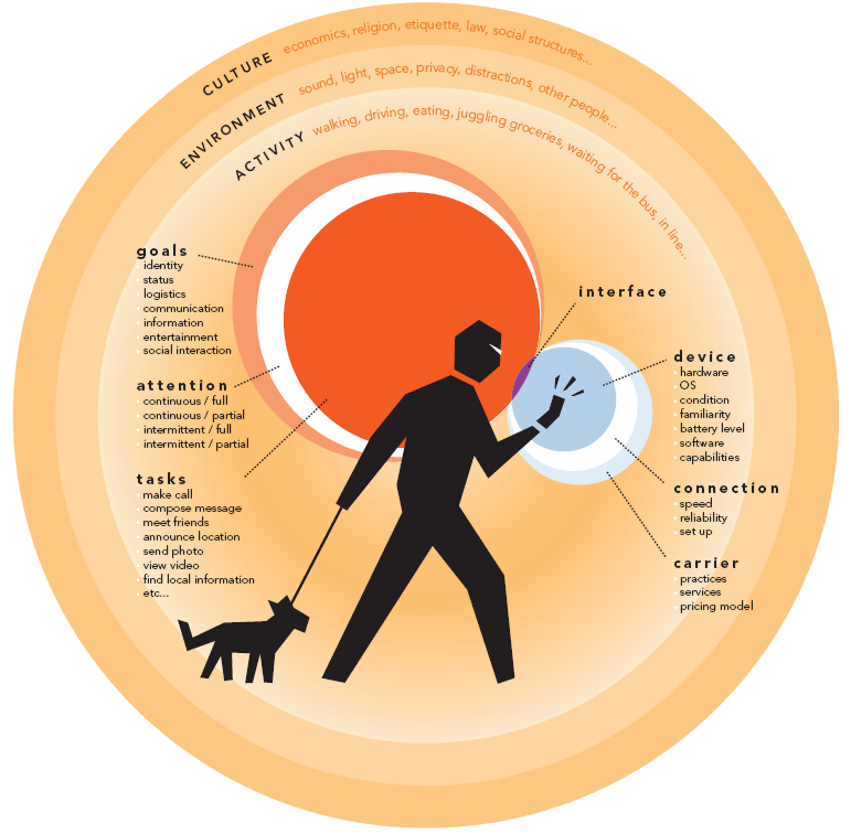
Source: giantant.com
Now, with the context in mind, let’s explore some UX best practices that can help you optimize for mobile to deliver a better conversion rate.
Design for Thumbs
We interact with our mobile touchscreen devices using our thumbs, so keeping all important navigational elements within comfortable reach is critical. But how do we do that?
A study conducted by Steve Hoober shows a Thumb Zone heat map that we can use to identify the “easy-to-reach” zones on a device.
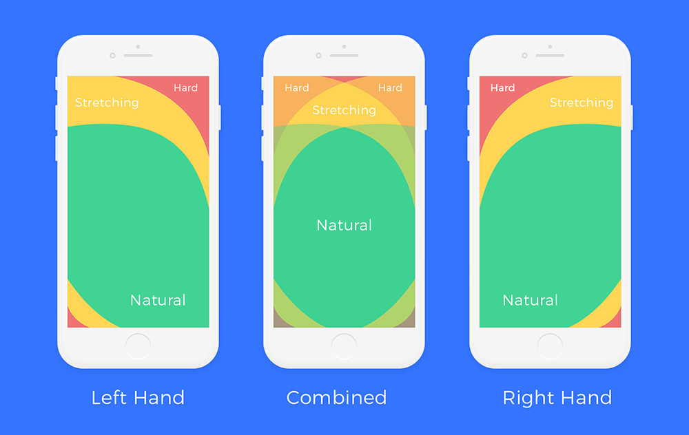
Make sure to place key navigational elements within these easy-to-reach areas. This will offer a more comfortable and natural mobile experience to your users.
“Fat-Finger” Friendly
On mobile, it’s very important to make sure that buttons are easy for the user to tap and control. On iOS apps, the target size for buttons should be 44 x 44 px, while on Android apps should aim for 48dp. You should also make sure that two targets are never in close proximity, so that the user can tap on the desired target without getting frustrated.
Use Appropriate Input Controls
Choosing the right input controls for your forms can have a big impact on conversion. Using the wrong types of input only adds complexity, and that’s a real deal-breaker for users.
Luke Wroblewski suggests that dropdowns should be the UI of last resort and that apps should use more appropriate input controls like steppers, radio groups, switches or sliders to keep the interface simple.
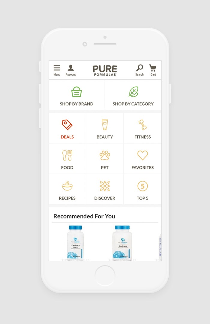
Clear Product Offering on the Homepage
What is the most intuitive journey for a shopper who isn’t clear on a brand’s product offering? A new shopper will likely scan the home page from top to bottom before taking an action. If the mobile website doesn’t clearly inform users of the product categories, they will go back to a search engine and look for another provider.
One approach, in addition to the already common “hamburger” menu, may be to use an app-like pattern of large category list navigation. This way we can help shoppers understand our brand’s product offering quickly, reducing the cognitive load required by using iconography.
Chromatic Balance
Using too many colors can be hard on a user’s eyes, so you should give special attention to this aspect of usability. You can achieve good contrast if you use 2-4 colors in your designs. This will help users find content that is relevant to their tasks quickly. More colors will just confuse users and spoil the look.
Content Legibility and Readability
Mobile screen real estate is much smaller than what’s available on desktop. Making everything smaller to fit in may be easy, but it’s not a good solution. Having less space means that the most important information needs to be prioritized. A rule of thumb for mobile from UX Planet states that “text should be at least 11 points so it’s legible at a typical viewing distance without zooming. Improve legibility by increasing line height or letter spacing. Good, generous whitespace can make some of the messiest interfaces look inviting and simple.”
Optional Registration and Login
Most users consider it a waste of time to register and log in to buy something online. Users should be able to access as many features as possible without having to log in. If you do decide to create a login, you should let users log in through a social media network or another existing account. This way they don’t have to invest effort and time to create a new account with you (and remember another password!).
Another popular best practice is to allow guest checkout so your users can buy whatever they want without having to create an account.
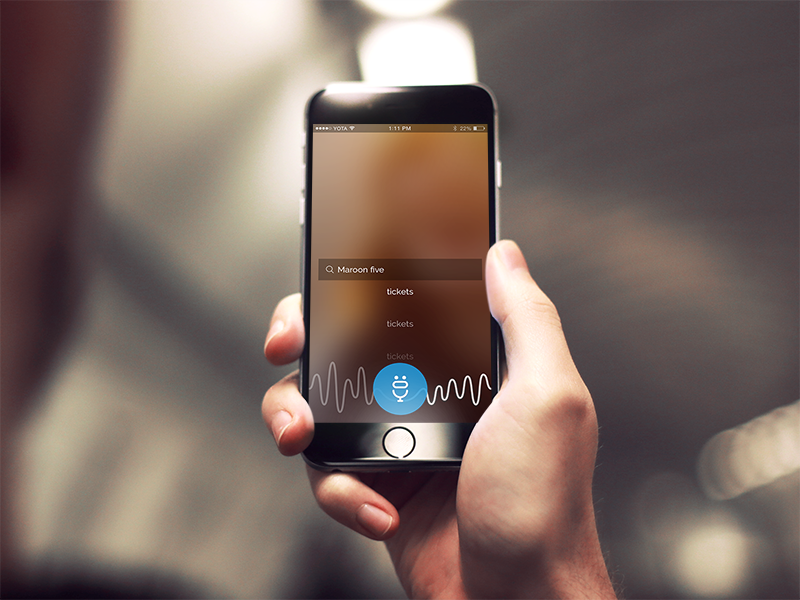
Human-Centered Search
The shopper search experience on your website has a great impact on your business. We recommend enhancing the mobile shopper experience using voice search and image recognition technology. Voice search is an incredible opportunity to stand out from your competitors these days. The advantages of voice search include speed, ease of use, accuracy, and popularity with users.
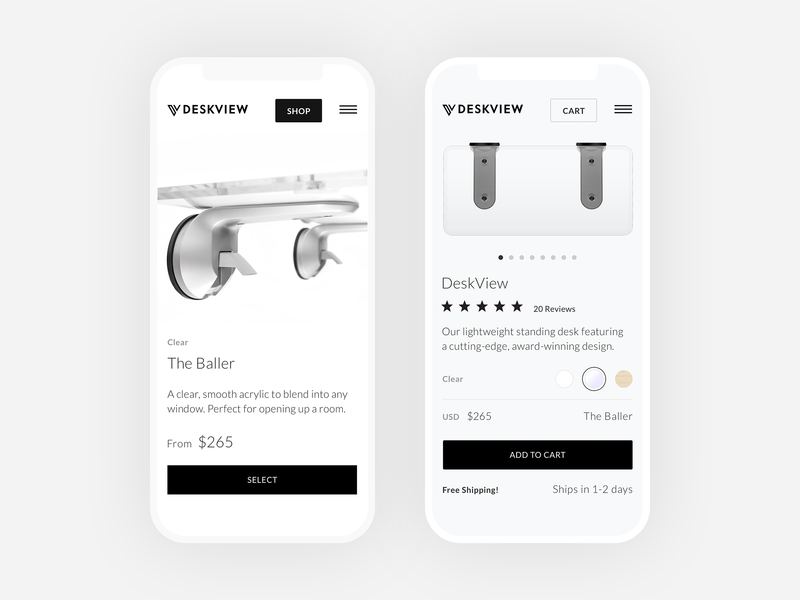
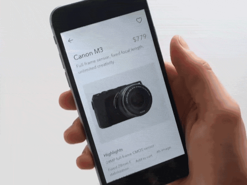
High-quality Product Images and Zooming Support
We all know how cautious shoppers can be. Naturally, they want to be able to inspect products thoroughly and are concerned about the small details. I know it from my own experience: if I’m not able to explore a product by zooming, I don’t feel comfortable buying it. Being able to zoom in on an image can make the purchase decision easier for users.
Users are interested in clearly seeing product details. Make high-resolution images available for all your products. Also, be sure to allow product page images to be swiped and zoomed with the familiar double-tap and pinch gestures. If you have these options in place, inform users that you support these gestures with a zoom in/out icon.
A Final Word
When designing mobile interfaces, most companies focus on usability and utility. Only a few aim for desirability.
Jon Wiley, lead designer at Google, told FastCompany that mobile “creates a whole new level of this need for desirability.” Mobile allows users to touch and manipulate objects, making room for more experimentation.
Desirability is about driving a user to take action through design. We can do that by using visuals, content and form elements. Visual design provides context, well-written content guides decisions, and form elements finalize actions.
It’s difficult to keep up with mobile eCommerce trends, but not impossible. What you need to remember is that context is key for good usability, but desirability is what will make your product stand out amongst other similar products.