You’ve probably heard it many times before, but it bears repeating: your landing pages can either make or break your marketing campaigns.
However, there’s a lot of advice out there on how to effectively design a landing page to maximize conversions and it’s not always easy to sift through it and figure out what to focus on.
So I decided to help you out – I’ve asked some of my favorite CRO experts to share their very best tips on how to create a high converting landing page.
Here’s what they said:
Talia Wolf
The most high-converting landing pages are customer-centric.
They focus on identifying their visitor’s pain, understanding it and solving it for them. Landing page visitors should be able to immediately see how the solution offered will help them. To create these types of landing pages you must know your customers, understand their expectations and make it about them.
At GetUplift we run significant customer research to better understand the target audience’s emotion triggers, their intent, pain, and desired outcome. Using surveys, polls, interviews and many other techniques we listen to our client’s audience and create landing pages that address their needs.
Paul Rouke
Stage 1 – conduct user research with existing customers to understand what motivated them to take action
Survey your current customers, asking them:
- why did you choose our brand over others?
- was there anything that nearly stopped you from choosing us?
- is there anything more you would love us to offer/provide?
- what would you miss about us if you could no longer use us?
- rank in priority order how important these elements are:
- then list out 5 perceived USPs about your business so customers can rate them on importance
Stage 2 – clarify the target audience that your acquisition team are going to be targeting
- if using Facebook advertising, understand what profile is being used and why to attract the right type of visitors to the landing page
- understand what search terms are being used, what devices are being targeted, what channels are being targeted, how budget is being allocated over the marketing period (this will help determine if there will be enough traffic to run A/B tests on the landing page)
Stage 3 – design and build your new landing page
- harness all the customer learnings made in stage 1, ensure the new landing page clearly communicates (without needing to scroll down):
- the brand identity
- a compelling, emotive headline, which is personalized based on the search term the visitor used in paid search
- 3-5 key brand messages/USP’s based on point 1
- one clear call to action
- credibility and reputation enhancers
- social proof review scores from an independent review source such as Google
- optimize image size and page speed (this is crucial to set a positive 1st impression)
- tag up all micro and macro interactions of the page
- set-up HotJar on the page, including a feedback poll asking the question:
- is there anything that you expected to see missing on this page? If so what is this and why did you expect it
Stage 4 – launch the marketing campaign and begin A/B testing (if there is enough traffic leading to at least 1,000 conversions per month)
- conduct remote 1-1 user research with your target audience using Lookback to understand behavior, perception, motivation, attitudes and any usability issues
- use Google Optimize to create segmented A/B tests based upon high performing paid media campaigns
- share the story of how this crazy high performing landing page was 1st created by speaking to customers
Stage 5 – establish this mantra for your company
- “Any paid media acquisition campaign we run in future will be customer-centric, just like this one”
Paul Boag
You will read a lot of different advice about ways to convince users to act, but as I explain in my masterclass the most effective technique is to make action easy. It is so tempting to get sucked into clever techniques and imaginative solutions when in truth people will pick easy every time.
If you make something effortless you reduce their cognitive load and that makes them feel more positive about the entire experience.
Jonathan Aufray
If I had to give 1 tip to create high-converting landing pages is to focus on testimonials. People trust other people. People trust reviews and testimonials. Ask for testimonials from your happy users and customers and add them to your landing page. This will definitely drive the conversions up.
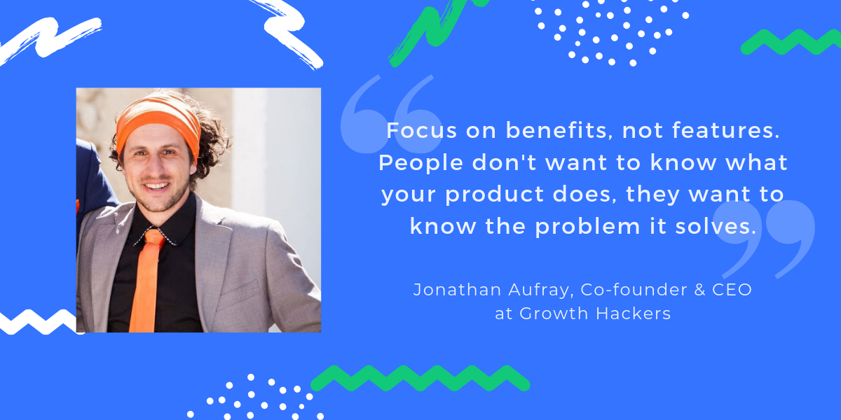
Another tip I recommend fellow founders, entrepreneurs, and marketers is: focus on benefits, not features. People don’t want to know what your product does, they want to know the problem it solves.
Another advice: make your landing page easily scannable. Instead of writing a long copy, sum it up with a few bullet points.
David Shaw
My main pieces of advice would be:
- Ensure the headline of the page is specific and addresses the visitors needs and is relevant to the marketing campaign that drove them into the site.
- Make sure the value proposition is clear. Avoid large blocks of text and engage the user with a clear value proposition that ideally is conveyed in bullet points, this is something that has worked well in many tests previously for me.
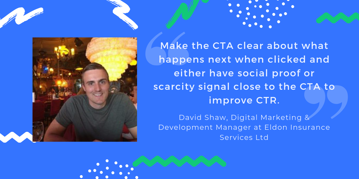
- Make the CTA clear about what happens next when clicked and either have social proof or scarcity signal close to the CTA to improve CTR. These signals will help to convince the user to make that first click and fall into your funnel.
I hope these tips will help you optimize your landing pages and ultimately, grow conversions and boost your business. A huge “Thank you!” to all the experts above, who contributed to this article and infographic.
If you have any more tips that have worked for you, please feel free to share them in the comments below!

